
In this revisited article we originally published early in 2024, we take a look at the (then) new Raymond Weil Millesime with Mario going hands on with the Challenge Watch Award Winning piece from 2023’s GPHG.
Originally published April 22nd, 2024
What We Love:
- Every design element feels exceptionally thought-out
- Appears larger than on paper, but wears comfortably and true to size
- A spec & design monster for the price point
What We Don’t:
- Some design elements feel slightly unnecessary
- Lack of a date can bug some people
- Would have liked a more finished movement
Overall Rating: 8.75/10
- Value for Money: 8/10
- Wearability: 9/10
- Design: 9/10
- Build Quality: 9/10
After the Piaget Polo Date Review, Chamath opened the floor to me, asking what other watches I wanted to review. Unlike last time, I didn’t jump straight into the annals of priceless and inaccessible haute horlogerie. With my newfound experience in reviewing timepieces, it felt right not to give him a heart attack this time. So, instead of asking for an MB&F or an Urwerk, I gleefully drafted a shortlist of five timepieces to review.
There wasn’t a real theme, rhyme or reason with the pieces I requested. I chose pieces not based on brand, price or reputation, but on what intrigued me the most horologically. It was hard to restrict myself to five, (There are so many I love!) but my feeble mind would have exploded before I managed to compile everything I wanted to see.
Enter Geneva brand Raymond Weil – a relatively young brand in watch terms – founded in 1976 by the titular Raymond Weil and facing early challenges set by the height of the Quartz Crisis. In the modern day, Raymond Weil still maintains their independent family ownership under Mr. Weil’s grandson Elie Bernheim. In recent years, however, the power behind the brand name had unfortunately waned, with many in the watch community not considering their watches as ‘must-haves.’ Raymond Weil was gradually getting backed into a corner, often playing second fiddle to other brands occupying their price range.
Despite this, in 2023 Raymond Weil bared their fangs and bit back. Releases like the Freelancer Pilot Flyback and the Jean-Michel Basquiat collaboration generated unprecedented buzz and critical acclaim for the brand.
This culminated in their most recent addition to the collection: The Millesime, named after the French term for ‘a great vintage wine.’ Not only did the release come unexpectedly from Raymond Weil, but it also landed them one of the most prestigious awards in watchmaking history, winning the Grand Prix d’Horlogerie de Geneve (GPHG) Challenge Watch Award (Best Timepiece under CHF$2,000/~AUD$3,300).
First Impressions
Full disclosure, my first impression of the Raymond Weil Millesime wasn’t a favourable one – its design was too simplistic, perhaps too boring, for a timepiece that had garnered acclaim from the GPHG. Admittedly, my judgment may have had a personal bias towards Studio Underd0g a burgeoning microbrand I had hoped would triumph in the same GPHG category.
But there can only be one winner, so when I learned Raymond Weil claimed victory over my beloved Studi0 Underd0g, it only fueled my distaste for the brand. “Who do they think they are?” I often thought, falling headfirst into a big bottle of Haterade. However, delving deeper, I discovered Raymond Weil was going through an underdog story of their own.
A half-century’s worth of heritage is no small feat. Compounding that, their surviving the Quartz Crisis whilst maintaining independence and family ownership is the stuff of dreams for brands in the same boat, worthy of further admiration in its own right.
As tempers cooled, I began to appreciate the Millesime’s unique charm within Raymond Weil’s lineup. Its departure from safe designs was refreshing, and its affordability belied its sophisticated design. With lingering resentment over Studio Underd0g’s loss, I swallowed my pride and decided to review the Millesime, albeit with a rigorous and vengeful eye.
Spoiler alert: I had to get extremely nitpicky because, even at my most critical, I found it hard to fault the quality of the timepiece.
The Design
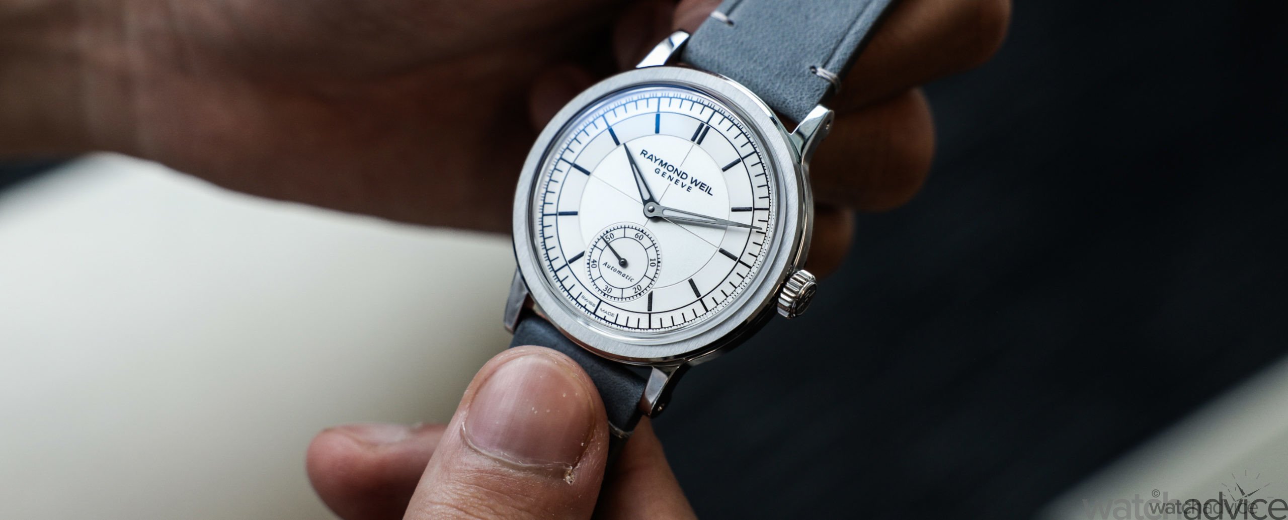
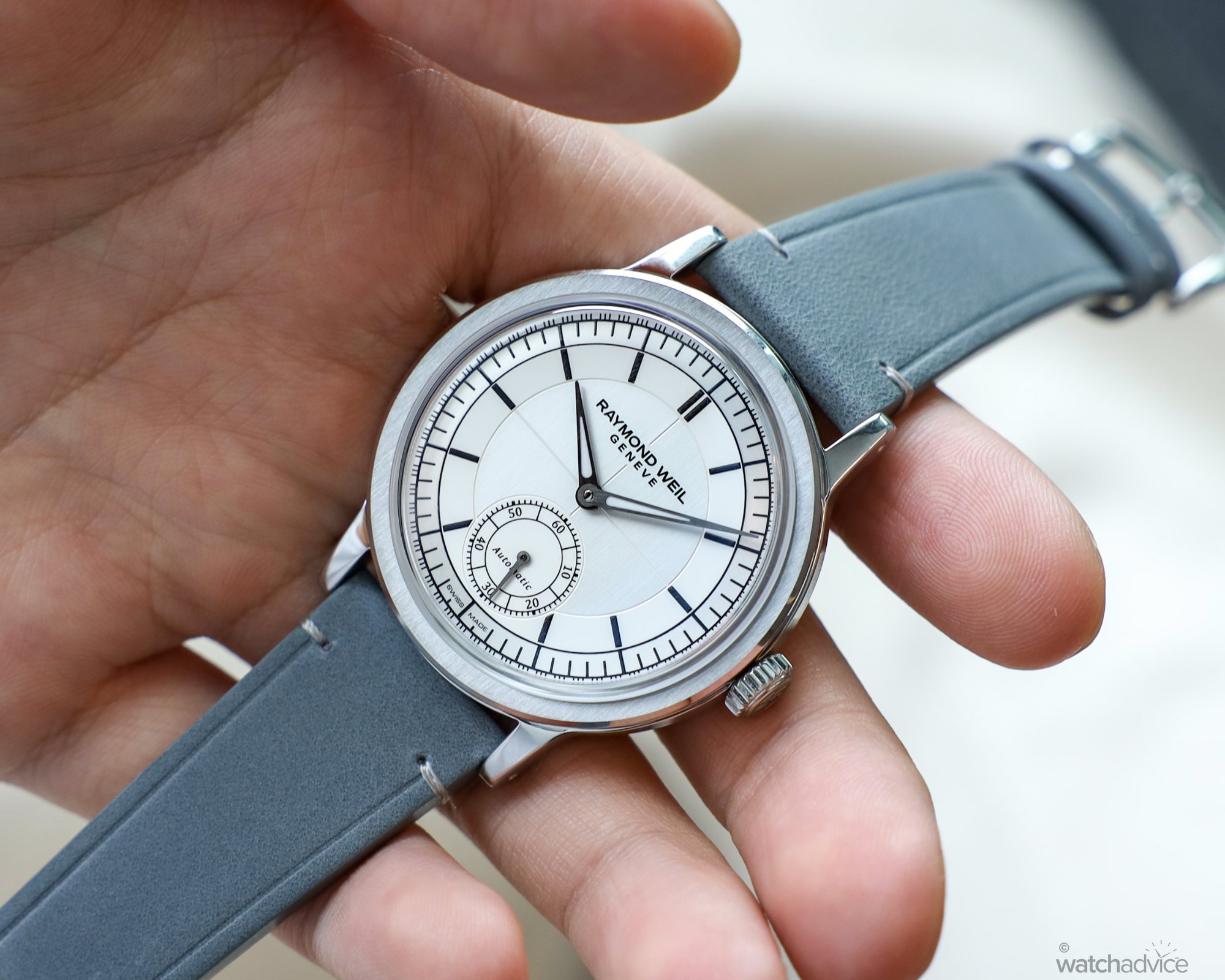
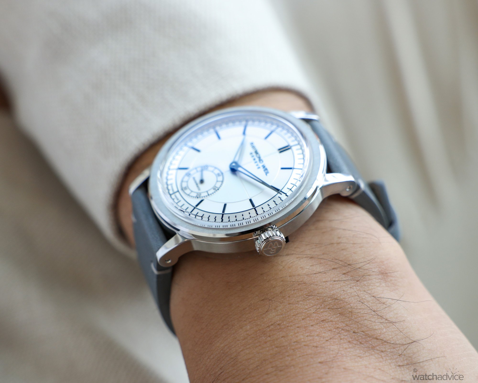
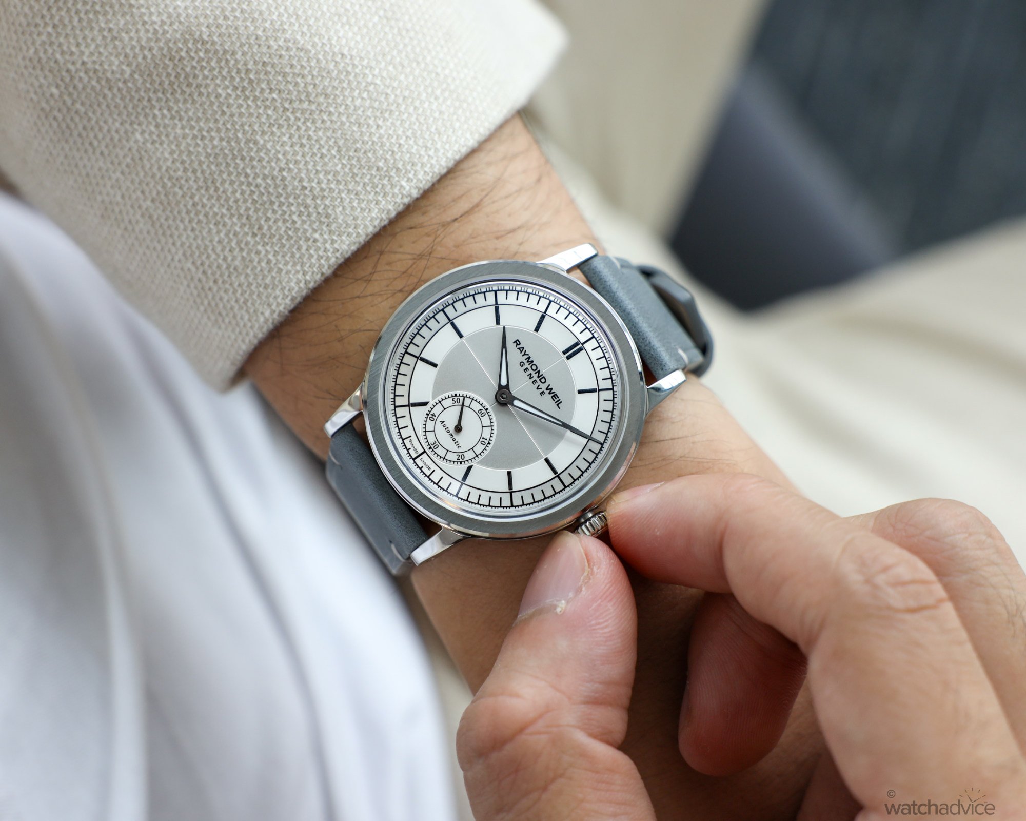
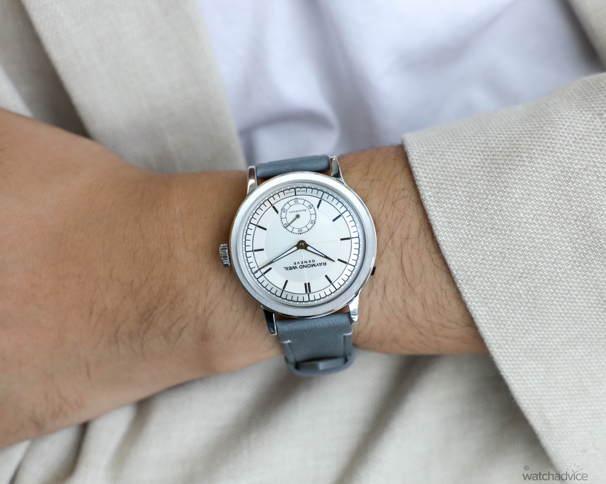
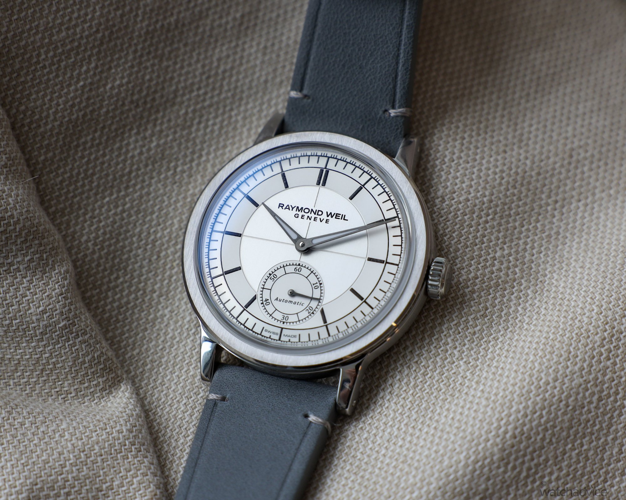
From design alone, it’s no wonder why they won the GPHG. The first thing that popped out to me was that gorgeous sector dial, coloured white with black accents on the award-winning model. Simplistic at first glance, the sector dial offers plenty of aesthetic variety. The black concentric hour, minute and quarter-minute markers draw you into the dial’s centre, which is finished in three different ways.
The outer minute track is snailed, the middle ring is glossy white, and the inner circle is vertically brushed, with straight grooves dividing it into quarters. The only interruptions to the dial are the Raymond Weil logo painted at 12 o’clock, and the split seconds complication. The latter is finished similarly to the middle ring – glossy white with black lines and text marking every ten seconds. Should you forget, the sub-dial also reads ‘Automatic,’ denoting the nature of the movement. However, I think the sub-dial’s text and the numerals could have been removed. It’s a detail that belongs on a sportier watch and detracts from the dressy appearance.
I love how meticulously the dial has been broken up here. Every section has its main attraction and keeps me invested – much more than a plain white watch should. The details are remarkably thought out, from the inner circle’s grooved lines separating to make way for the Raymond Weil logo to the small seconds sub-dial, which has been integrated into the overall design instead of being cut out. Features like these allow the watch to succeed up close and from far away, making it almost irritatingly good for the price point!
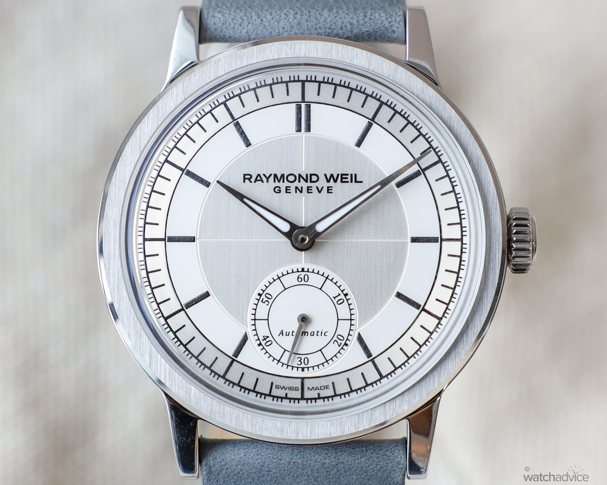
Moving on to the case, you’ll find finishing similar to the dial, with the bezel’s vertical brushing coinciding with the dial’s inner circle. The brushing makes way for a polished rim resembling anglage on a movement, with the polishing continuing to the top and bottom of each lug, and on the engraved case back. The case and lug sides are all horizontally brushed, accompanied by drilled lugs and the Raymond Weil signed crown. Finally, the box sapphire crystal bubbles up and over the bezel, accompanying the retro vibe without looking overtly campy or comical.
Thanks to the polished outer facet of the bezel, it almost makes it look like the watch is glowing in the sunlight – something I was captivated with for a long time. One feature I didn’t expect to like as much as I did was the polished and engraved case back – I mean, nobody but me is going to see it, so what made it so fascinating? The movement I’ll get onto later, but I adore how symmetrical the case back engraving is. The case back’s text is equally separated by engravings of lines and rhombuses, which is incredibly satisfying as soon as you realise it.
This doesn’t mean I have my reservations about the design. I alluded to it before, but some elements just don’t feel necessary. It doesn’t mean they’re not welcome – I wouldn’t turn away lumed hands, for example – but I just feel that it makes it slightly less distinctive from the rest of the lineup. Take Raymond Weil’s Freelancer collection for example. It’s obvious that the Freelancer is the premiere sports watch for the brand, so why are they adding sportier features to what is ostensibly a dress watch? However, I understand that the appeal of a dress watch may not be as it once was – especially in a humid place like Queensland that eats leather straps for breakfast. I just hope that they keep the Millesime and Freelancer identities separate.
How It Wears
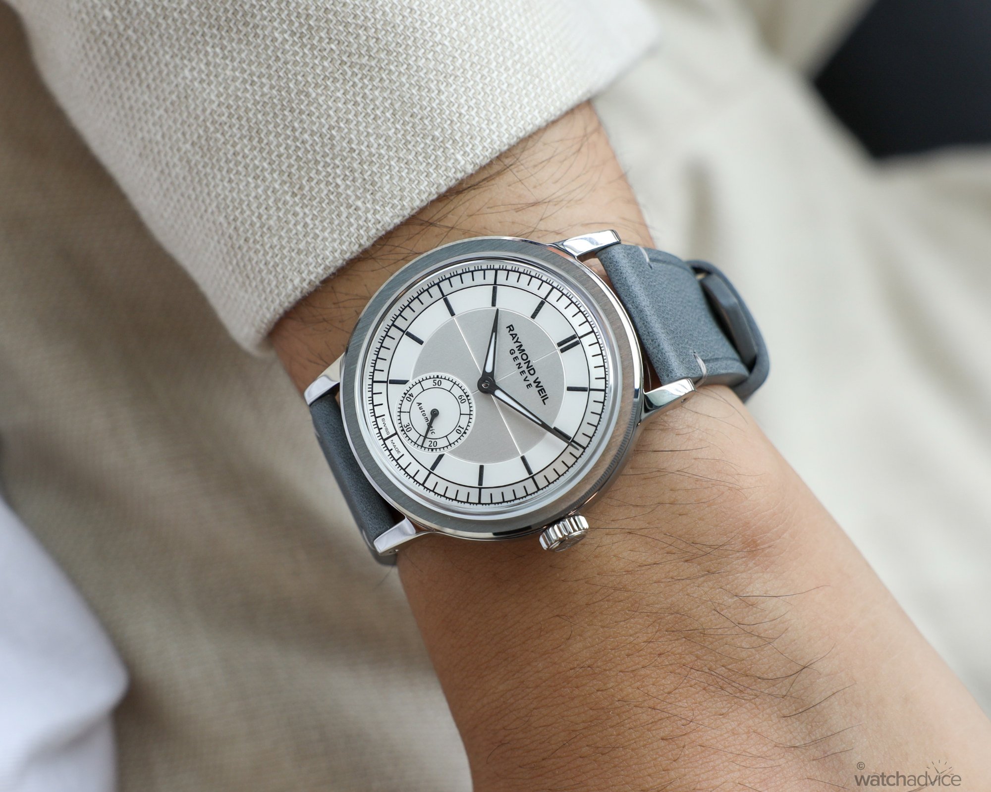
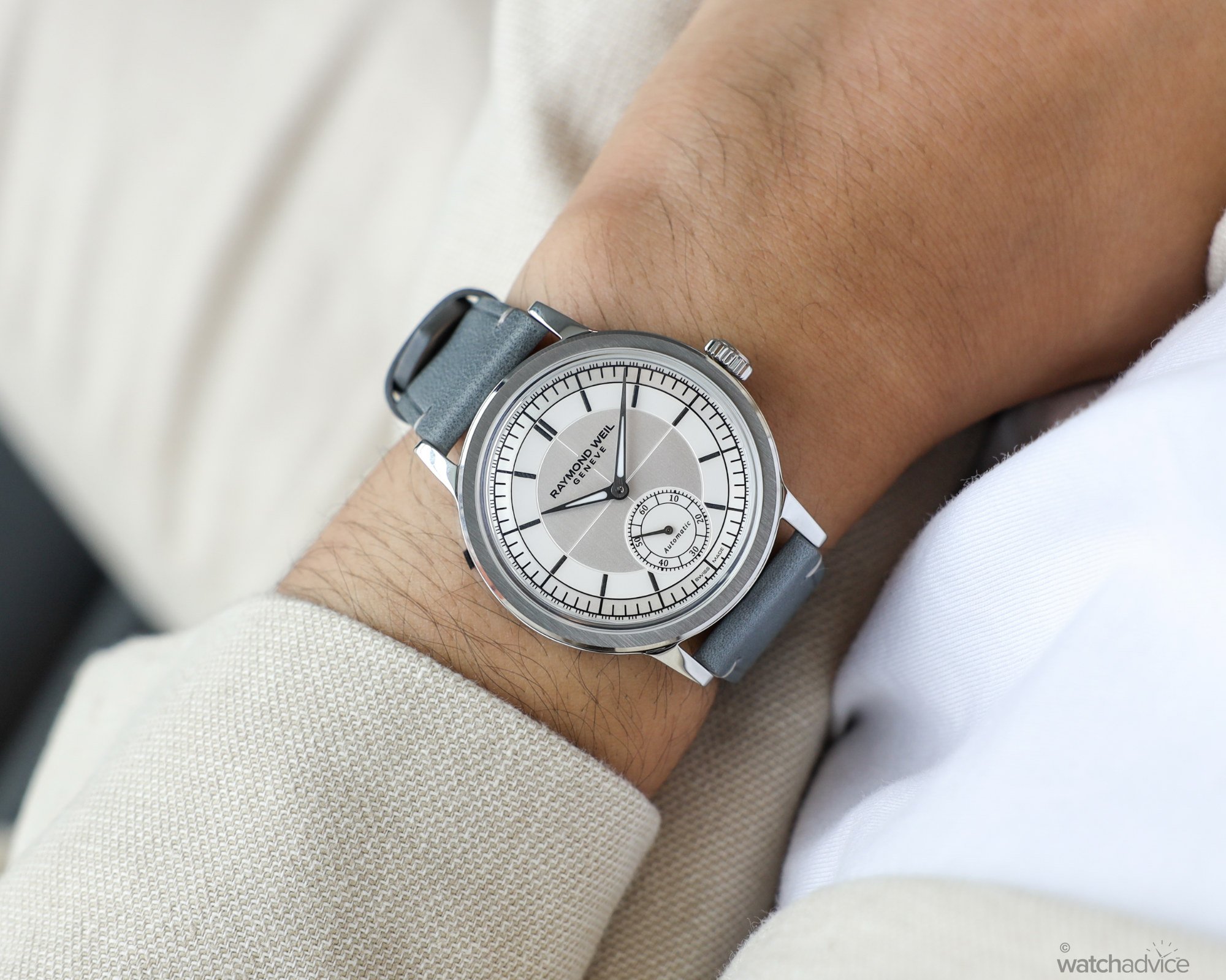
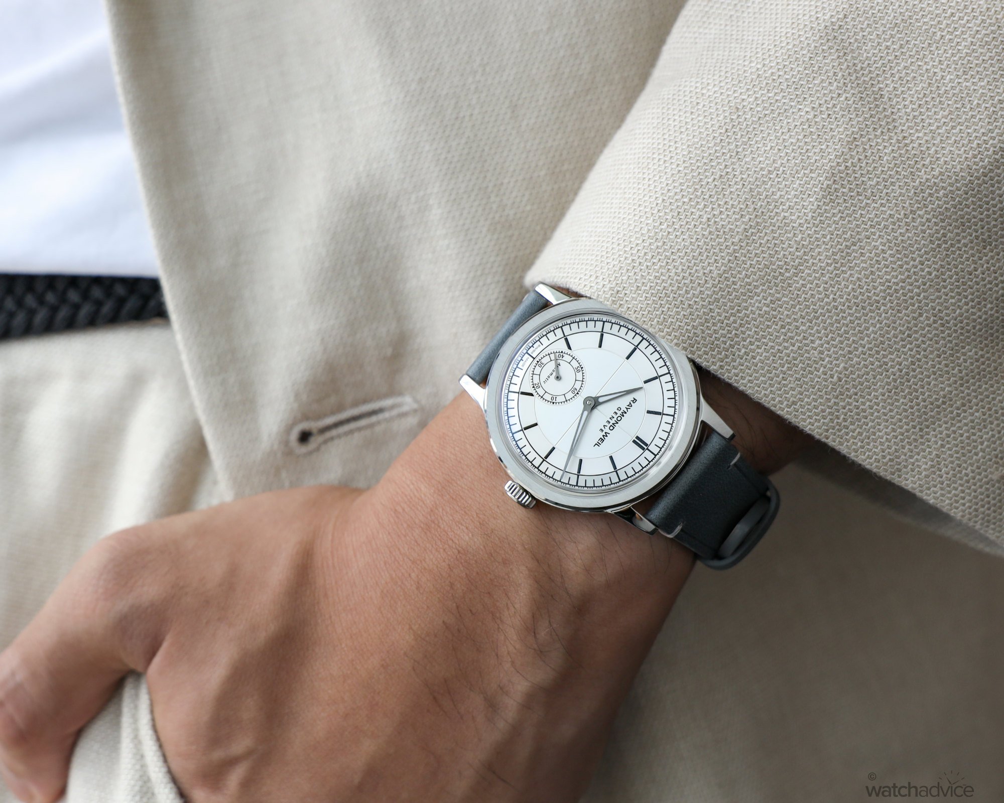
As an average-sized, small-wristed man, I was very happy to find out that the Raymond Weil Millesime’s wearing dimensions were right up my alley. The timepiece measures up at 39.5mm case diameter with a 46mm lug-to-lug and a 10.25mm thickness. While these dimensions are universally wearable for just about anybody, I find that the curvature of the lugs contributes the most to the wearing experience. The lugs curve elegantly downward, ending in a bulbous profile that permits the watch to wear significantly lower to the wrist than what the thickness suggests. 39.5mm is also a weird dimension to make your timepiece, but it gives the watch a larger appearance without compromising wearability.
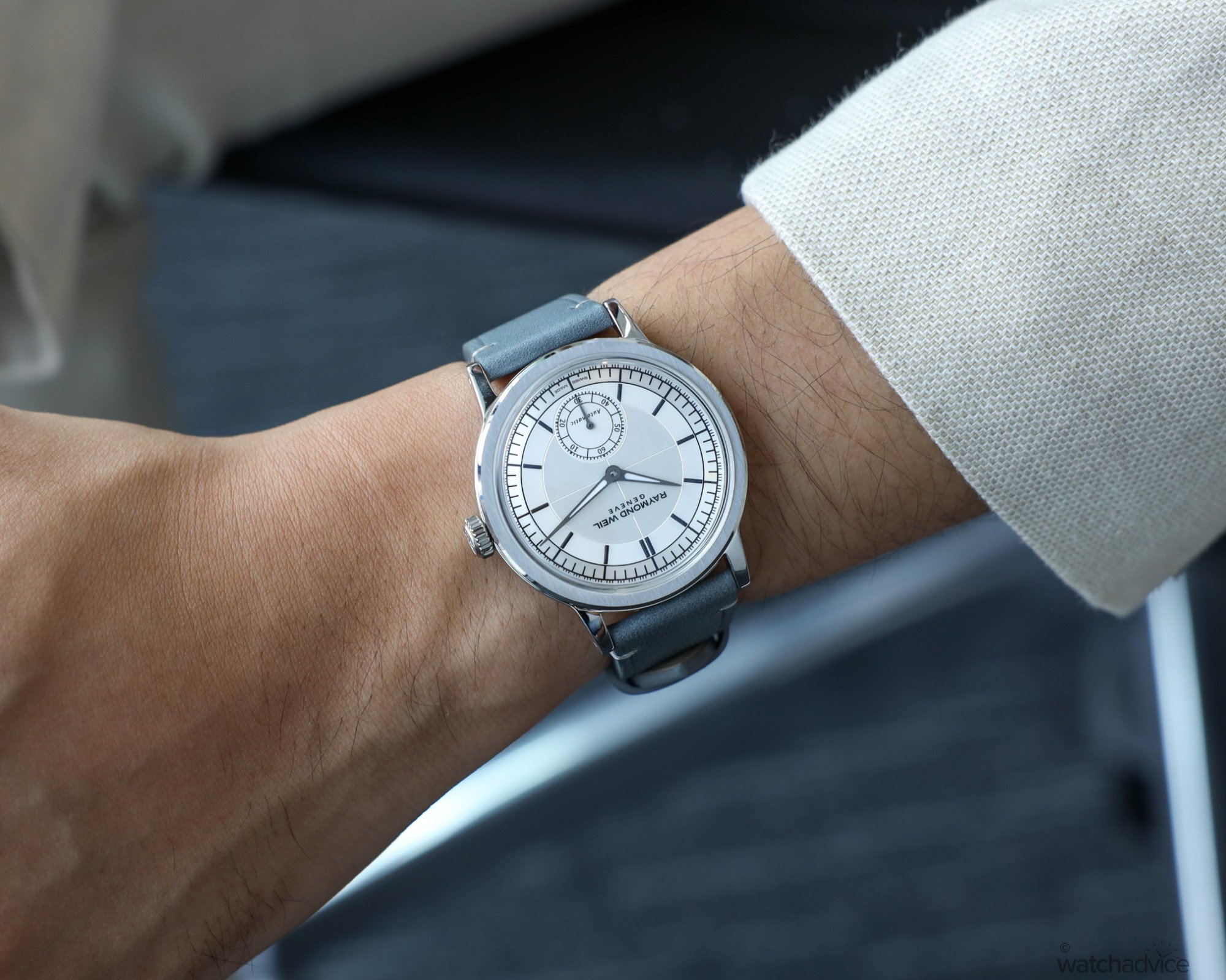
Also helping wearability is the Millesime’s provided leather strap. Grey-toned on the outside and tan inside, it is accompanied by a stainless steel signed pin buckle. This strap never felt too stiff or fragile on the wrist and wore exceptionally well thanks to the myriad of adjustment holes available. While I often challenge how tight a leather strap can go – especially since I wore this one on the last hole – I have to say that it still felt extremely comfortable! I’m sure humidity and temperature are bound to adjust the sizing, but on this strap, I’m not worried.
One small feature that had me jumping out of my seat was the addition of drilled lugs, which allow for unfettered access to the strap’s spring bars without risking damage to the watch. I am a big-time custom strap fiend, so drilled lugs are an added convenience for those in a similar mind space. However, if you’re more of a quick-release strap guy, drilled lugs are still welcome, but ultimately redundant.
Compounding this, the Millesime has a 20mm lug width, which opens up the entire watch strap world to you. Chamath reckons that the Millesime would look deadly on a burgundy strap, and while I don’t bout it, I can’t help but imagine a mesh strap on this one.
The Movement
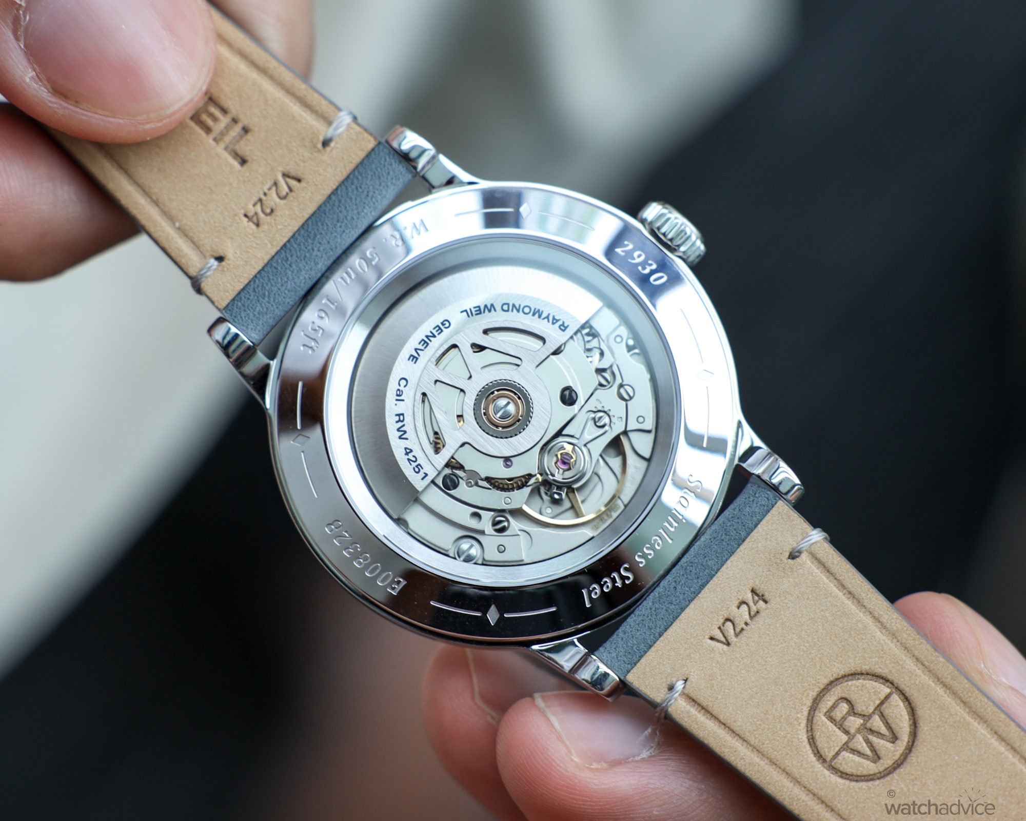
The beating heart of the Raymond Weil Millesime is the automatic calibre RW4251, beating at 4Hz (28,800bph) with a 38-hour power reserve. Given Raymond Weil’s longstanding partnership with independent movement manufacturer Sellita, it’s not a far cry to state that this movement started life as a SW200-Series movement. I suspect that the RW4251 is most closely based on the SW261-1, which includes a small seconds complication and a date window which Raymond Weil removed for the Millesime lineup. If you know Sellita, then you know that it’s a reliable movement that’s easy to service and keeps reasonably good time.
Looking at the case back, the finishing isn’t anything to write home about, which is a bit of a shame. I love the custom-signed rotor, but I can’t help but think that even at this price point, Raymond Weil could’ve blued a screw or two and made it look a little more interesting.

What is interesting to me is Raymond Weil’s working relationship with Selitta, which has stayed consistent throughout the years. You could compare Raymond Weil and Selitta’s partnership to that of Longines and ETA, who have already reached astronomical levels of success together. However, I believe that Raymond Weil has a lot more potential in this space.
While Longines and ETA are powerhouses in the watch and movement manufacturing industries, they both belong to the same parent company – Swatch Group. Raymond Weil, on the other hand, is fully independent and family-owned. This effectively means that they have carte blanche to go in whatever creative direction they please, which is a luxury that Longines may not be looking to exploit – I mean, who can blame them? They’re a juggernaut.
For Raymond Weil, however, the floor is theirs, and if they play their cards right I don’t doubt that they will become a significant force in the market before long. In the future, We could even see them making calibres in collaboration with Sellita’s bougie younger brother, AMT Manufacture. I know I’d love to see it happen!
Final Thoughts
The Raymond Weil Millesime has proven to me that no matter how you feel about a watch – whether you love it, hate it, or are somewhere in-between – there’s no substitute for excellence. I came into this review ready to crucify Elie Bernheim and his team for beating Richard, Rich and Ricky’s Studio Underd0g at the GPHG last year, but upon experiencing the watch for myself it’s not hard to see why. In the short time that I had it, it felt almost unreal that I had it on my person. The reputation could be felt throughout every single minute detail, and my eyes weren’t short on finding something fascinating to look at.
However, while its design is exceptionally unique, the sector dial market is surprisingly fierce. The aforementioned juggernaut Longines has its offering with the AUD$4,100 Heritage Sector Dial. While it’s certainly a fierce competitor, I feel like the design is somewhat derivative of Omega’s Specialties CK859 . Furthermore, Raymond Weil has not settled on just the white dial Millesime – so many other options exist in dial colour, case material, and even a central seconds rendition. Following Watches and Wonders 2024, the Millesime collection now includes a feminine offering, a moon phase offering (Read about both here), and even a chronograph offering, all in the same distinctive aesthetic. While the Longines Heritage Sector has its advantages, it has very quickly been eclipsed by Raymond Weil’s grand expansion.
At AUD$3,600, you’re getting a methodically detailed and crafted watch from an unexpected – but not inexperienced – source. While the identity of the Raymond Weil Millesime may be ambiguous, I find that there is a sense of completeness about the design that I’ve not found in a lot of other watches out there, both cheaper and drastically more expensive than this. If you’re looking for a gorgeous, special-occasions dress watch that’s still capable of doing just a bit of everything, then I think you should give the Raymond Weil Millesime a try. In a few short years, I’m certain that the community will be singing their praises – but you’re welcome for the heads-up.
Reference: 2930-STC-65001 (GPHG Award Winner, White Dial)
Specifications
- Case Material: Stainless Steel
- Dimensions 39.5mm diameter, 10.25mm thickness, 46mm lug-to-lug
- Dial: White sector dial with lumed hands
- Movement: Automatic Cal. RW2451 movement with small seconds complication
- Beat Rate: 4Hz/28,800bph
- Power Reserve: 38h
- Water Resistance: 50m(5bar)
- Crystal: Box sapphire
- Strap: Gray calf leather with signed stainless steel pin buckle