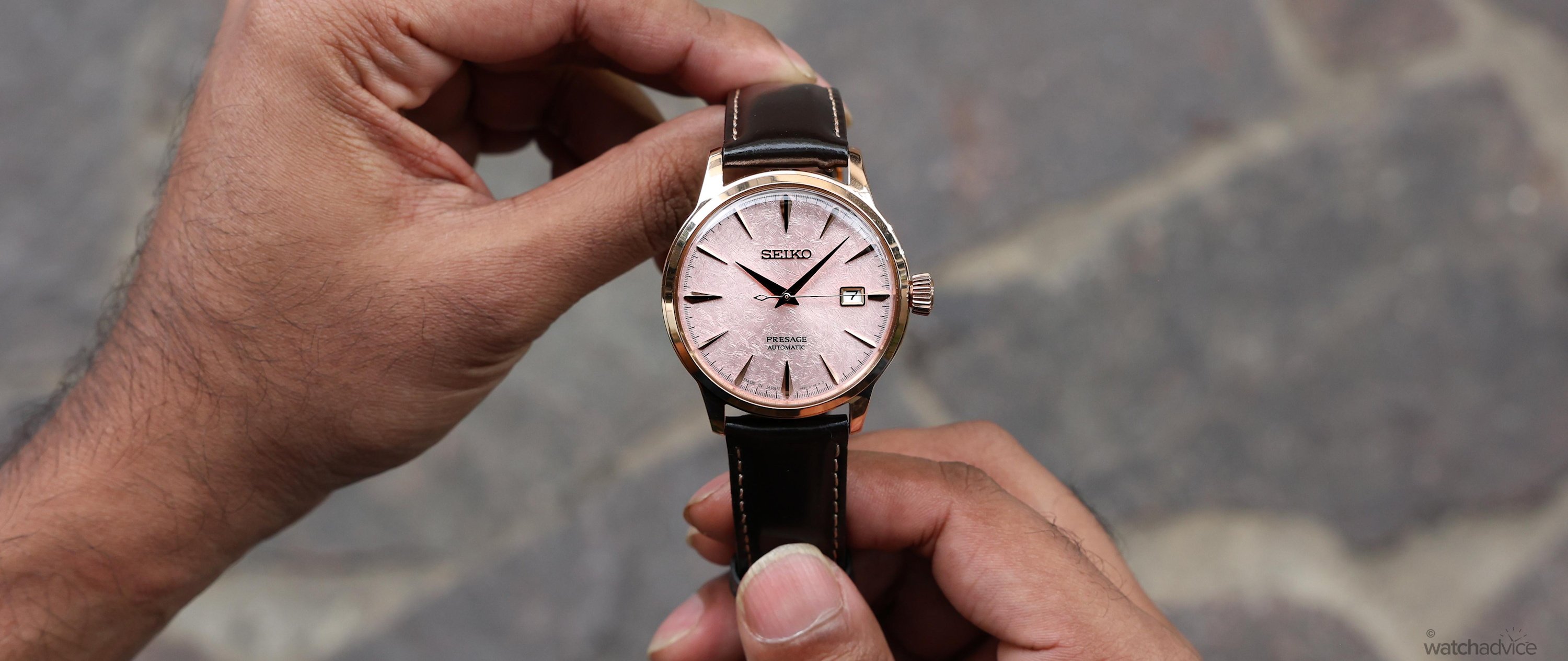

A blush-pink textured dial and rose-gold-tone case give this AU$950 Seiko Presage plenty of appeal. However, does it elevate the familiar Cocktail Time design?
What We Love:
- Blush-pink dial with beautiful intricate crisscross texture
- Rose-gold case beautifully complements the dial
- Comfortable proportions with plenty of dial presence
What We Don’t:
- White date wheel interrupts the pink dial
- No matching bracelet option
- Limited 41-hour power reserve
Overall Rating: 8.9/10
- Value for Money: 9.2/10
- Wearability: 8.75/10
- Design: 8.8/10
- Build Quality: 8.7/10
Seiko has recently introduced two new Presage Cocktail Time models dedicated to the Asia-Pacific region, one with a vibrant green dial and the other with a blush-pink dial. While the two models have distinctive personalities, it is the pink one that caught my eye straight away. And I’d go so far as to say that it’s one of the best pink dials I’ve seen not only from the Presage collection but from Seiko in general. But does it elevate the familiar Cocktail Time design? I’ve spent some time with this latest HCB011J to find out!
Seiko’s Cocktail Time story stretches all the way back to 2010, when the brand made a mechanical watch inspired by cocktail bars for the Japanese domestic market. As I would have expected, it began attracting attention from international watch blogs and forums, where enthusiasts outside Japan took an interest in the stunning Cocktail Time design.
Seiko launched the Presage collection internationally in 2016, and then in 2017, the brand brought the cocktail-bar concept into the global Presage range, with the brand itself crediting demand from enthusiasts in its launch announcement.
While there have been several Cocktail Time additions since its launch, pink dials have been few and far between. So when one comes along, it catches my attention almost immediately. By early 2020, Seiko had introduced the pink Cosmopolitan SRP839J1, which takes its blush-pink colour from the cocktail of the same name. With its 33.8 mm stainless steel case, Seiko positioned it as a women’s model, which meant that if you wanted a similar blush-pink dial in a larger Cocktail Time case, you might have had a little longer to wait.
Well, that wait is now finally over! With this new Asia-Pacific limited edition HCB011J, Seiko pairs a 40.5 mm rose-gold-tone case with a blush-pink dial inspired by sunset by the sea. The crisscross texture of this pink dial has a softer sheen when compared to the Cosmopolitan’s radial pattern, which brings me back to the original question I want to answer on the wrist. Does this pink dial elevate a familiar Cocktail Time design?
Initial Impressions of The Cocktail Time Asia Pacific Pink Dial
When the WatchAdvice team was given a box of new Seiko models to review, my eye immediately went to the pink dial as soon as the box was opened. There were some great-looking watches in there too, which made this model’s ability to catch my eye even more impressive. It was the combination of the pink dial and rose-gold PVD case that caught my attention first.
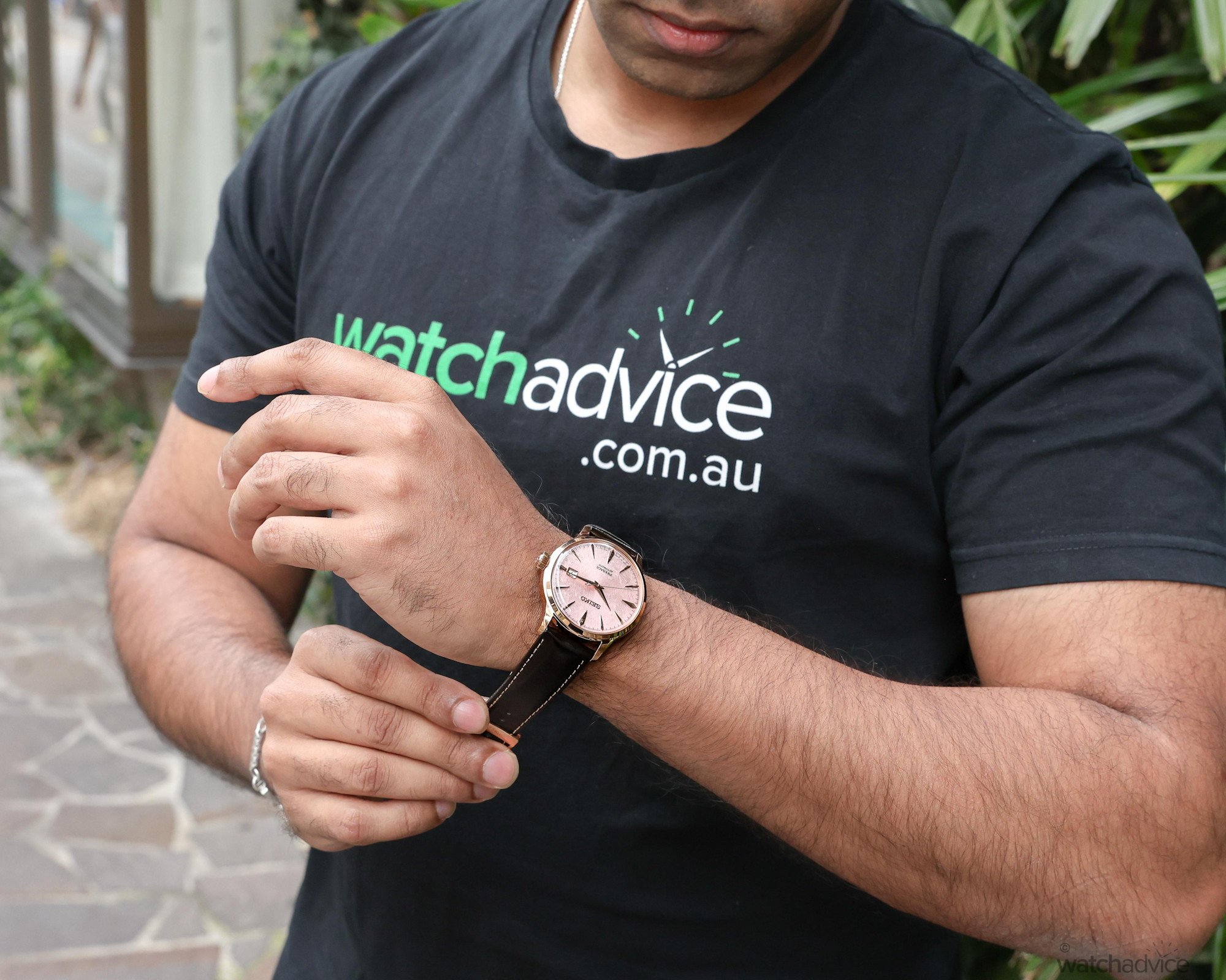
Personally, I think these two colours work extremely well together, especially in the watchmaking world, as the warmth of the rose-gold case gives the pink dial a more luxurious look, which certainly suits the dressier character of the Presage Cocktail Time collection.
After spending a little more time with the watch, what made me fall in love with it even more was the textured dial. Seiko took inspiration from sunsets by the sea in the Asia-Pacific, with the blush pink picking up that soft colour you see in the sky as the sun goes down.
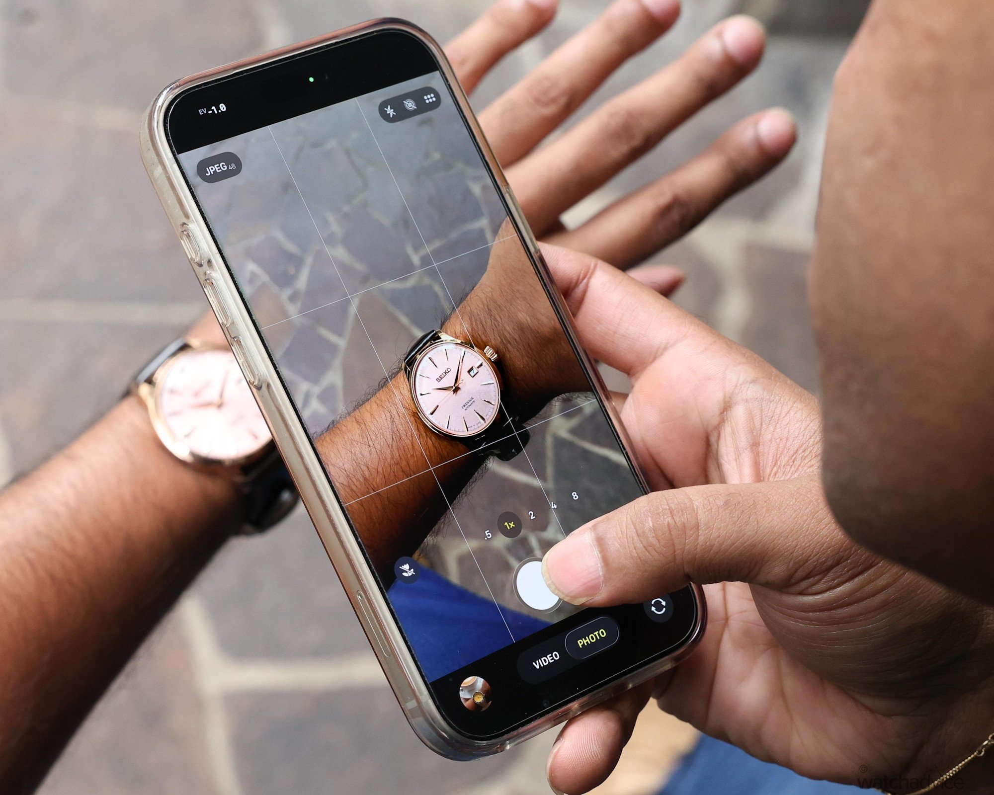
While this is certainly portrayed on the dial, when I first looked at it, it reminded me of the cherry blossom editions from Seiko’s sister brand, Grand Seiko. There’s something about the way the pale pink catches the light across the crisscross pattern that made me think of cherry blossom petals. I love that this same dial can bring two very different images to mind.
Rose Gold Makes the Difference
These latest Cocktail Time Asia-Pacific models carry the collection’s familiar dimensions of 40.5 mm in diameter, 47.5 mm lug-to-lug and 11.8 mm thick. Part of the height comes from the box-shaped Hardlex crystal, which rises above the bezel and gives the case that slightly vintage profile. At almost 12 mm thick, however, it may look taller than some would prefer for a dress watch. Personally, the raised crystal is a familiar Cocktail Time detail, and one that I actually think suits the watch visually.
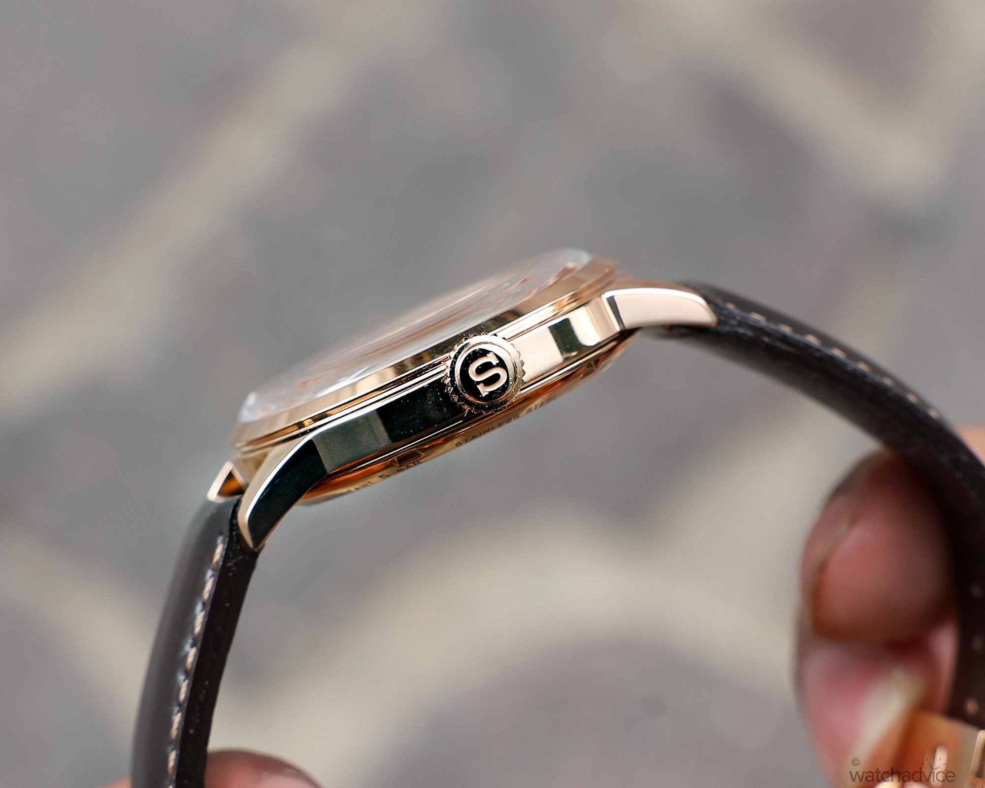
Below the crystal, the stepped bezel slopes away from the dial, giving the case more definition when viewed from side angles. This sloped bezel design fits in nicely with the overall smooth and curved nature of the Cocktail Time case. It adds to the elegance of the model, while the polished finishing gives the watch its luxury appeal. This same smooth polished finish continues along the case flank and into the lugs, which taper nicely towards the tips and curve down to follow the contours of the wrist.
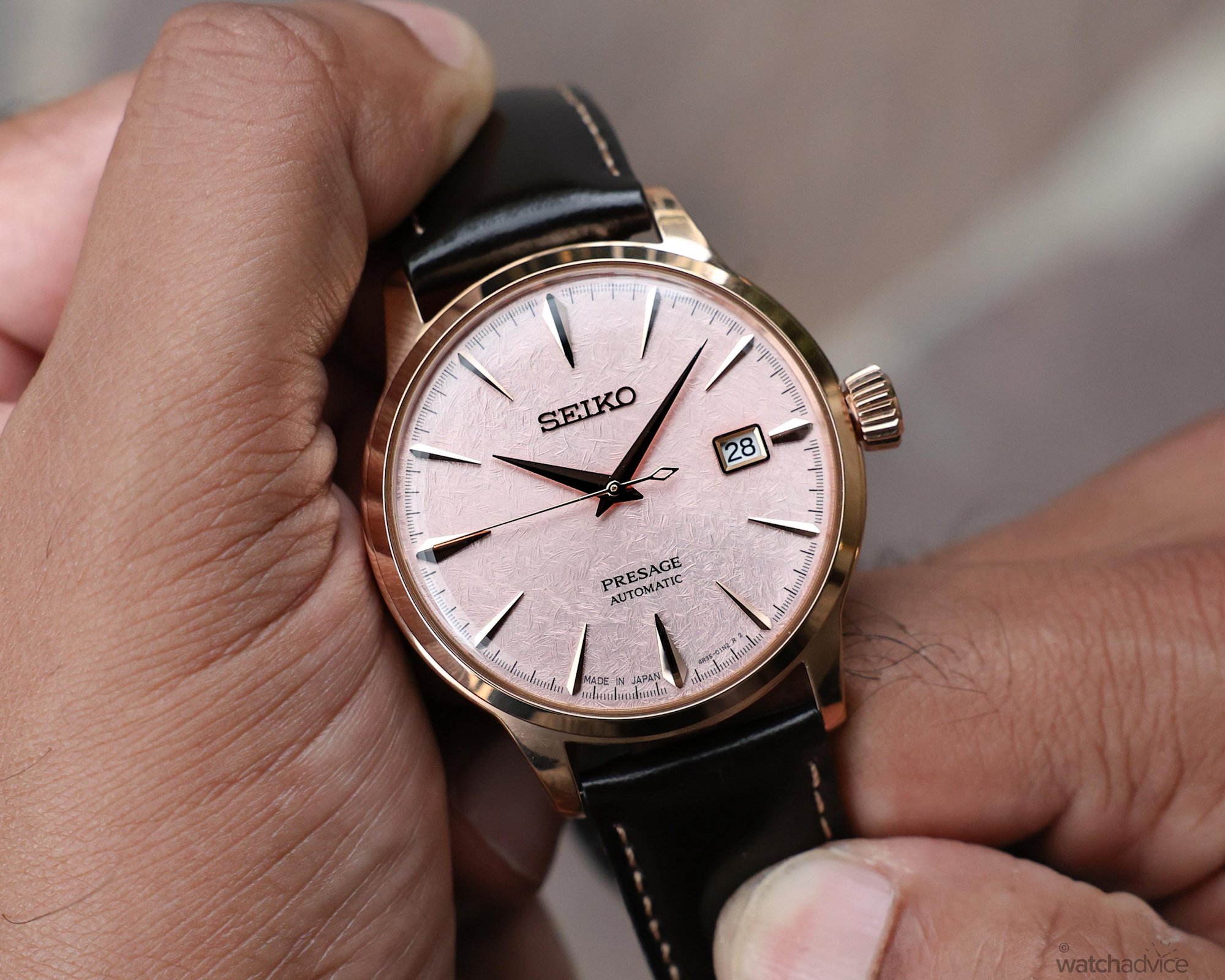
As mentioned previously, the stainless steel case, crown and bezel have a rose-gold PVD finish, which, aside from the stunning pink dial, is one of the first things I noticed about this model. If you have read my previous reviews, you’ll know I’m a big fan of pink gold, whose tone complements my skin nicely. Compared with yellow gold, I find pink gold warmer and a little less vivid, which nicely suits the look I want from a luxury dress watch.
I do prefer pink-gold cases paired with darker-coloured dials, as I think the contrast allows both elements to stand out and catch attention nicely. I mean, let’s face it, if you’re wearing a pink-gold model, you’re not exactly trying to be subtle. While darker dials are my usual preference, pairing the case with a soft pink dial gives both elements an appeal of their own.
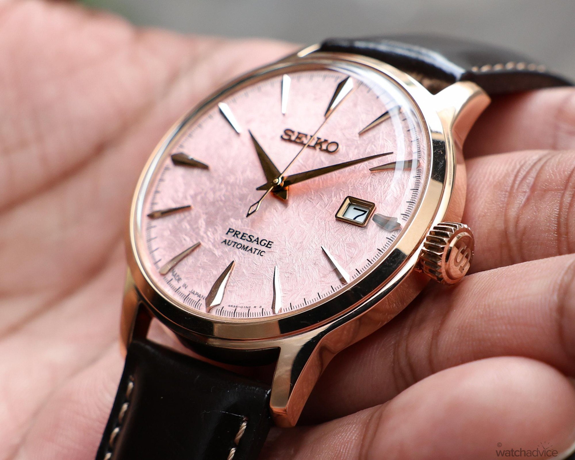
The pinkish hues of the case pick up on the soft blush of the dial. While it may sound like both these elements are competing for attention, I think it’s quite the opposite. You still notice both colours even though they are closer together. However, it’s the finishing that gives them separation. The polished bezel and case catch the light sharply, while the textured soft pink dial gives off a calmer, softer sheen.
While a darker-coloured dial would certainly create a more distinctive contrast, it’s the balance between the pink gold and the softer pink dial that makes the pairing work so well. The rose-gold tone carries the warmth of the dial through to the case, which gives the watch a more cohesive appearance.
A Familiar Colour, With A Fresh New Expression
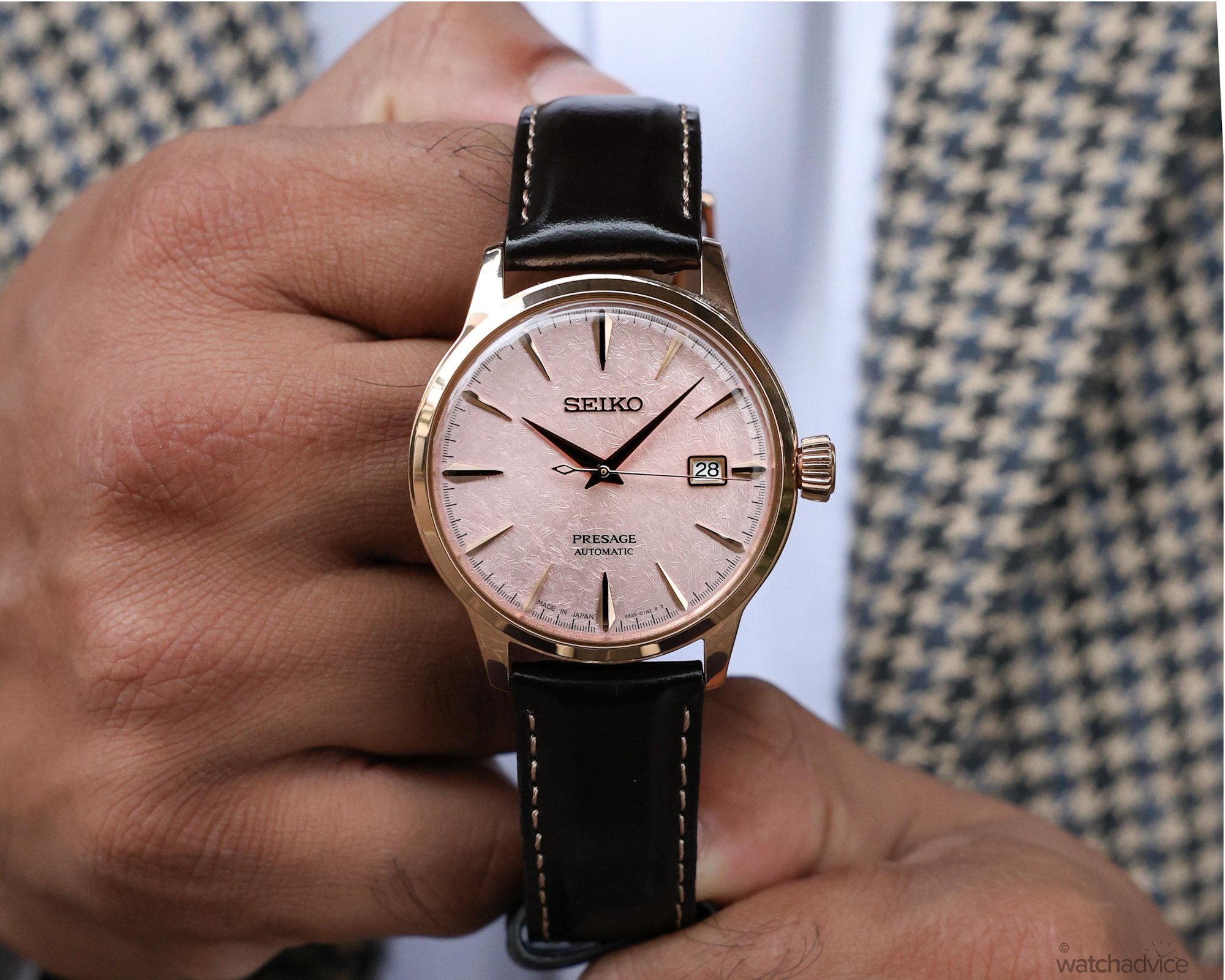
Seiko states that the blush-pink dial of the HCB011J takes its colour from the soft pink hues you see as the sun sets by the sea. This, for me, is the part of the sunset inspiration I can see most clearly in the watch. When you look closer at the dial, this beautiful soft pink colour sits over a fine crisscross pattern. The lines intersect in different directions, which gives the dial a slightly busy and irregular look that I find more interesting the closer and longer I look at it.
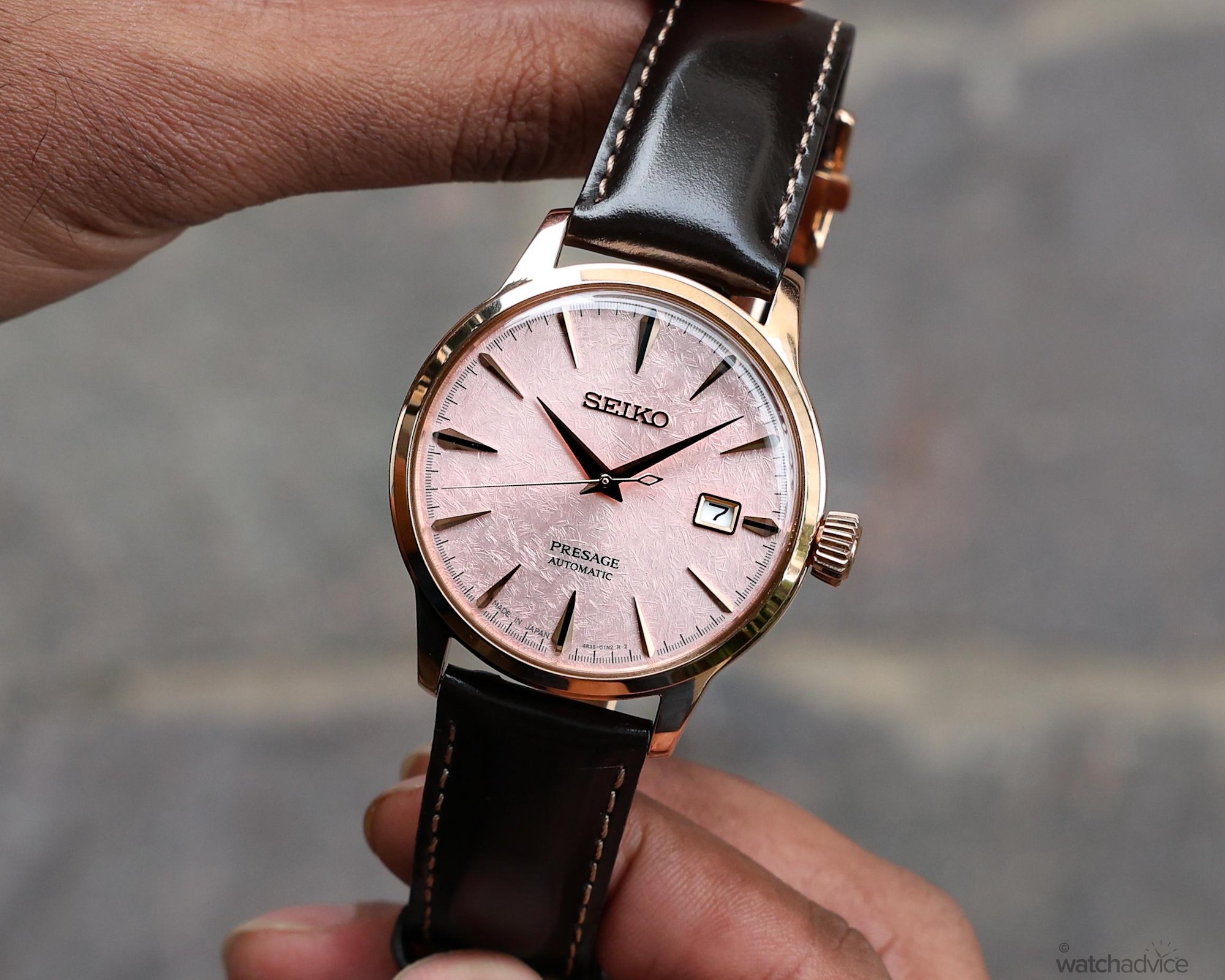
Another signature element of the Cocktail Time collection is the sunburst effect on the dial. This finish is carried across to the HCB011J as well, with the colour shifting across the textured pattern as you tilt the watch. Some areas of the dial turn soft and pale pink as they catch the light, while others take on a slightly deeper tone. By comparison, the earlier Cosmopolitan SRP839J1 has pressed sunray lines that fan out neatly from the centre, giving its blush-pink dial a more uniform aesthetic.
Personally, I prefer what Seiko has done here. While the Cosmopolitan’s pattern draws your eye outwards from the centre thanks to the radial texture, the irregular crisscross texture on the HCB011J gives me different areas to look at each time I tilt the watch.
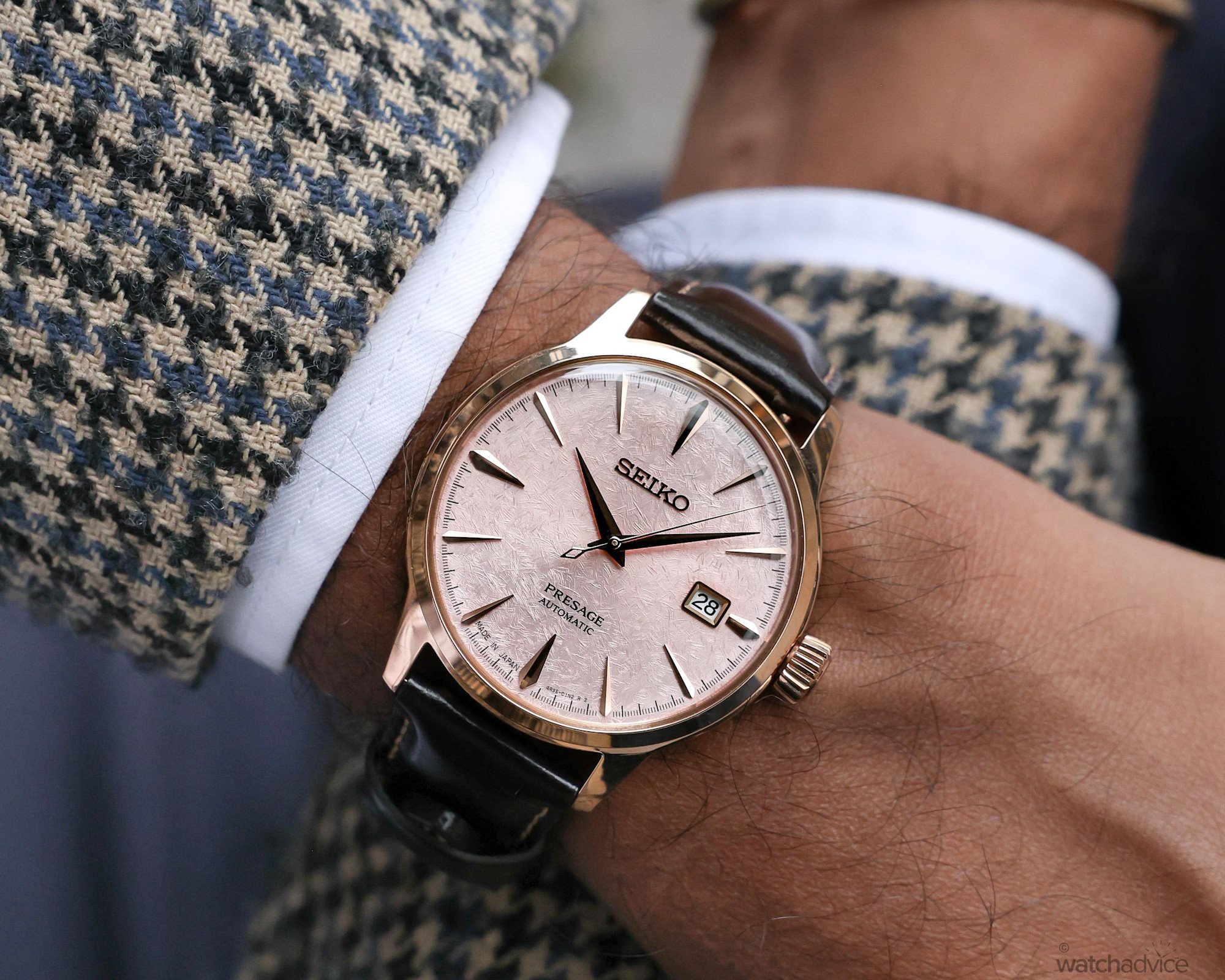
What’s more interesting is that while Seiko takes inspiration from the pink hues of a sunset, personally, the dial’s crisscross texture reminds me more of Grand Seiko’s 62GS SBGH341. Having seen the SBGH341 in person, I can see a resemblance in the texture and that beautiful pale pink colour, which Grand Seiko describes as an interpretation of cherry blossoms covered by snow.
While this Seiko Presage Cocktail Time Asia-Pacific model takes its inspiration from a different scene, I can see a resemblance to the Grand Seiko edition. I’ve always been drawn to cherry blossom season in Japan, and having visited the country recently and fallen in love with it, that slight resemblance was a big part of the dial’s appeal for me. And as I stated earlier, the fact that the dial can evoke two different images is a testament to its design and appeal.
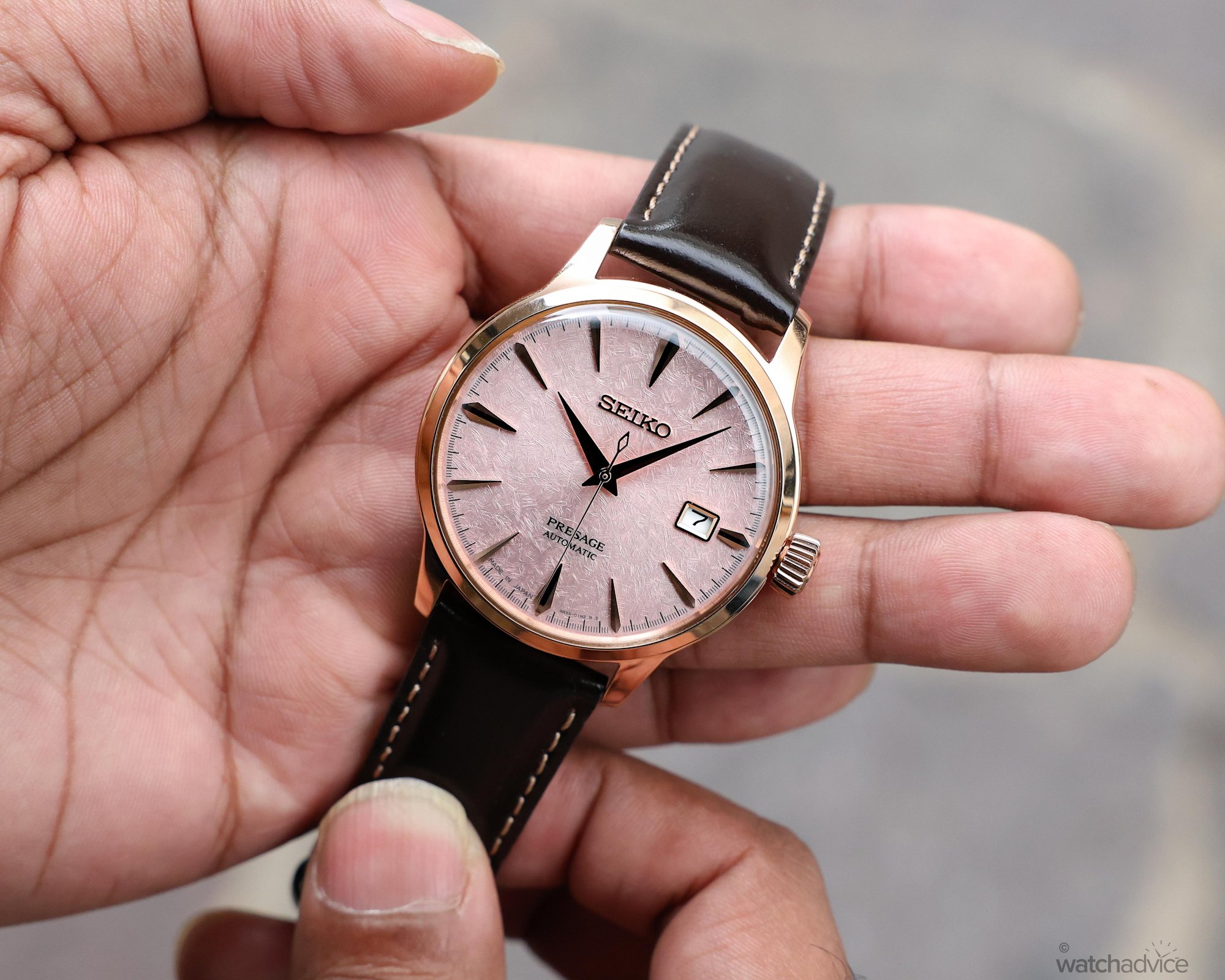
The dauphine hour and minute hands and the slim, faceted applied indices give the dial its familiar Cocktail Time layout. Their pointed shapes stand out against the crisscross lines nicely. The rose-gold tones of these elements carry the warmth of the case and bezel onto the dial, which I think sits naturally against the blush-pink colour.
If, for example, Seiko had chosen a silver-toned case with matching hands and indices, it would have introduced a cooler contrast. A yellow-gold-tone case with matching fittings would have created a stronger contrast, which I personally feel wouldn’t work as well here. As stated in the case design section, the pink gold and blush pink work well together because they are different tones of a similar colour.
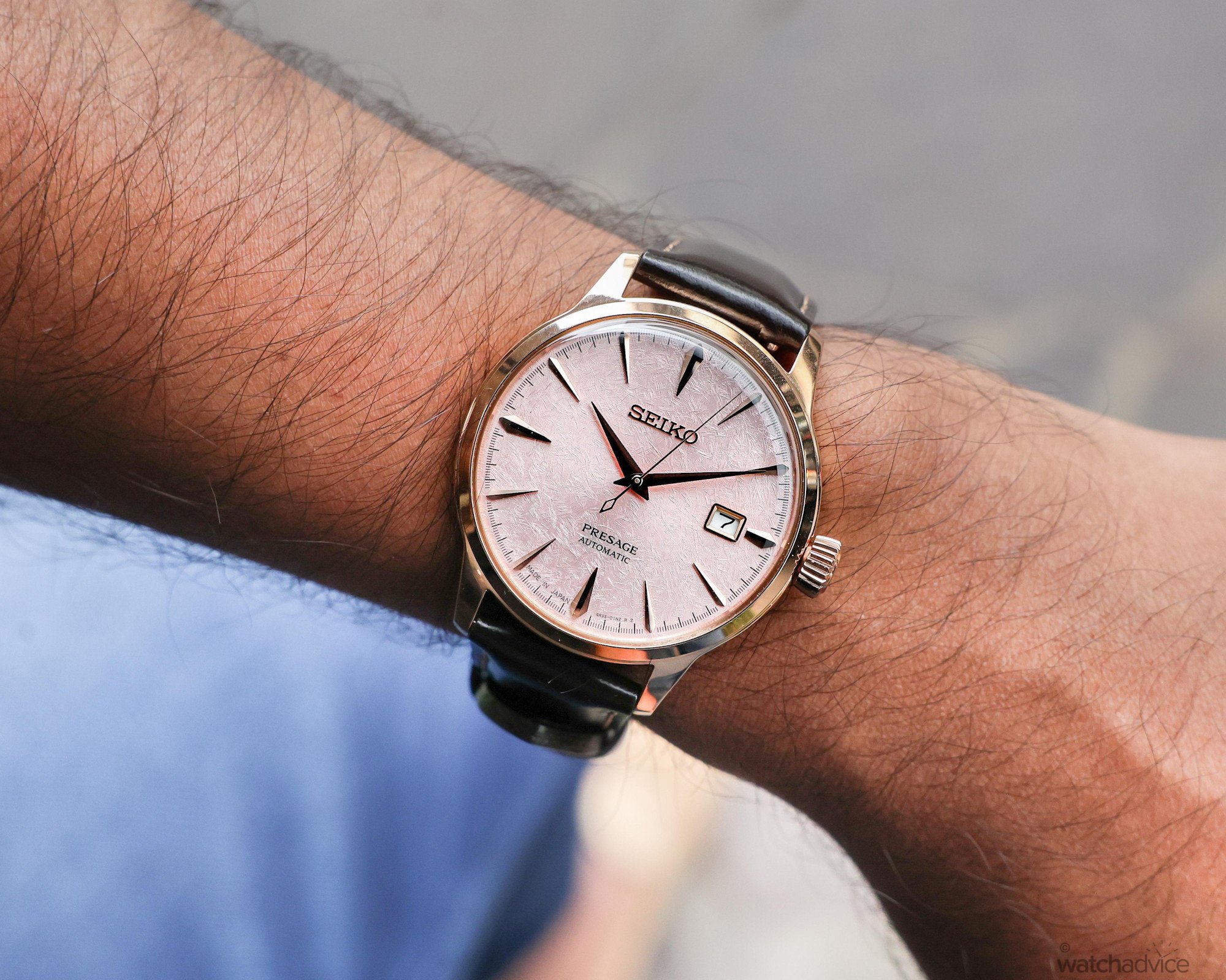
Where I think the design could be improved is in the integration of the date window. While its placement is a signature design feature in the Cocktail Time collection, I personally think Seiko could do a better job by removing the shortened three o’clock hour marker and moving the date window into its place, allowing it to act as the hour marker. Colour-matching the date wheel to the dial would also help it blend in more naturally.
Currently, the white date wheel stands out like a sore thumb, as there are no other white details on the dial for it to tie in with. This feature stands out because the rest of the dial feels so well designed and carefully thought out. However, having said that, this is still, for me, one of Seiko’s best Cocktail Time dials. It answers the question I started with because the texture changes how I look at the dial each time I move the watch, while the rose-gold tones of the indices and hands beautifully match the soft pink background.
More to Admire Beneath the Dial
The Seiko Presage Cocktail Time Asia-Pacific HCB011J uses the brand’s automatic calibre 4R35, a familiar movement in the Cocktail Time collection. The movement runs at 3 Hz (21,600 vph), delivering a power reserve of approximately 41 hours. That’s enough for daily wear, although if you take it off for a full weekend, it will need setting again.
Personally, I think this is an area where the movement could be developed further to offer a bit more autonomy, especially for a model as good-looking as this, which I’d want to rotate with my other timepieces. The calibre 4R35 does feature a stop-seconds mechanism, which means that the seconds hand pauses when the crown is pulled out to set the time. This makes it easy to synchronise the watch down to the second, allowing for precise time setting.
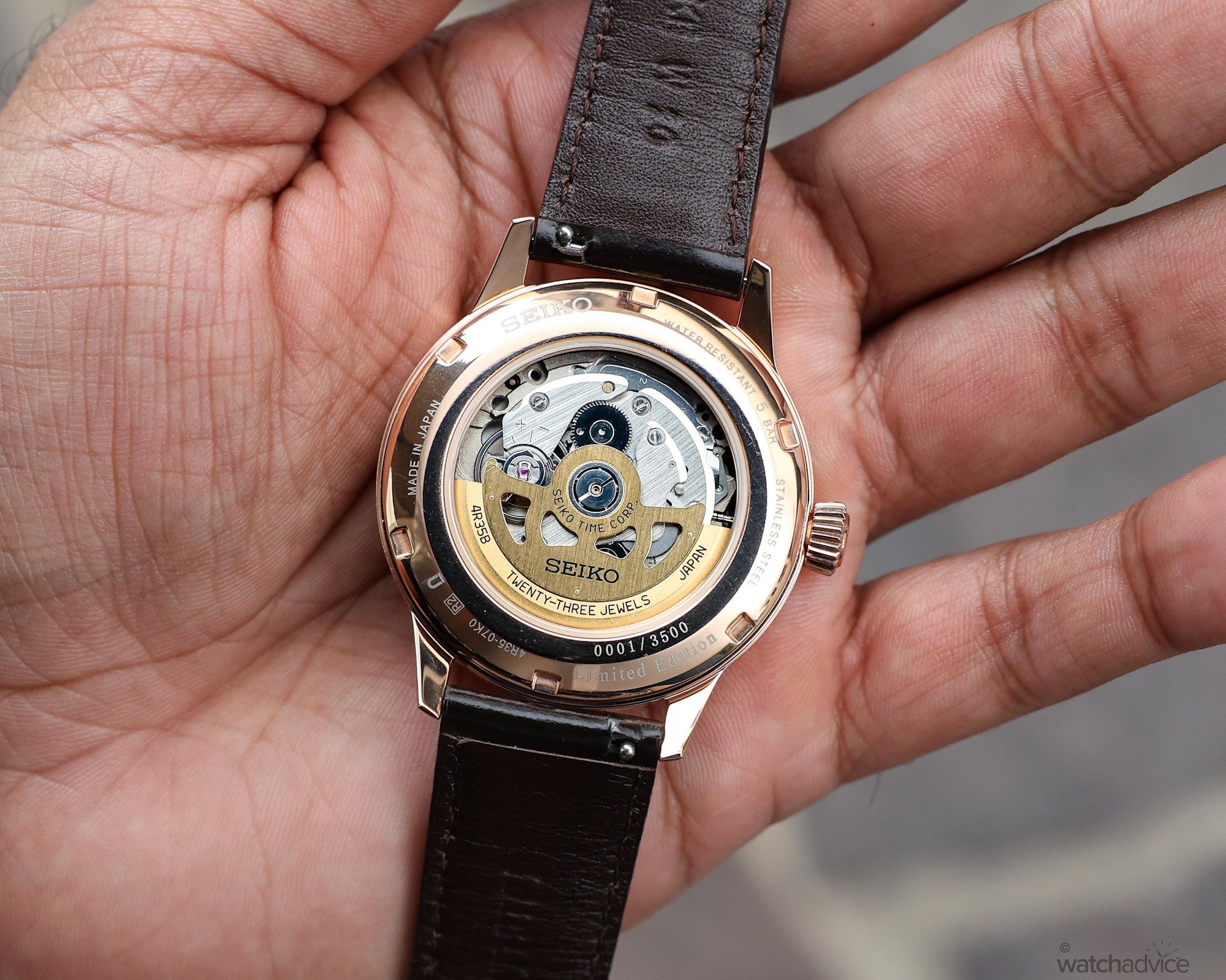
With the model priced at AUD $950, I had modest expectations for movement finishing. However, turning the watch over, I was pleasantly surprised by how much there was to admire. The first detail I picked out was the perlage beneath the balance wheel. The overlapping circles are easy to miss at first glance, given the small area they occupy. The movement plates have vertical brushing, with polished chamfered edges that catch the light against the softer brushed surfaces.
However, the standout detail for me is the skeletonised winding rotor, which has two distinct finishes. The openworked section is vertically brushed, picking up the same finish on the plates visible underneath. Then, around the outer edge of the rotor, Seiko switches to a grained texture. That change in finish gives the inscription on the rotor a distinct background and makes it easier to pick out. Personally, I expected a silver-toned rotor, so the gold-toned finish was a welcome surprise. It certainly complements the rose-gold tone of the case and carries some of that warmth through to the back of the watch.
How Does The Cocktail Time Sunset Edition Wear?
At 11.8 mm thick, this Seiko Presage has the wrist presence that I enjoy in a watch. Whether it’s a dive watch, sports model or dress watch, I do prefer a bit of thickness, as I like to feel the watch on my wrist. For me, this thickness hits the sweet spot. It has enough substance to feel present on my 16 cm wrist, and the height never really bothered me while wearing it. However, I can see how it may be too thick for some, especially those who prefer a slimmer profile for a dress piece.
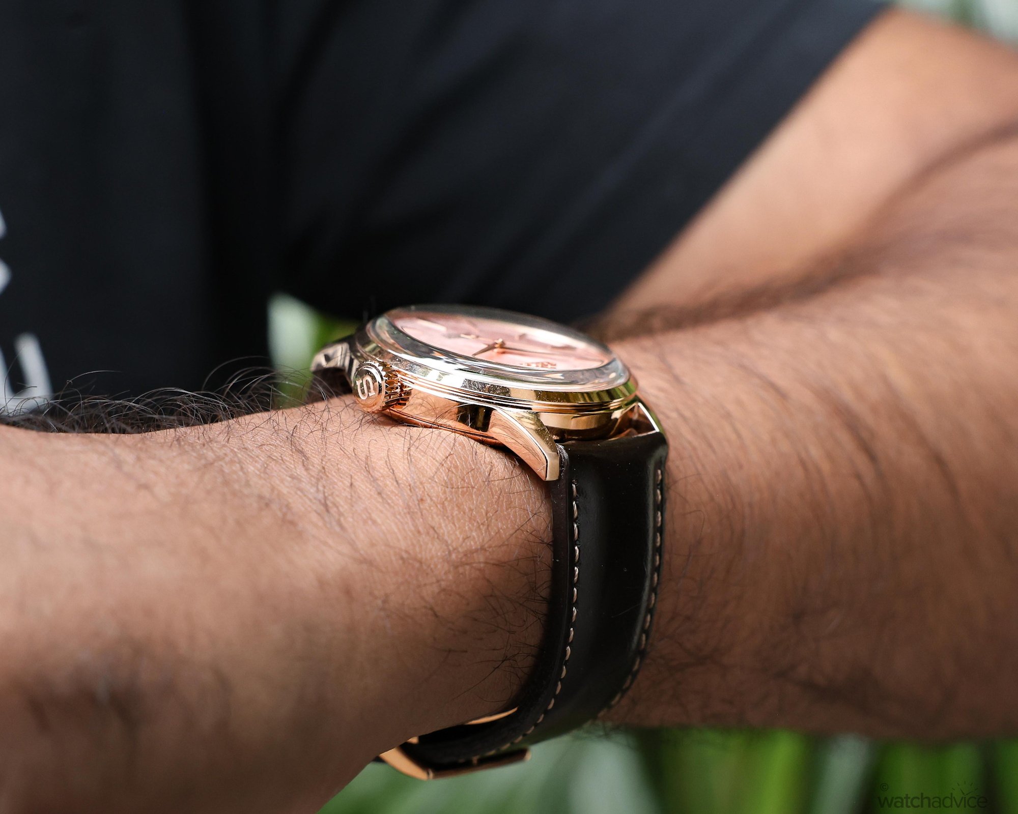
The 40.5 mm diameter, however, is larger than I’d normally go for in a dress watch, especially considering most of my dress pieces are currently 39 mm or smaller. However, the 47.5 mm lug-to-lug distance, accompanied by the downturned lugs, helps the case follow the shape of my wrist nicely. I think that if the lug-to-lug distance were any longer, at say 48 mm or more, this watch would have been too big for my wrist. As you can see from the photos, the watch fits just about right!
The 40.5 mm case also gives the dial more space than it would have in a smaller version of the watch. And when you consider the beauty of this dial, I certainly welcome that extra space. The pink dial and its crisscross texture give the watch enough presence to stand on its own, even when the rest of the outfit is simple.
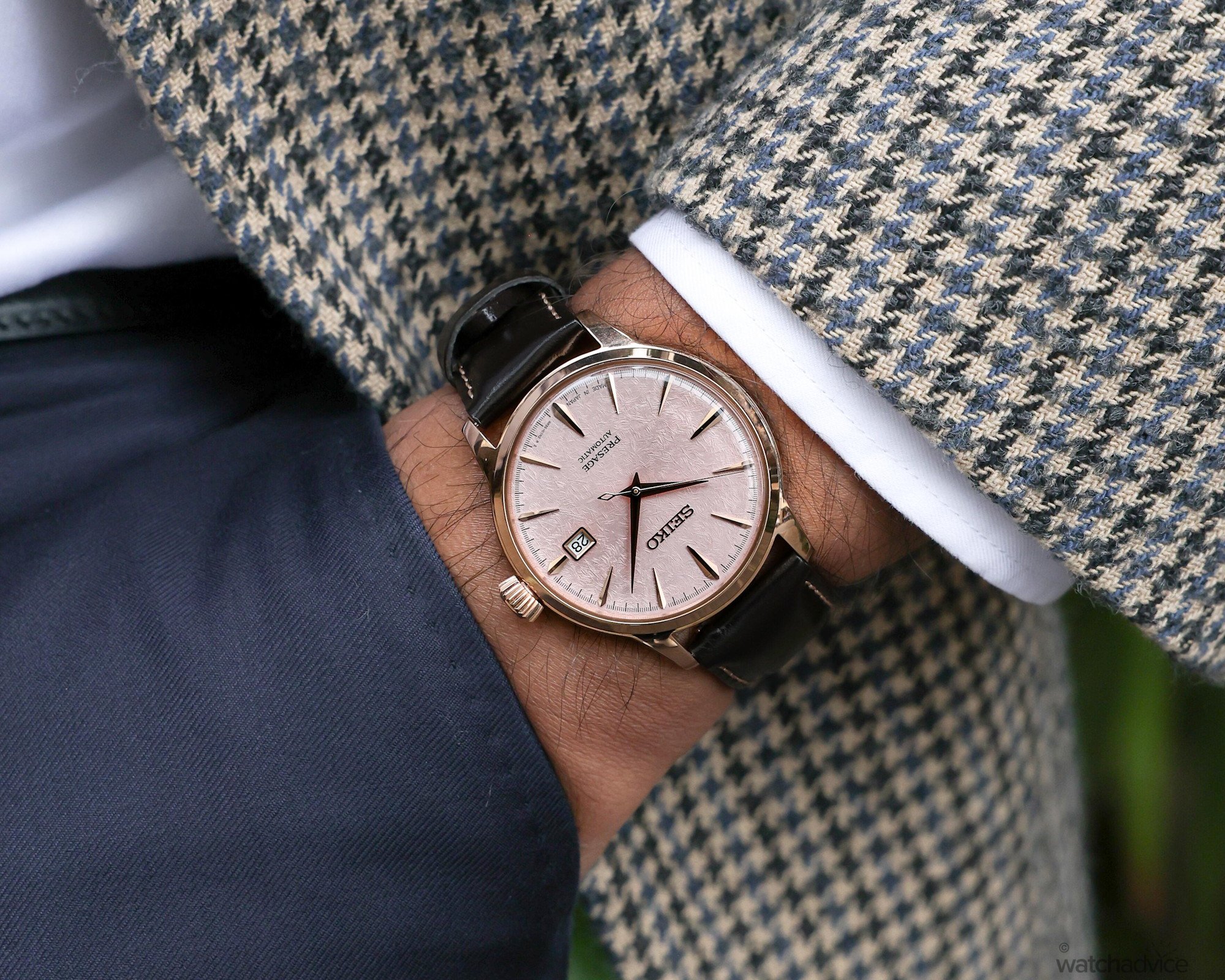
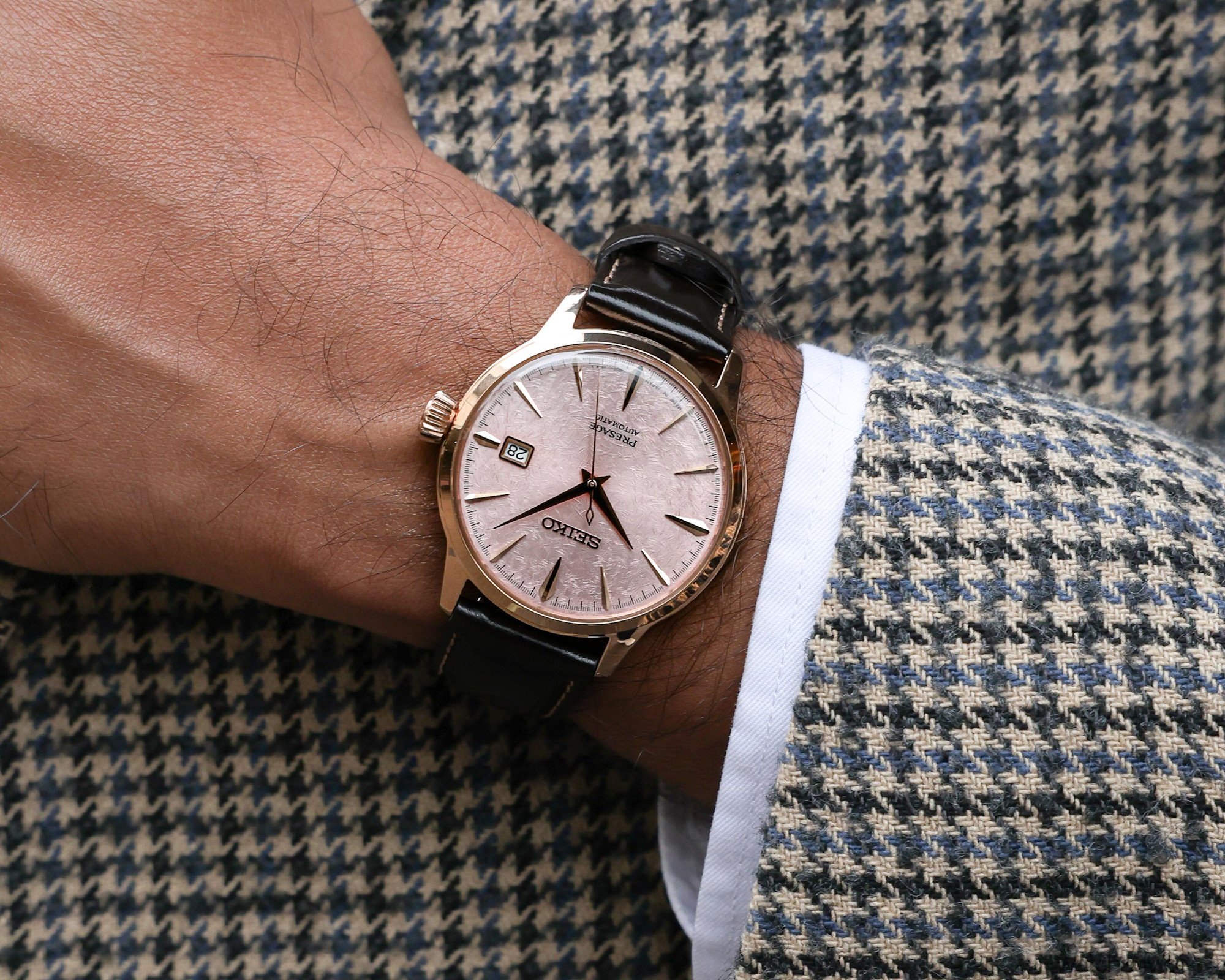
I wore this Presage Cocktail Time HCB011J to the office, to meetings, and on more formal occasions. The jacket shots of Chamath above show how naturally this Cocktail Time fits into the dressier end of that range.
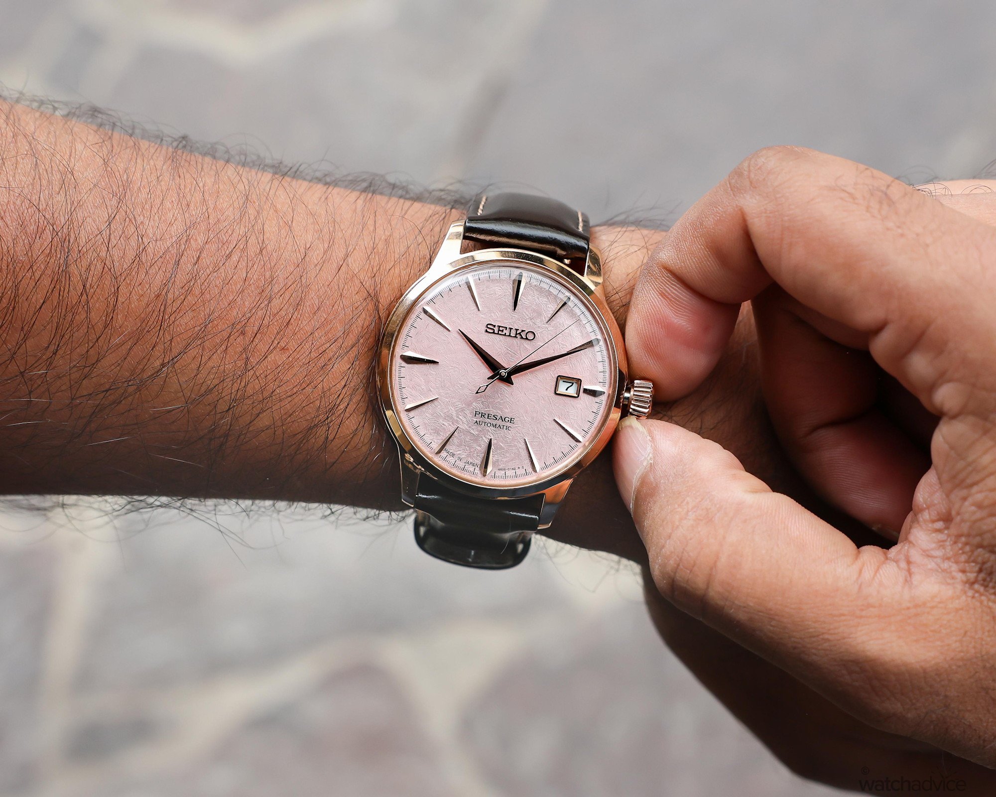
That’s not to say that the watch doesn’t look good dressed down! With a simpler outfit, say a T-shirt and jeans, the watch itself became the most dressed-up part. One thing was for sure: it didn’t look out of place. Although the precious-metal look does limit how often I might reach for it on sporty or outdoor occasions, it nails that luxurious look.
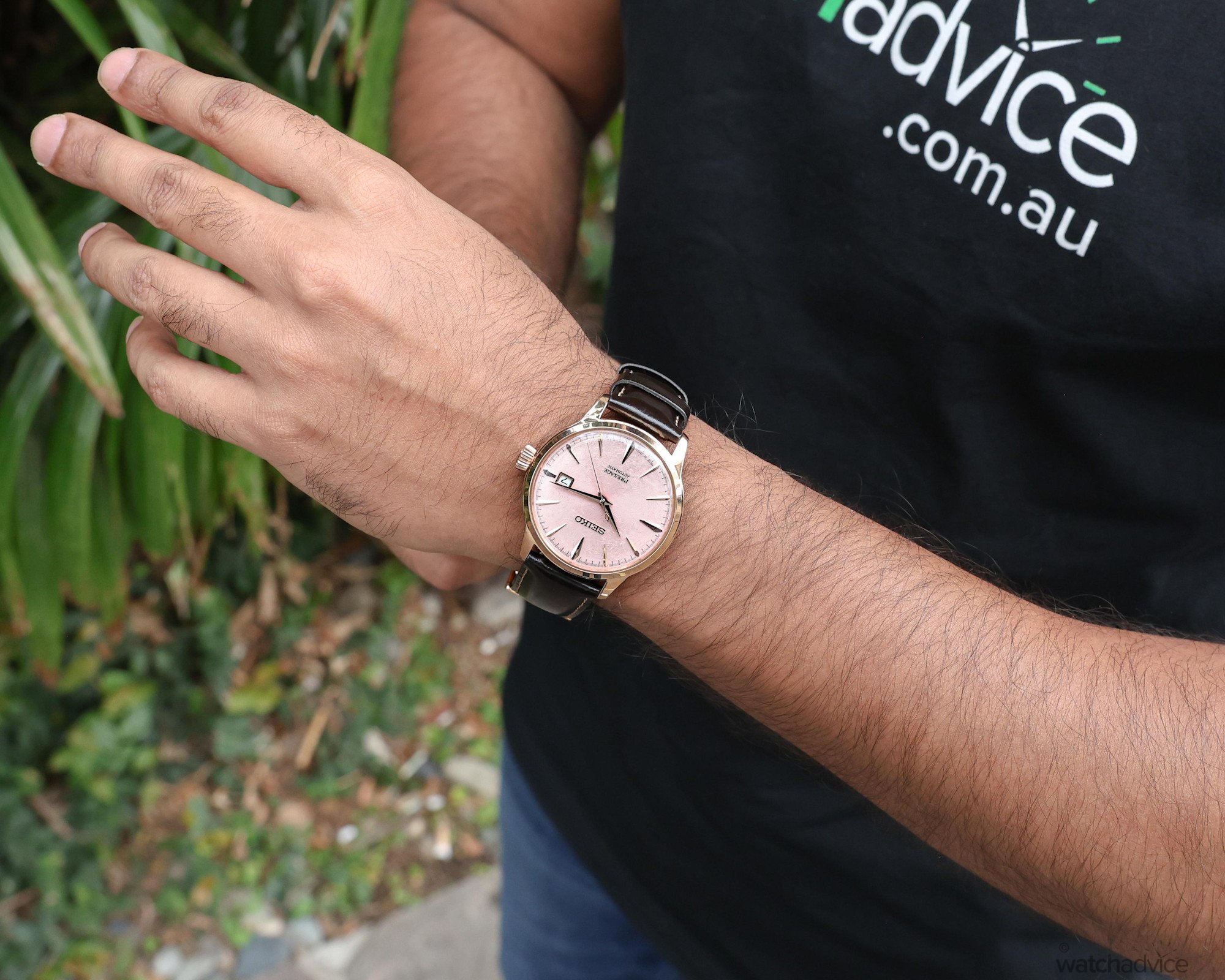
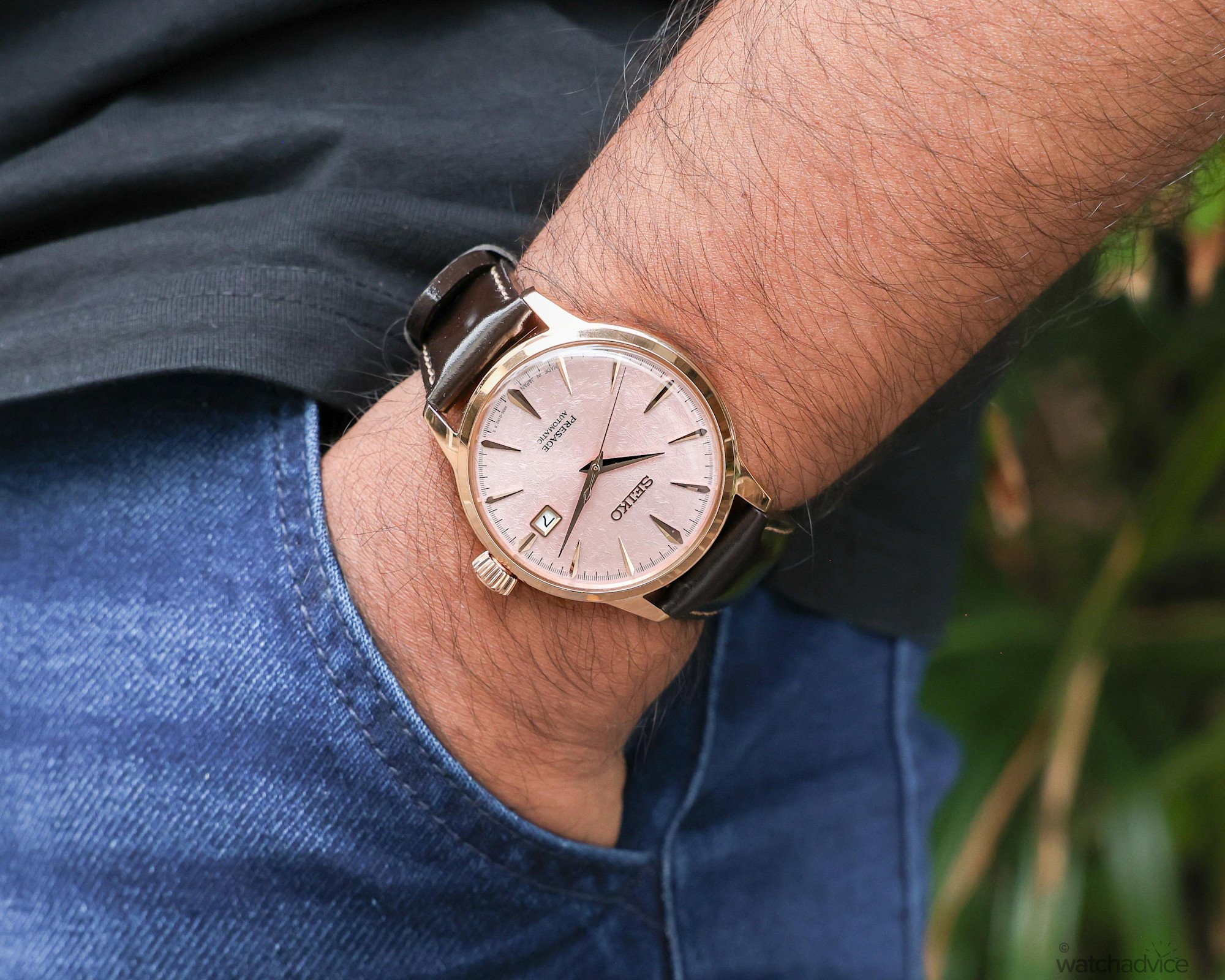
And this goes back to what I mentioned earlier in the case design. I feel that steel or yellow gold wouldn’t do the dial quite the same justice as the pink-gold PVD finish does here. If we take Seiko’s eye-catching SRPE47 model, which features a salmon-pink dial with an embossed radial diamond pattern, it is paired with a stainless steel case and matching steel mesh bracelet.
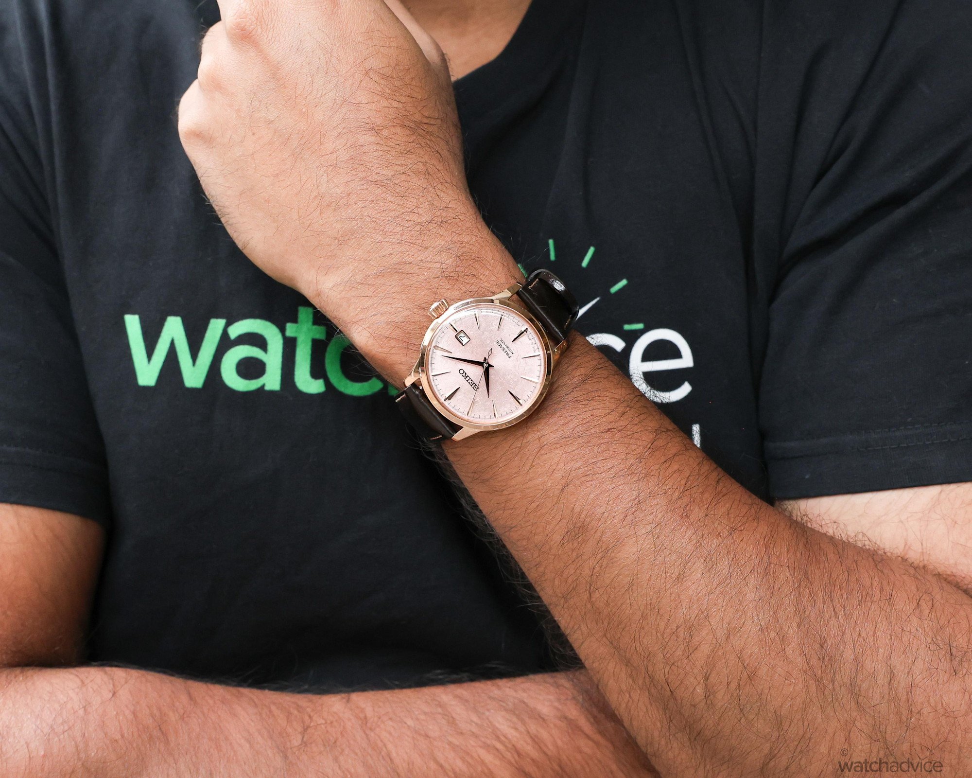
While the SRPE47 is certainly gorgeous, I feel like the latest Presage Cocktail Time, with its rose-gold-tone case and soft blush-pink dial, makes a stronger case for a pink-dial dress watch I’d wear regularly. The warmth of the case against my skin is what tips it for me.
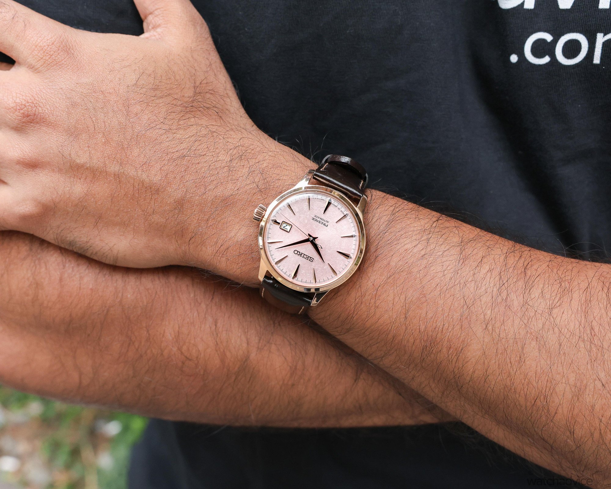
The timepiece comes paired with a dark brown leather strap, which is comfortable to wear. Its understated colour suits the elegance of the case while also contrasting with its rose-gold tone. My hesitation with leather straps, however, is the Australian summer. I tend to sweat in the heat, so I would need to be more mindful of how the underside of the leather might look over time.
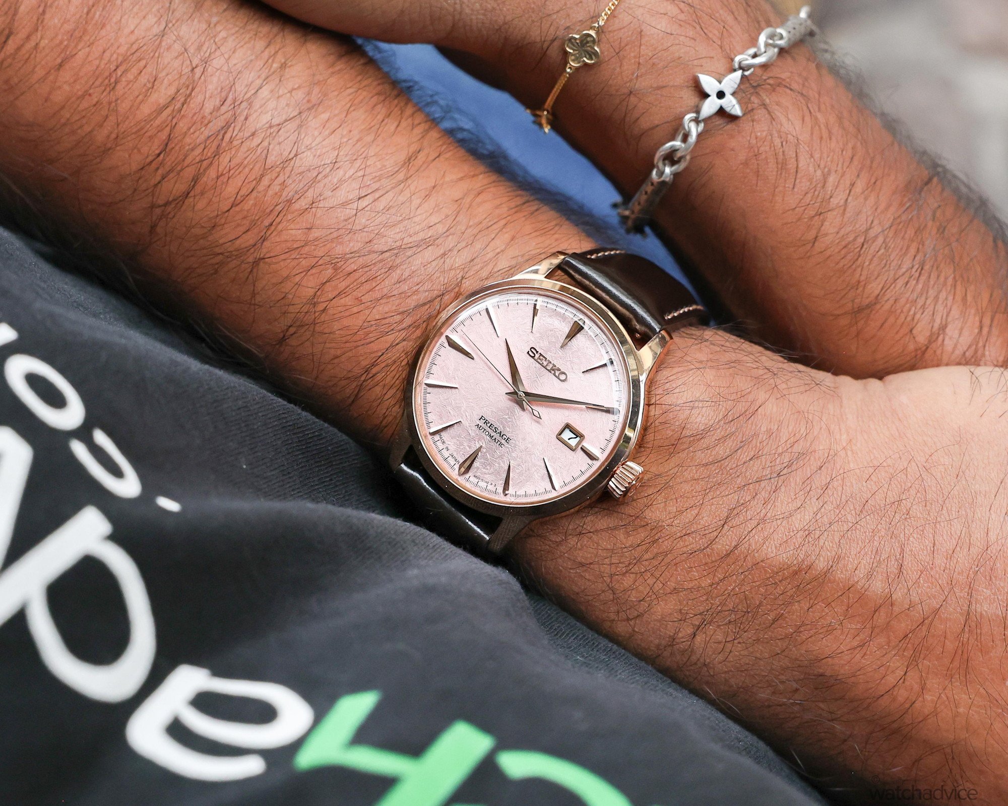
A second strap or bracelet option would certainly give this timepiece a lot more flexibility, especially on days when I’d rather keep the leather off my wrist. For example, the green model from the same Asia-Pacific pair already comes on a five-link gold-tone bracelet, so a matching rose-gold-tone bracelet feels like a natural option for this pink edition. I do have to say, however, that the leather strap does nail the traditional dress-watch aesthetic!
Final Thoughts
Seiko has explored pink dials in the Presage Cocktail Time collection before, but this latest edition immediately caught my attention. For me, the HCB011J Asia-Pacific limited edition goes further than just adding another pink-toned dial to the collection. Its crisscross texture elevates the watch beyond what its price might suggest.
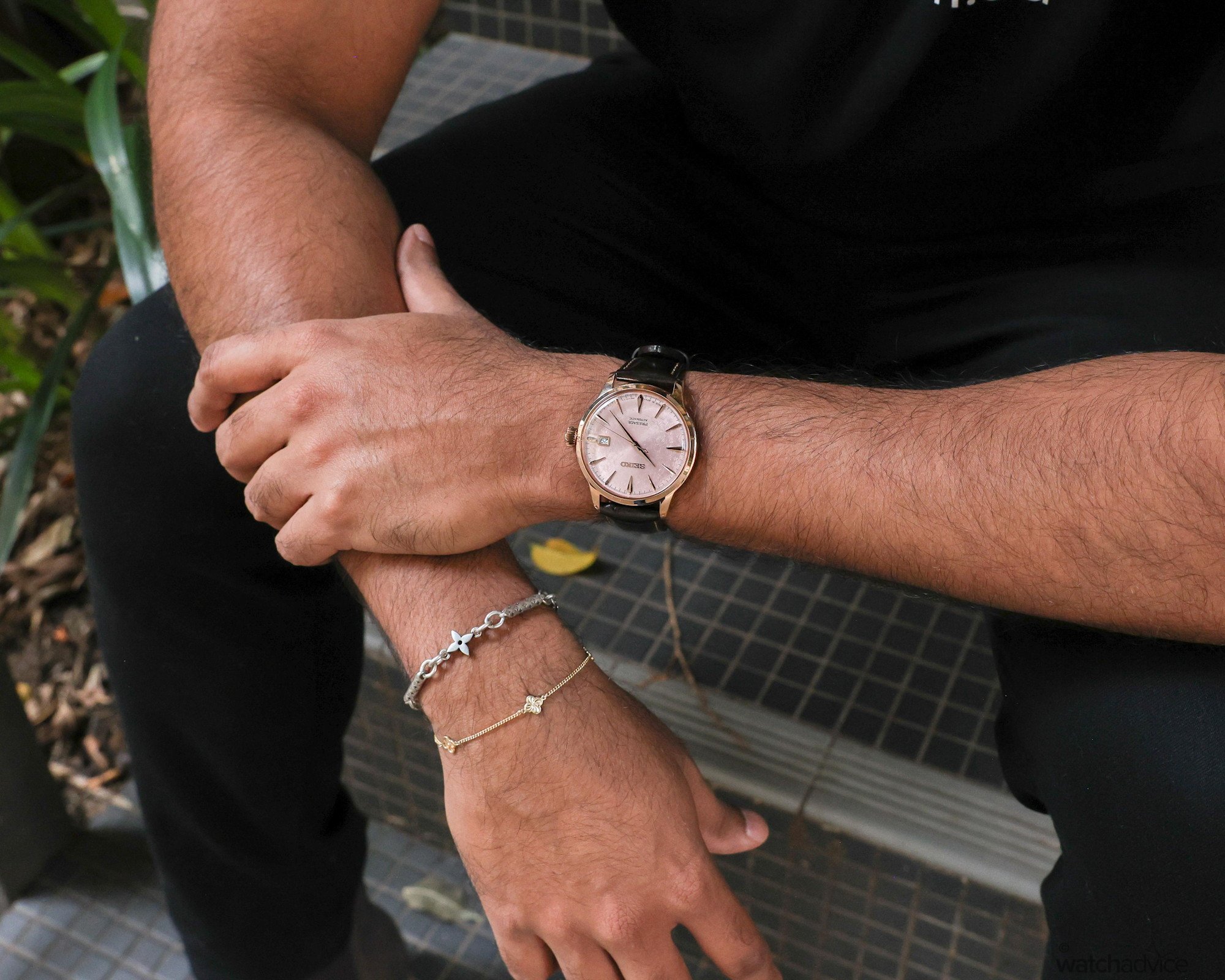
Pairing the dial with a pink-gold PVD finish was a great design choice. As I’ve explained throughout this review, I personally feel that the pink-gold tone brings the best out of the dial, carrying its warmth through to the case. And while the case measures 40.5 mm in diameter and 11.8 mm thick, it sat comfortably on my wrist and gave that beautiful dial plenty of room to show off its texture.
At only AUD $950, the combination of a textured pink dial, case finishing and comfortable proportions makes this an appealing dress watch. There’s still room for improvement, particularly with a colour-matched date wheel and the option of a bracelet. Even so, having spent some time with the model, the HCB011J is a timepiece I’m seriously considering adding to my own collection!
Seiko Presage Cocktail Time Asia Pacific Sunset Limited Edition
References & Specifications
| Feature | Specification |
|---|---|
| Reference | HCB011 (Pink) |
| Dimensions | 40.5mm case diameter x 47.5mm lug-to-lug x 11.8mm thickness |
| Case | Polished stainless steel with rose-gold PVD finish |
| Dial | Blush pink with crisscross texture, rose-gold-tone hands and applied indices. Date at 3 o’clock |
| Crystal | Box-shaped Hardlex |
| Caseback | Screw-down exhibition caseback with limited-edition marking and individual serial number |
| Movement | Automatic calibre 4R35 with manual winding, stop seconds and date. 23 jewels |
| Power Reserve | Approximately 41 hours |
| Beat Rate | 3Hz / 21,600VpH |
| Water Resistance | 50m / 5bar |
| Strap/Bracelet | Dark brown leather strap with three-fold clasp and push-button release. 20 mm lug width. |
Australian Retail Price: $950
Availability: Asia-Pacific limited edition of 3,500 individually numbered pieces. Available from November through Seiko boutiques, authorised retailers, or online at SeikoBoutique.com
Full Image Gallery: