

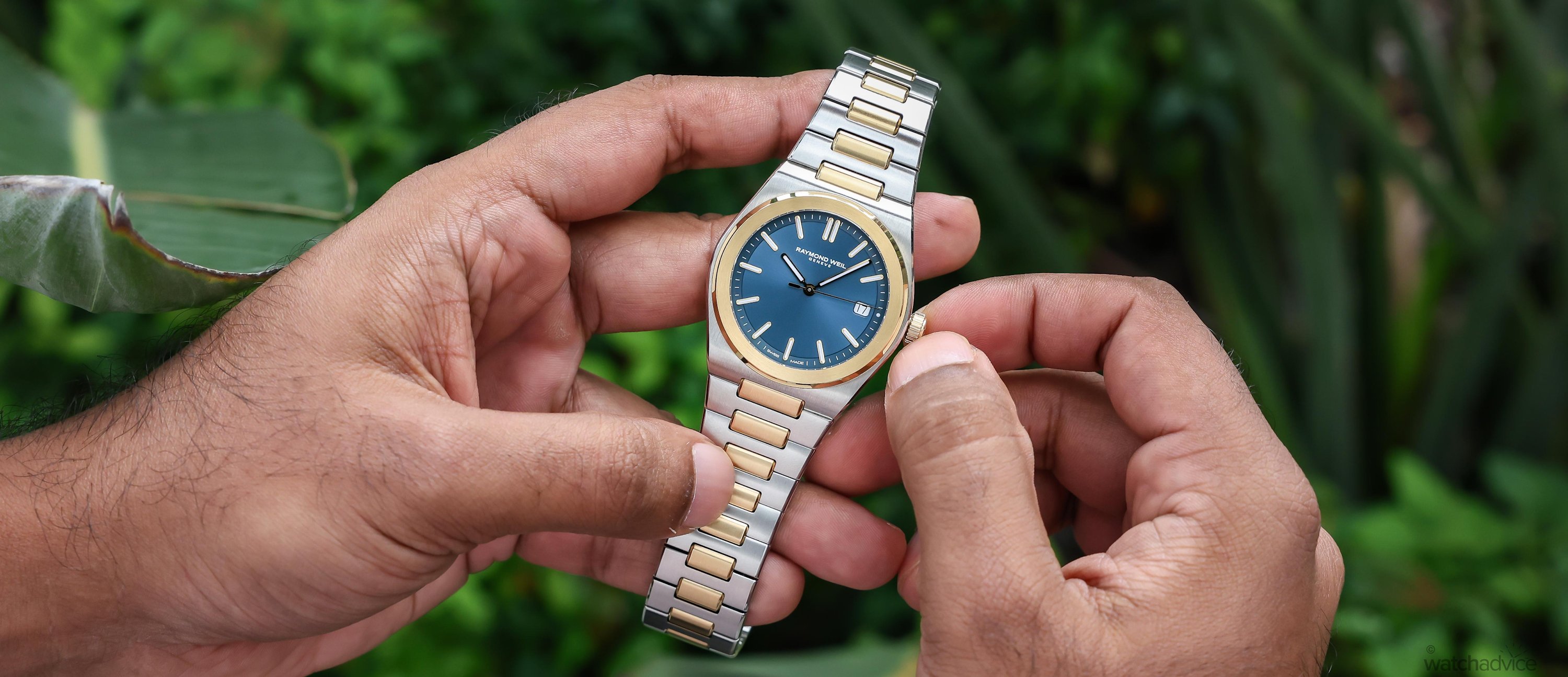
Raymond Weil’s first integrated-bracelet sports watch blends 1970s inspiration with compact proportions and accessible contemporary luxury.
What We Love
- A design inspired by 1970s integrated-bracelet watches
- Strong variety of colours and finishes
- Excellent integrated-bracelet option for the price
What We Don’t
- No bracelet micro-adjustment
- Dial finishing could have more character
- Movement could offer greater autonomy
Overall Rating: 8.4/10
- Value for Money: 8.5/10
- Wearability: 8.5/10
- Design: 8/10
- Build Quality: 8.5/10
Raymond Weil has gone through quite a resurgence over the last couple of years, bringing the brand back into the spotlight and creating watches with genuine substance behind them. The Millésime collection, for example, helped reposition Raymond Weil when it was introduced in 2023, combining vintage-inspired styling with thoughtful design. It also won the Challenge Watch Prize at the 2023 Grand Prix d’Horlogerie de Genève, showing just how well received the collection was.
Since then, the brand has continued building on the collection, introducing various complications and aesthetic interpretations to keep it evolving. In fact, I loved the 2025 Millésime Tri-Compax Chronograph so much (see the review above!) that after having it in my hands for just 30 minutes, I placed an order for one!
However, Raymond Weil’s resurgence cannot be built on the Millésime collection alone. This is where the brand’s next challenge lies, continuing on the Maison’s ‘renewed’ momentum and translating that into something new. This is where the A.R.T enters the picture.
The A.R.T arrives at an important moment for Raymond Weil. With the brand celebrating its 50th anniversary in 2026, rather than resting on nostalgia, they have used this special occasion to announce a few new collections. One of them is the A.R.T, making it more than a colour/material change or addition of a complication to an already existing and established line. The A.R.T is Raymond Weil attempting to define what the next chapter in their history looks like.
The name A.R.T. stands for “Art, Refinement and Timekeeping.” While this acronym may sound generic on the surface level, it actually connects to the brand’s longstanding association with music and arts. Collections such as the Maestro, Toccata, and Freelancer have regularly drawn upon musical language, so what this new collection is doing is carrying that link to cultural identity in a more architectural form.
While the artistic sense is less literal on this model compared to the abovementioned collections, instead, “art” is defined through the proportions, the refined design, the finishing, and of course, the integrated bracelet design. CEO Elie Bernheim describes the A.R.T. Date as “a watch designed to move naturally through different moments of modern life”.
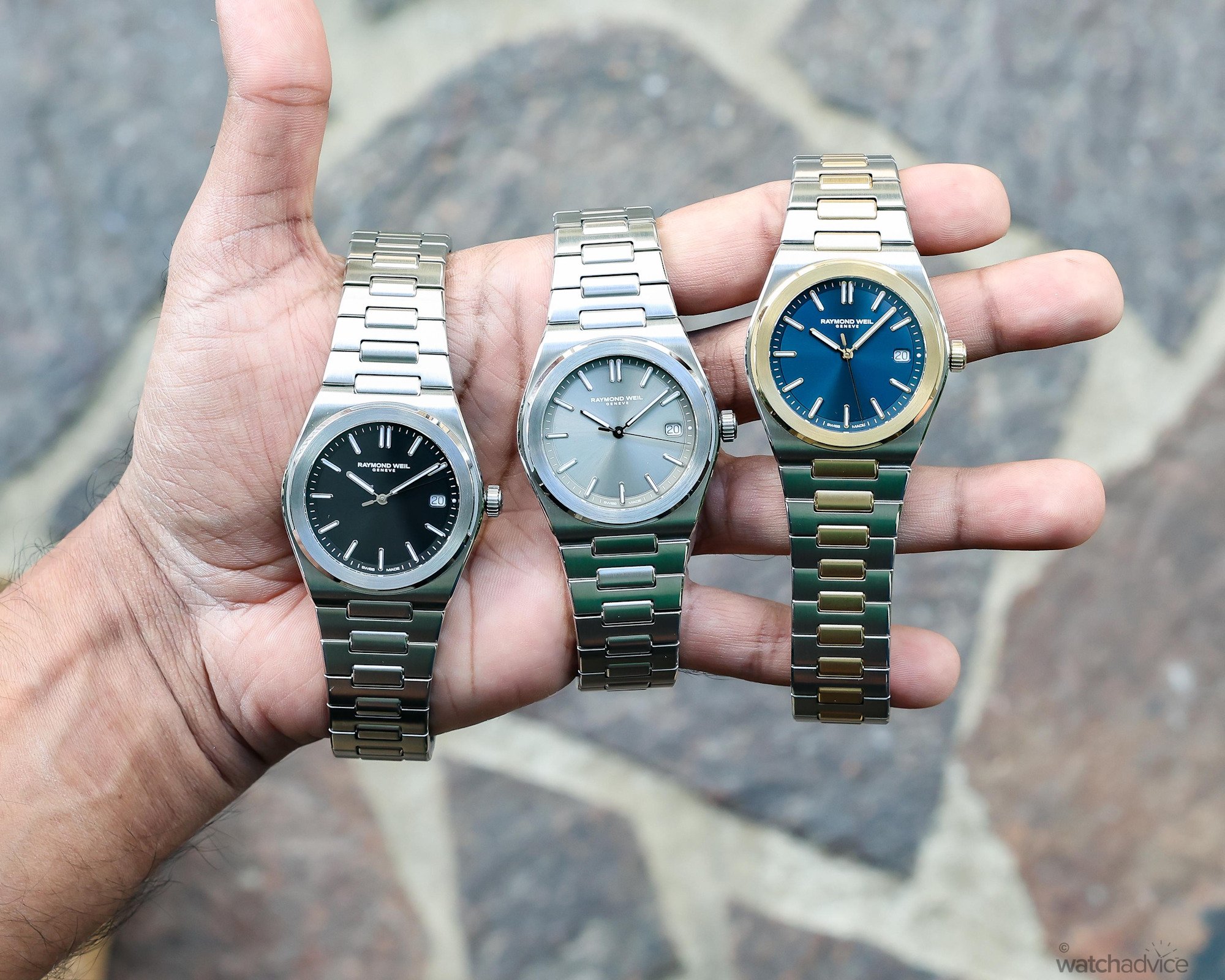
Raymond Weil launched the A.R.T. Date collection with 5 different variations. The models include three stainless steel editions and two-tone with gold-PVD. had the chance to get up close and personal with three of these new editions: the two-tone with blue dial, and two models in steel with graphite black and sage grey dials.
Initial Impressions
This is the brand’s first integrated bracelet design in the steel sports watch format, and with them stepping outside of the vintage-inspired and elegant design norm, I was excited to see what it would feel like on the wrist. The design also has that ‘elephant in the room’ moment as well. Looking at the reaction online to the model’s release, it’s fair to say that enthusiasts are comparing the design to watches (or a watch) of similar design, albeit at a much higher price point.
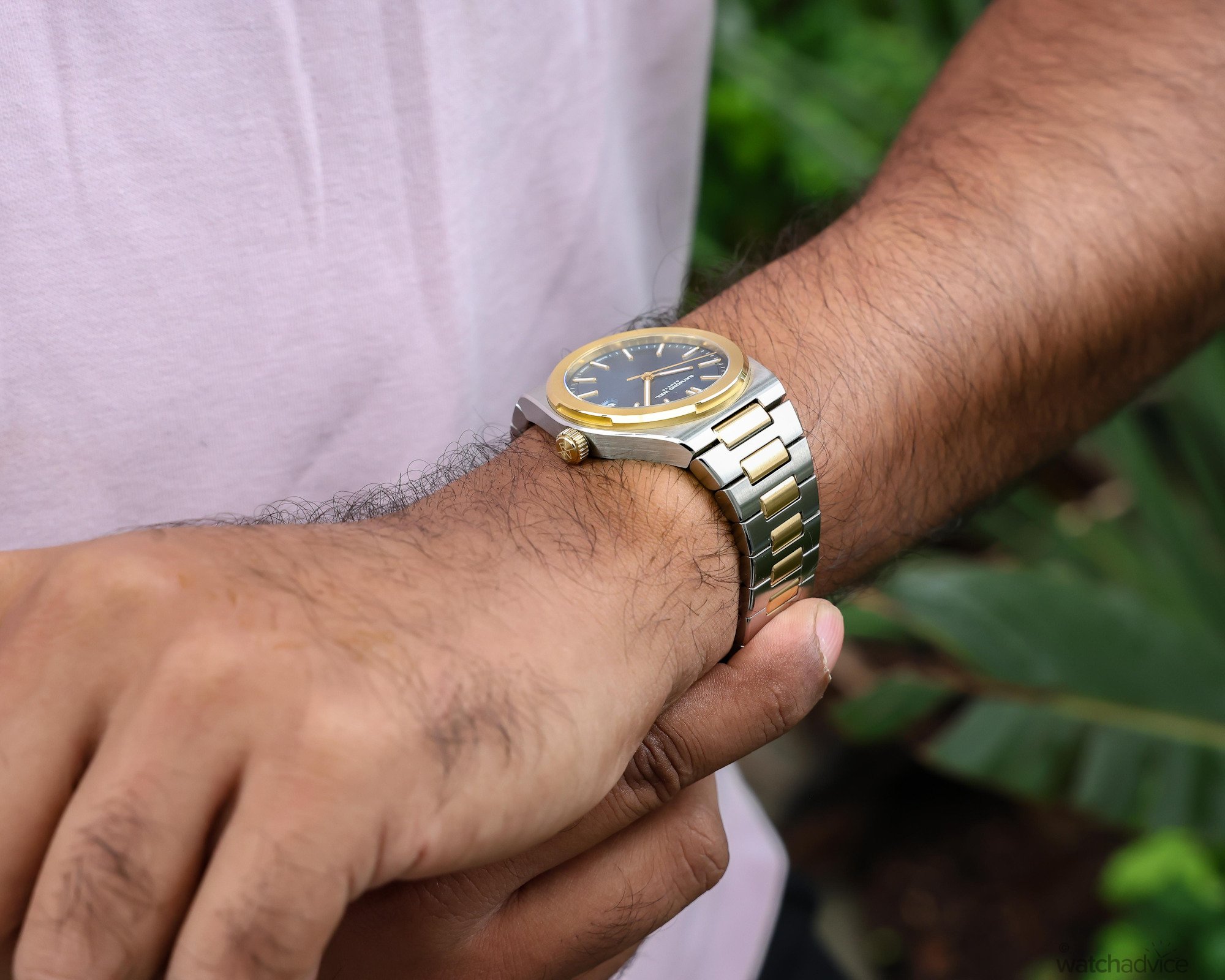
While the tonneau-shaped case, sculpted bezel, and H-link bracelet may draw comparisons with several familiar models, this design language does not belong to any one particular watch. Instead, the A.R.T. Date draws from the broader integrated-bracelet sports-watch aesthetic established during the 1970s, and delivers an easy-wearing and much more accessible version of this signature blueprint.
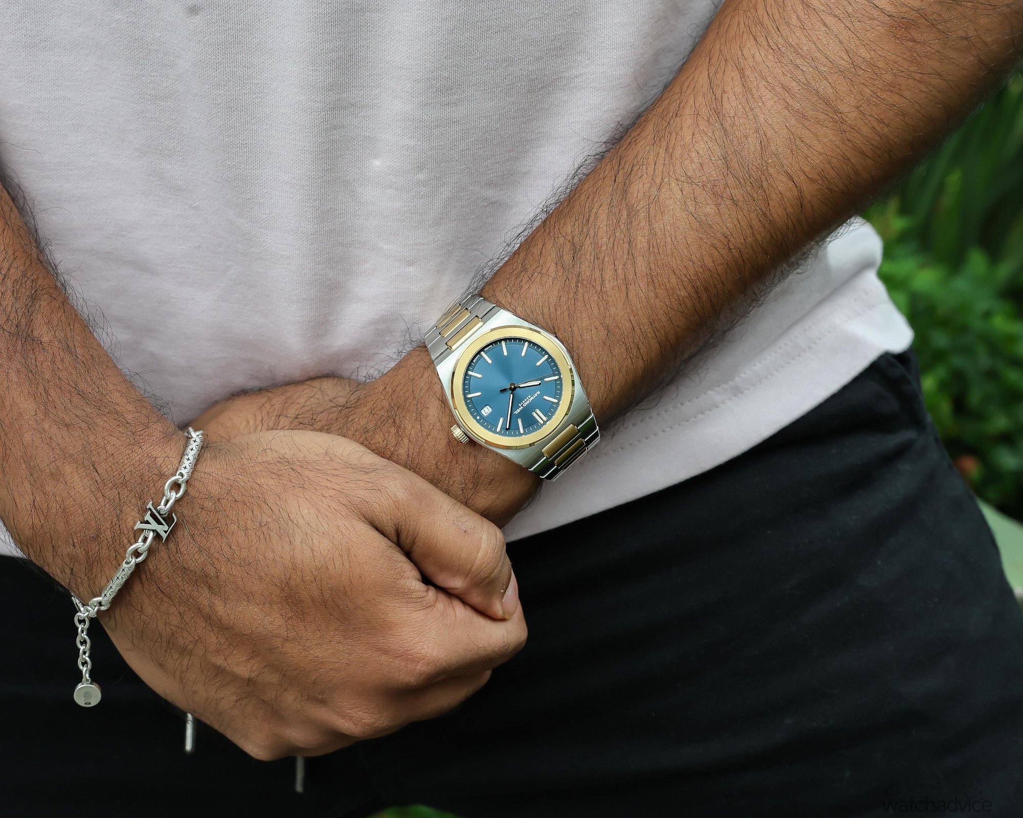
Out of the three models I had the opportunity to spend time with, I personally preferred the two-tone edition. Its combination of stainless steel and yellow-gold PVD accents gives the watch a bolder, dressier character with a touch of luxury.
Sculpted Lines Meet Integrated Style
The stainless steel case has a slim profile, measuring 38mm in diameter and only 9.95mm thick. These dimensions place the A.R.T. Date on the compact side of the modern luxury sports watch category and help it avoid the bulky aesthetic that can sometimes come with an integrated bracelet design.
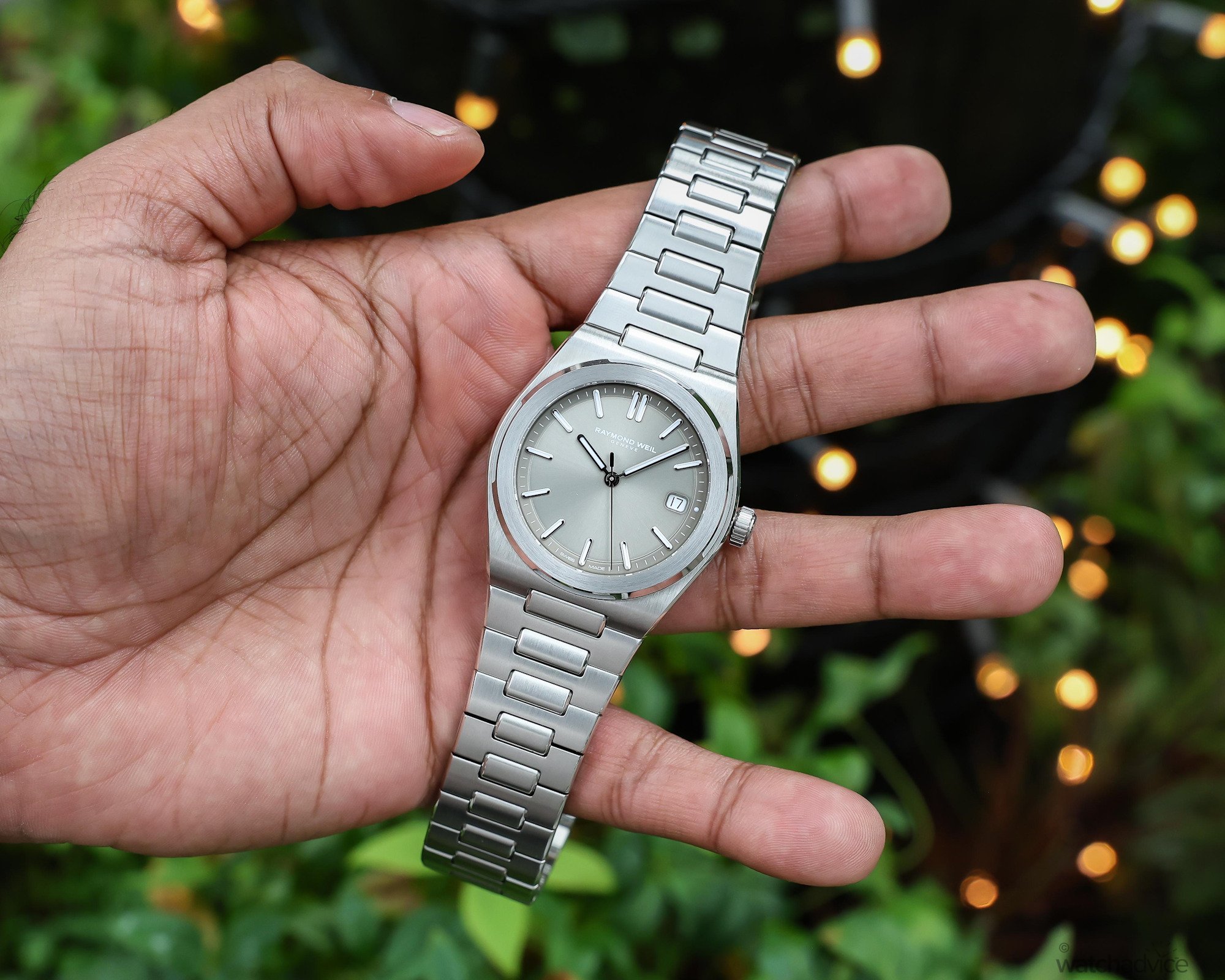
While the overall aesthetic may seem relatively simple in its nature, there are quite a lot of details to this design. Firstly, the watch is officially described as having a ’round’ case, but I feel there’s more to this than what’s stated on paper. The broad shoulders of the case flow directly onto the bracelet in a tonneau-like shape, which ultimately creates a wider and more architectural silhouette than a traditional round watch with lugs.
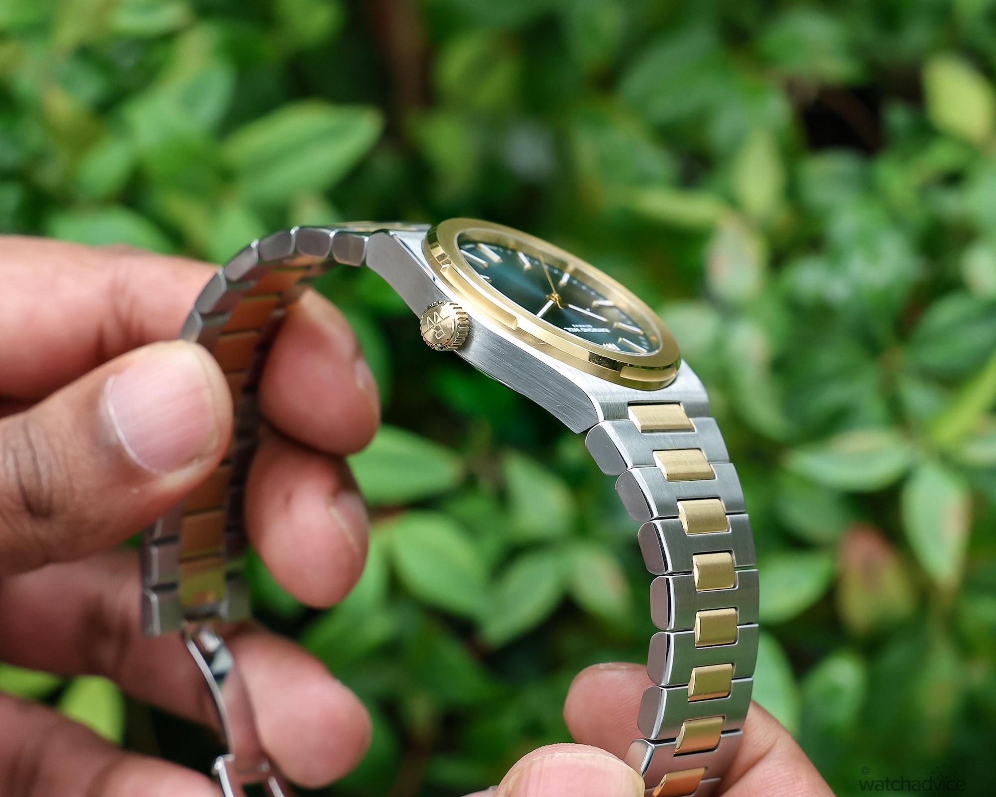
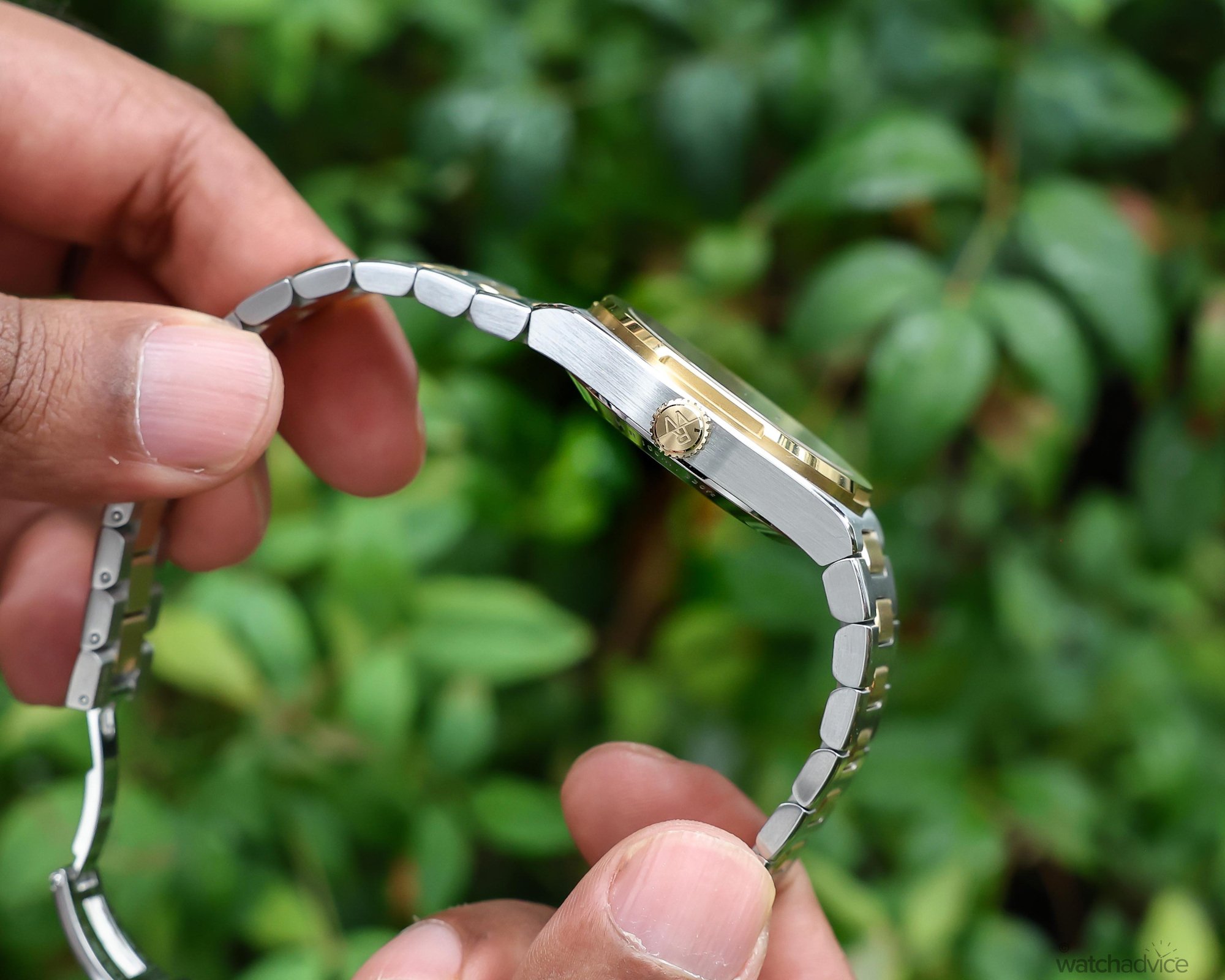
The design draws heavily on the rounded geometry that is associated with 1970s sports watches. This is why we see rounded bezels and beautiful smooth edges instead of sharp and angular surfaces, with Raymond Weil also creating softer transitions from the case to the bezel.
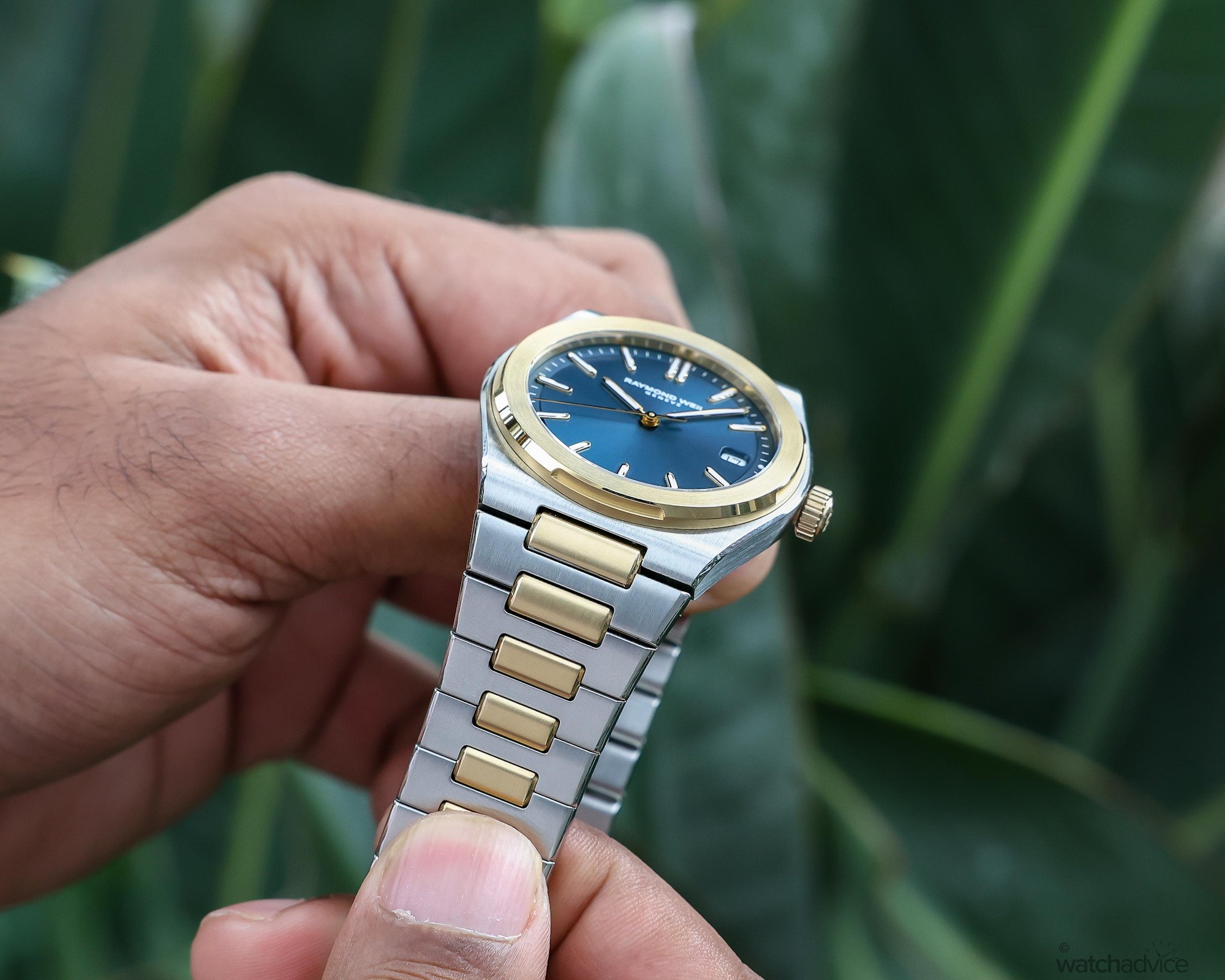
The sculpted bezel is one of the more defining elements of the design for me. There are four shallow recesses which are positioned around its bevelled perimeter, which subtly break up the circular form of the bezel. This choice of aesthetic design also gives light additional surfaces and angles to interact with, and prevents the bezel from being too one-dimensional.
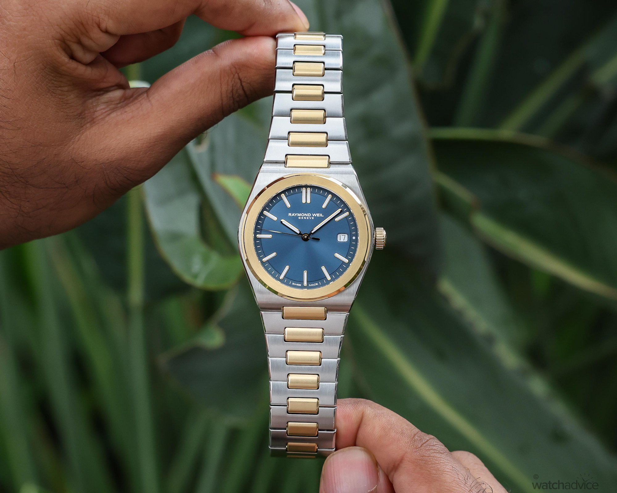
The varied finishing also adds to the visual appeal of the case and bezel design. The bezel features a circular satin-brushed surface, while its chamfered edges are polished, creating a beautiful contrast that plays with the light. This finishing continues onto the case, where vertical and horizontal satin-brushed surfaces feature across the top and sides, while the chamfered edges are once again polished for a more refined appearance.
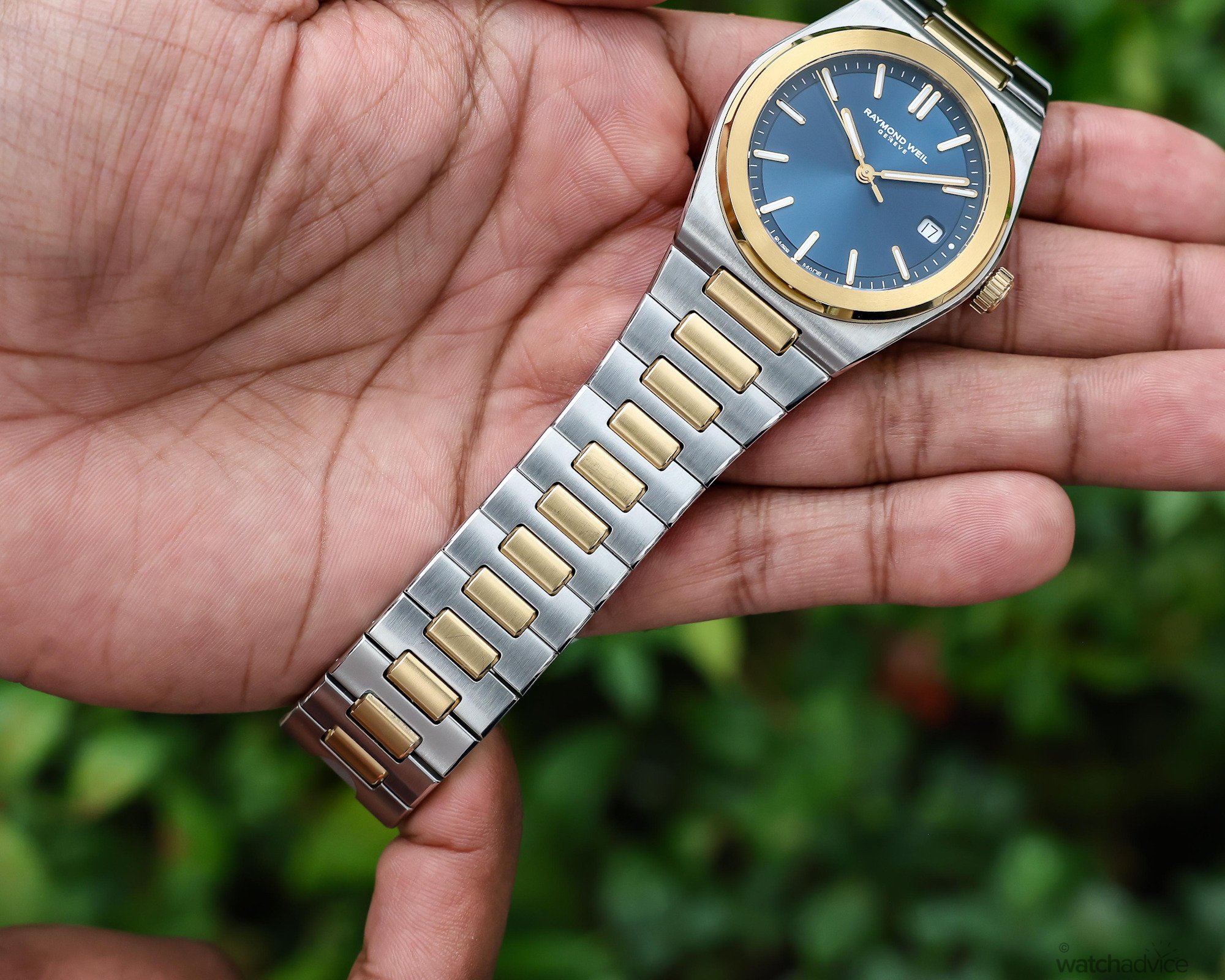
The same attention to finishing continues onto the integrated H-link bracelet. Its surfaces feature vertical satin brushing, while the polished chamfered edges catch the light and create a seamless connection with the case and bezel. This contrast is highlighted even more so with the two-tone edition, where the yellow-gold PVD-coated central links add warmth and definition, allowing the H-link construction to stand out more against the surrounding stainless steel.
Simplicity Through Colour And Light
While the case features several subtle details that add to the watch’s character, the dial takes a more restrained approach. The three different versions I have had time to spend with have three entirely different personalities when you look at the dial. The blue for me is the standout, while the black and sage grey dials are the more traditional classic options.
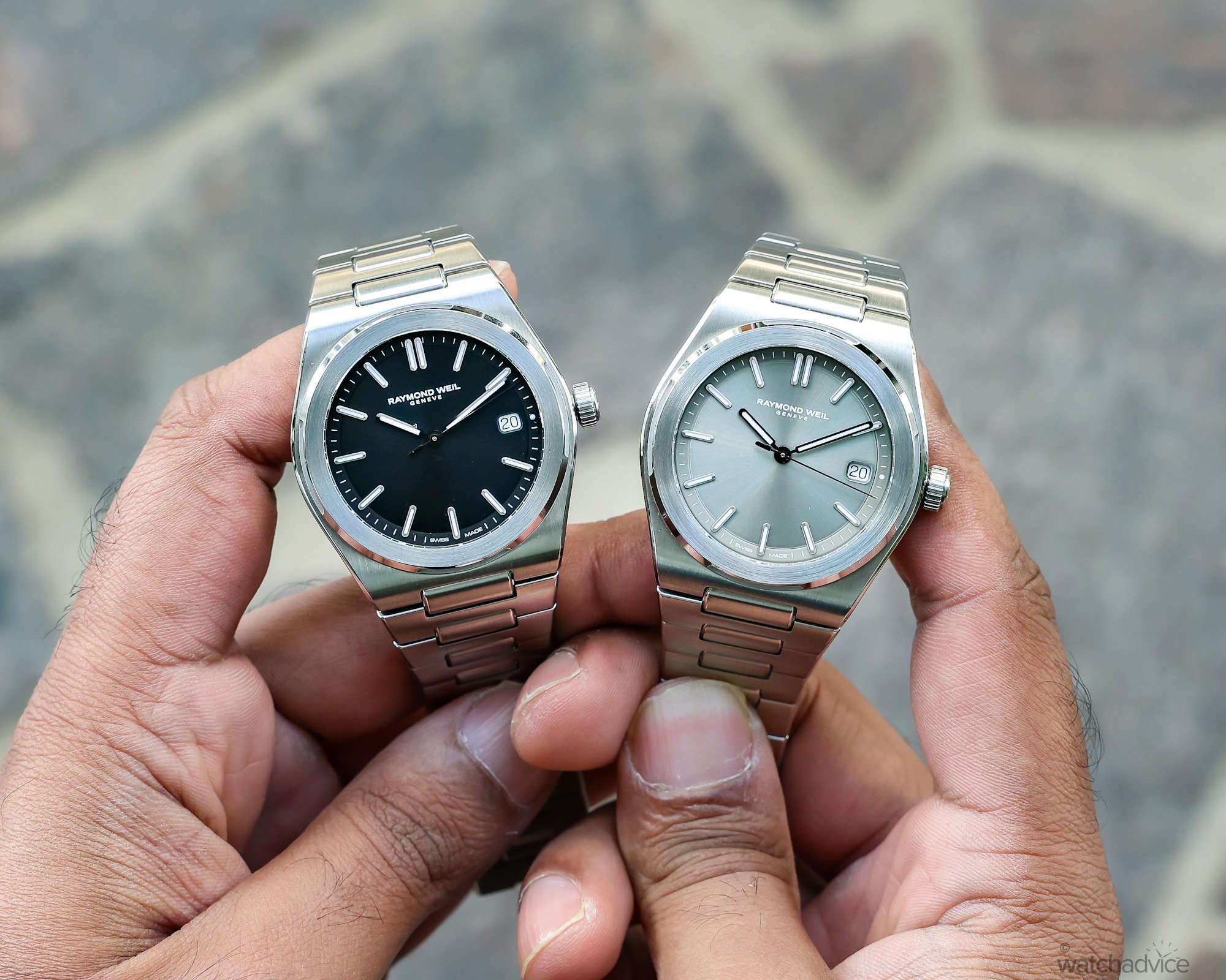
All three models feature a sunburst finish, and while this is clearly visible on the brand’s website, each dial behaved differently when I had the watches on the wrist. The blue was the most prominent, shifting noticeably between different shades as it caught the light from various angles. The sage grey offered a more subdued look, which is understandable given its softer, more muted colour palette. The black, on the other hand, I noticed to be more of a flat matte dial, with a very subtle hint of a sunburst effect.
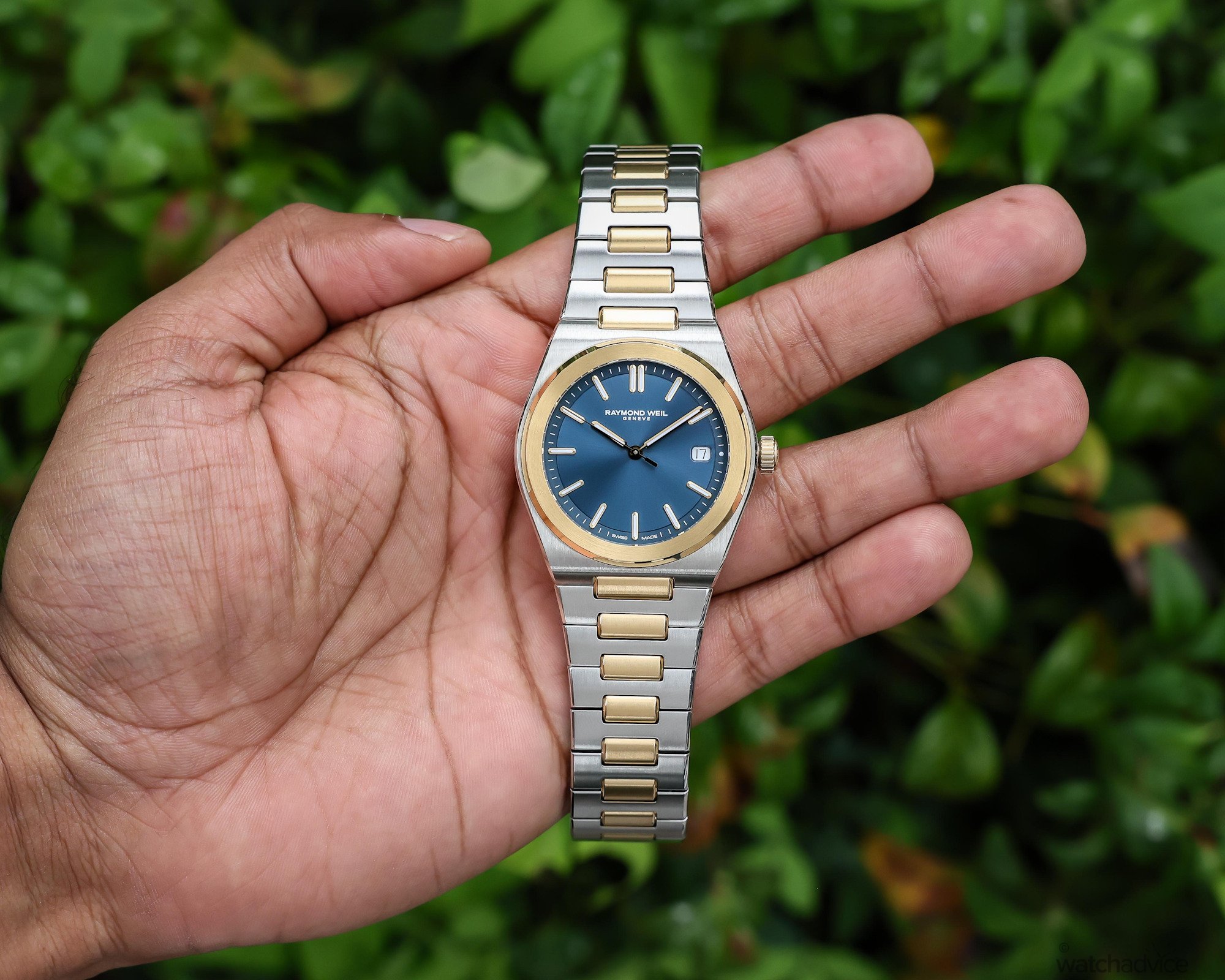
Even though it’s the same design, all three provide very distinctly different personalities, allowing the collection to range from vibrant and expressive to the more subtle and understated. For me, though, the metallic blue gives the watch its strongest point of visual character. Blue is a highly adaptable colour, working well against surrounding material regardless of its colour. Depending on the lighting, the dial will move between brighter electric tones and deeper navy shades, helping an otherwise restrained dial feel more dynamic.
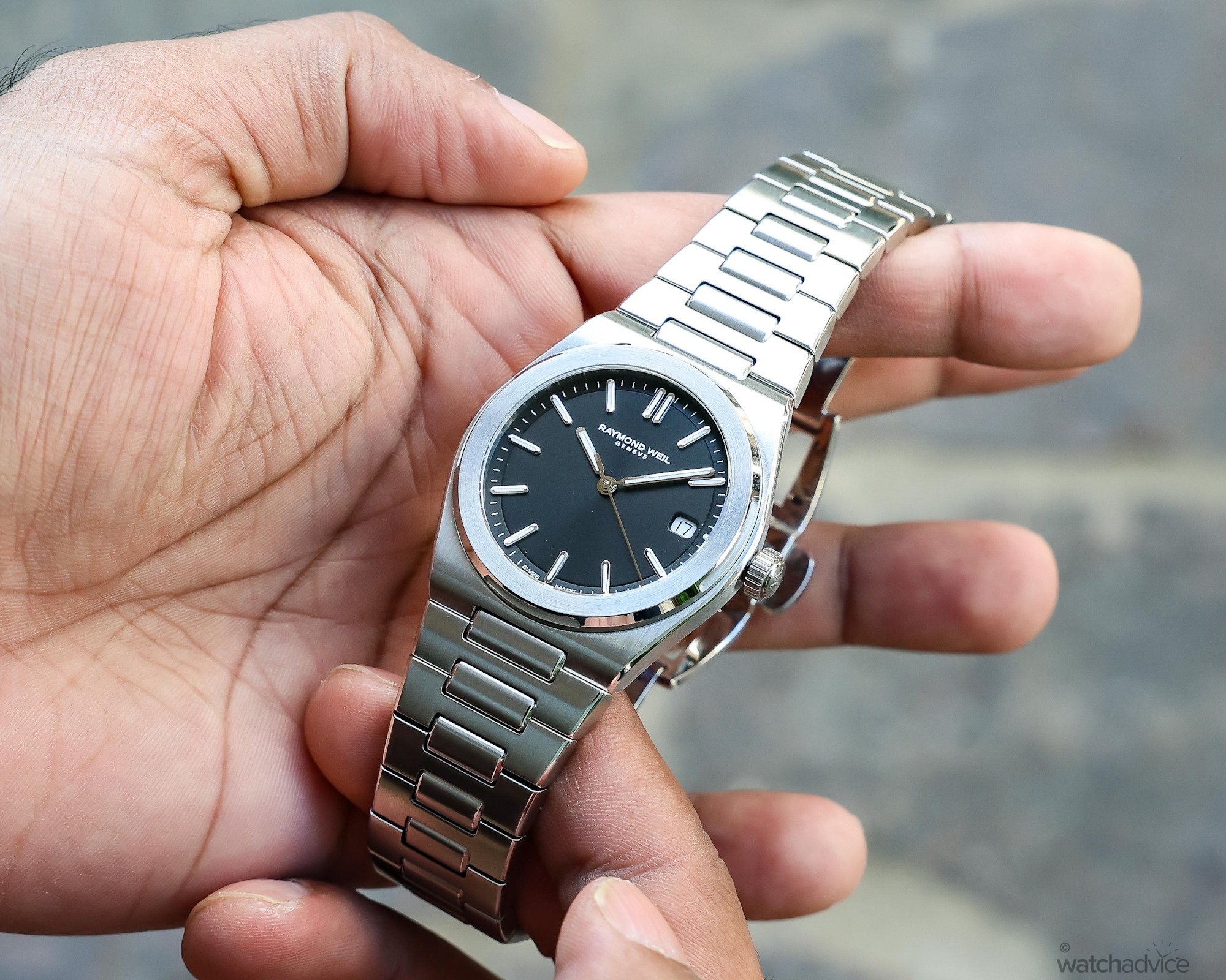
The dial also uses two seperate finishes, rather than relying on one continuous surface. Its central section receives a sunray-brushed treatment, while the surrounding minute track uses a fine azuré, or concentric texture. A recessed groove sits in between the sunray centre and the outer minute track, which helps to seperate the different dial finishes, while also creating physical depth.
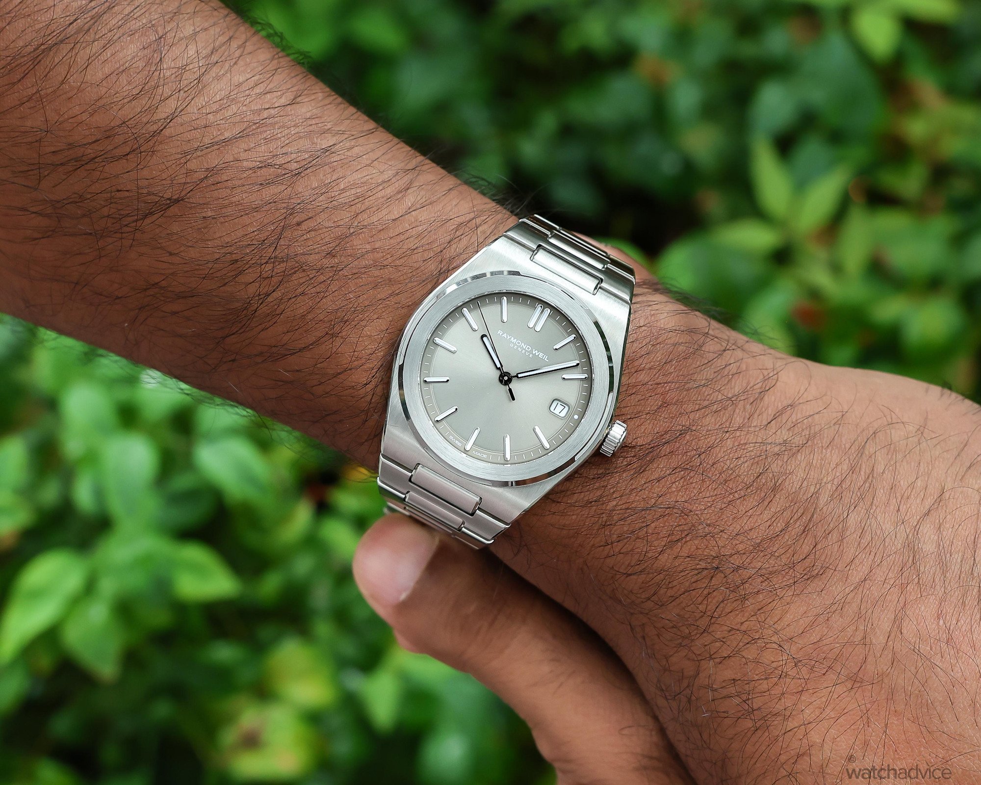
The slim applied baton indices and faceted hour and minute hands share a similar aesthetic, helping to tie the dial together and create a clean, easy-to-read appearance. These elements also have green-emitting Super-LumiNova, which adds useful low-light functionality and also reinforces the A.R.T. Date’s everyday usability.
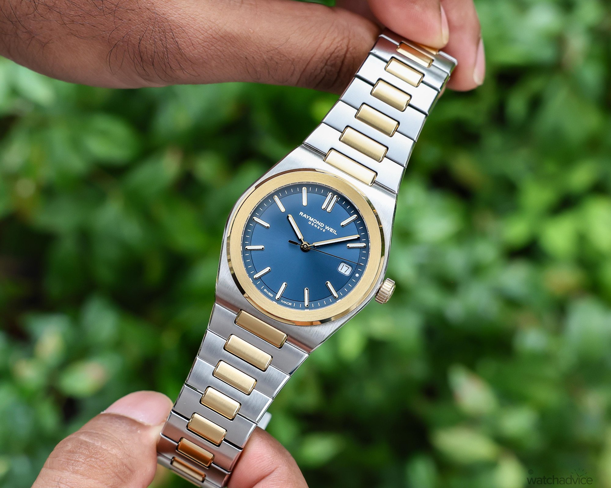
While the dial is intentionally simple and minimalist in its execution, I do wonder if it could have benefitted from a more distinctive textured pattern to elevate the character of the watch further. Perhaps I have become accustomed to the layered textures used throughout the Millésime collection, which give them a clear identity and also help them stand out in a crowded market.
There is certainly nothing wrong with the A.R.T. Date’s metallic sunburst finish, and its restraint complements the watch’s clean, sport-chic design. However, a subtle pattern or additional texture could add much greater depth to the dial while also giving the watch a strong visual identity. However, since this is a brand-new collection, it could be something Raymond Weil explores in future variations.
Reliable Mechanics For Everyday Wear
Inside the A.R.T. Date sits Raymond Weil’s self-winding mechanical Calibre RW4200, which is based on the Sellita SW200-1 architecture. The movement operates at a frequency of 4Hz (28,800vph) and provides hours, minutes, central seconds and a date display at 3 o’clock. It also features a hacking-seconds mechanism, which stops the seconds hand so the time can be set more accurately.
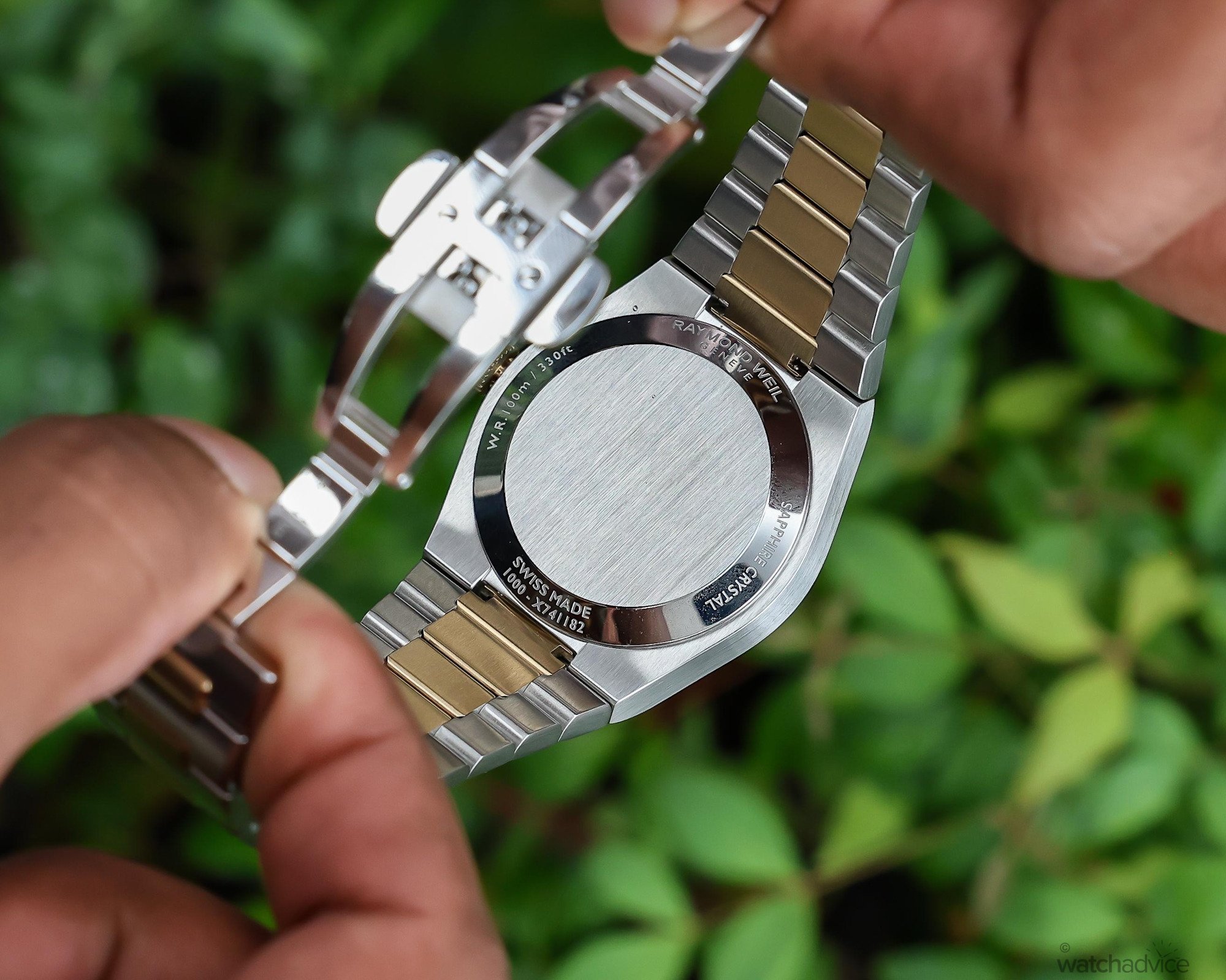
The Raymond Weil A.R.T. Date offers everyday practicality thanks to its 41-hour power reserve. However, I feel this falls slightly short of the extended reserves offered by some modern movements. What the Calibre RW4200 does provide, though, are the benefits of proven reliability and straightforward servicing. The watch does not feature an open sapphire caseback, but this keeps the focus on the A.R.T. Date’s external design while also allowing the solid stainless steel caseback to be personalised.
How Does The Raymond Weil A.R.T. Date Wear?
With slim case proportions of 38mm in diameter and 9.95mm thick, alongside an approximate case length of 42mm, this watch was always going to sit nicely on my 16cm wrist. The integrated first links extend its effective wrist footprint to around 45mm, allowing the A.R.T. Date to feel substantial without creating any overhang. I think this compact sizing may be one of the watch’s strongest practical advantages.
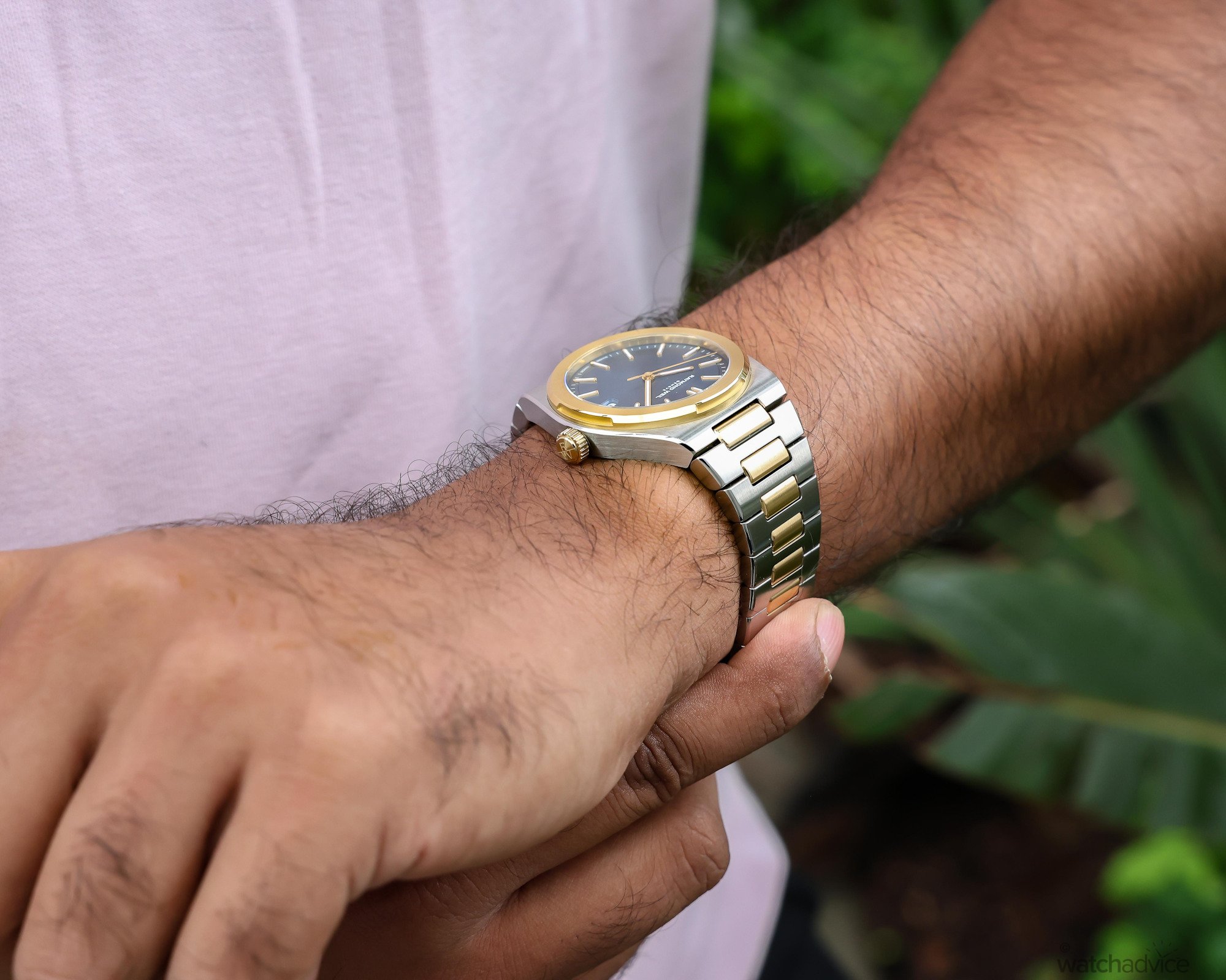
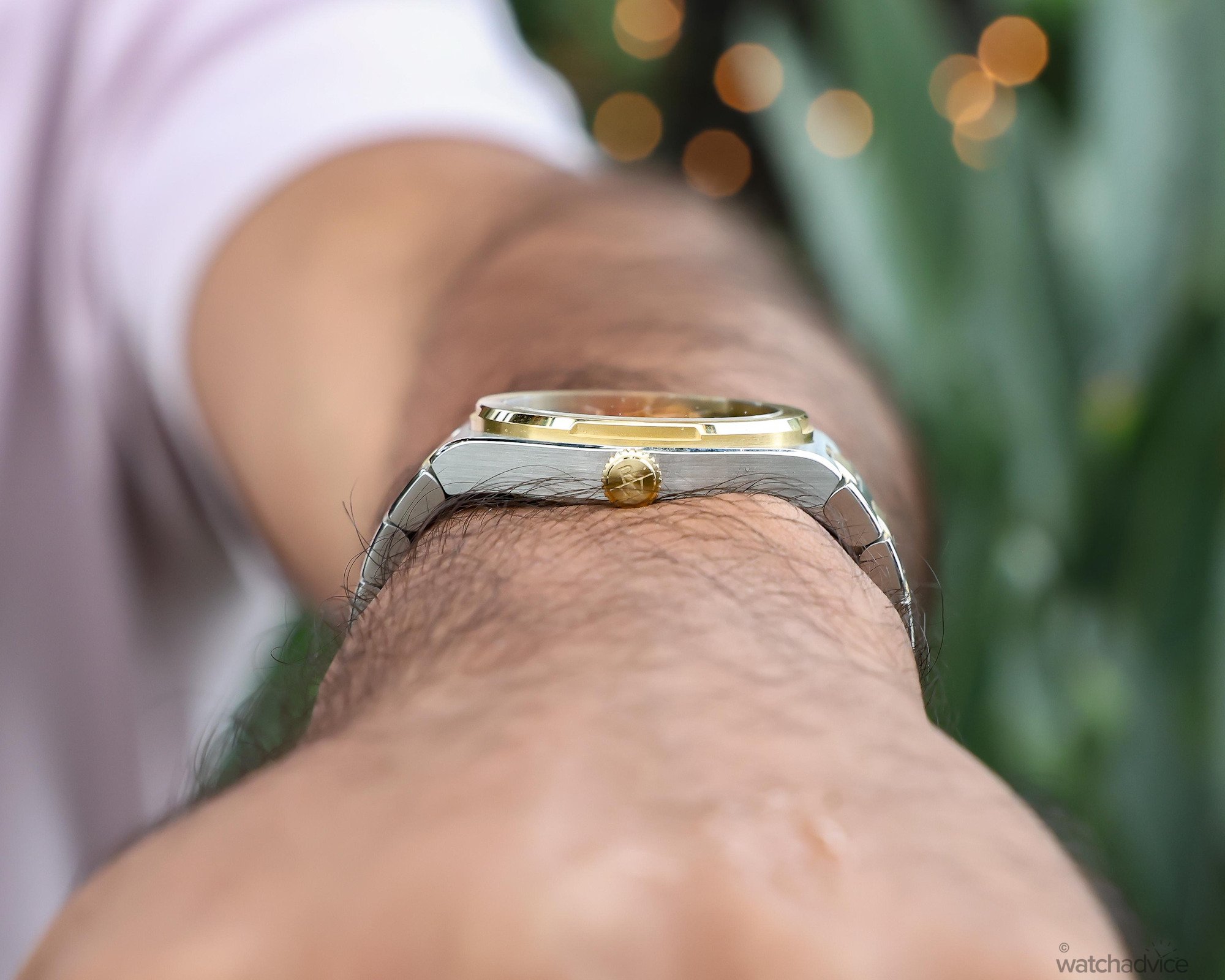
Comfort is another strong point of the Raymond Weil A.R.T Date. The relatively slim case sits quite low against the wrist, while the integrated H-Link bracelet follows the wrist’s natural shape. It’s not a bulky watch by any means, but it also has the presence on the wrist that you notice; however, it never becomes overly heavy of cumnbersome during extended wear. And for me, this is what attests to the A.R.T Date’s everyday wearability.
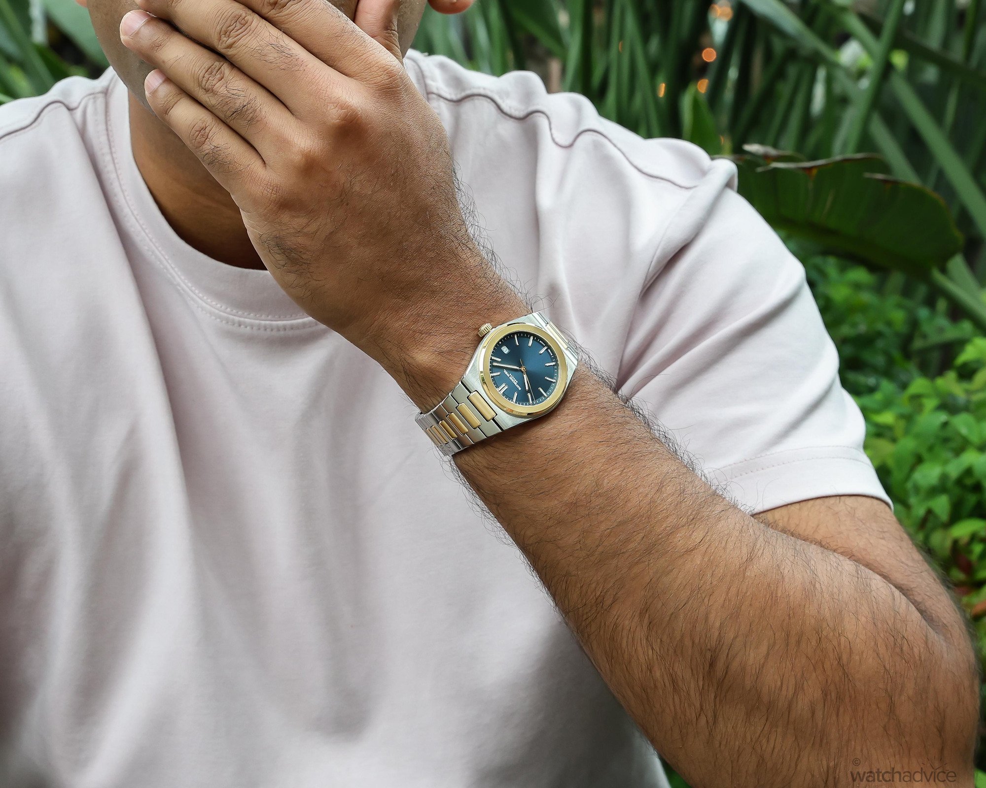
It carries the presence expected of an integrated sports watch, while offering a level of wearability comparable to considerably more expensive models. Although the power reserve could certainly be improved, it was not something I found problematic, especially when wearing the watch daily.

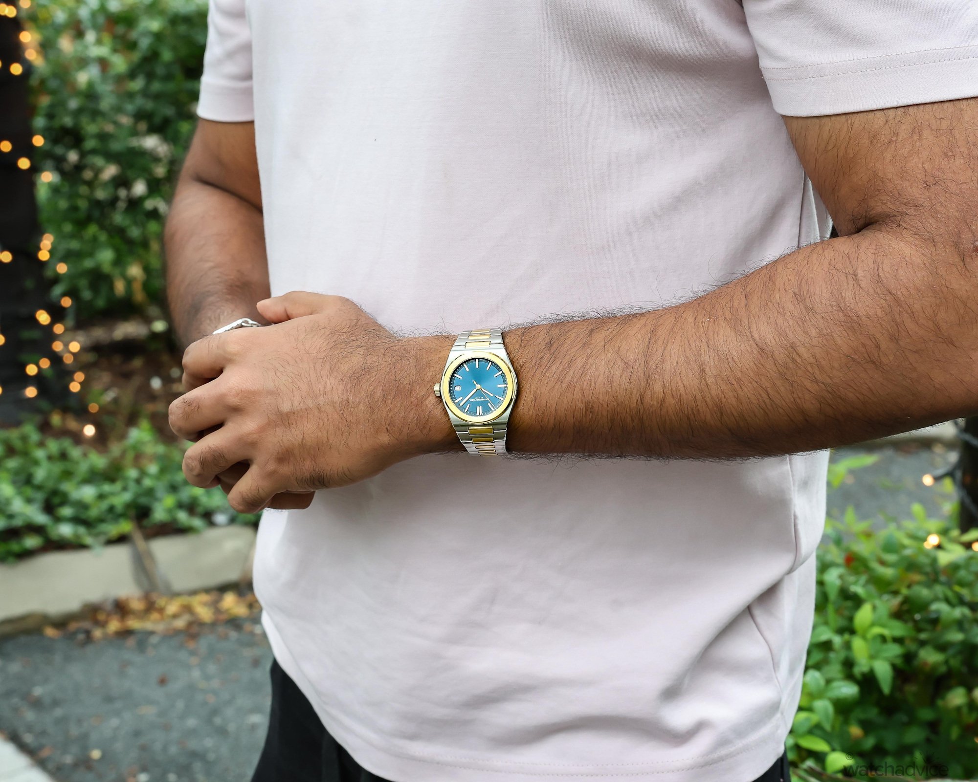
And when it comes to picking the right colour, there certainly are a lot of options to choose from. The sage grey and graphite black steel editions demonstrate how much the dial colour changes the personality of the watch. While both colours are in line with your classic colour choices, the sage grey has a sunray brushed finish that gives hints of lighter tones of grey, while the black, as mentioned earlier, gives off a matte look.
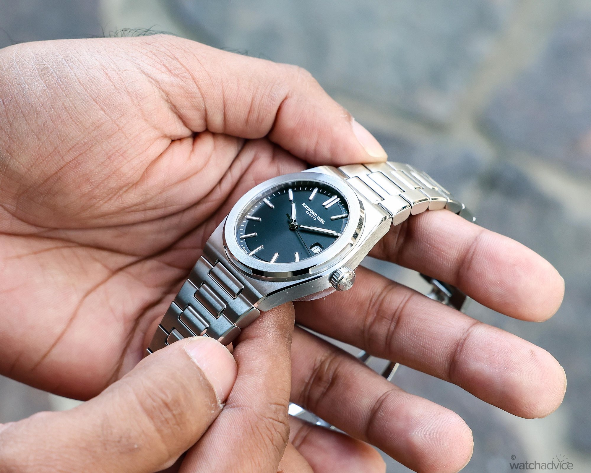
Personally, I lean more towards the black, as the sage grey dial matches too closely with the steel case and bracelet, giving off a monochromatic look, while the black is far more restrained, offering a classic and versatile appearance that would transition easily between casual and more formal settings.
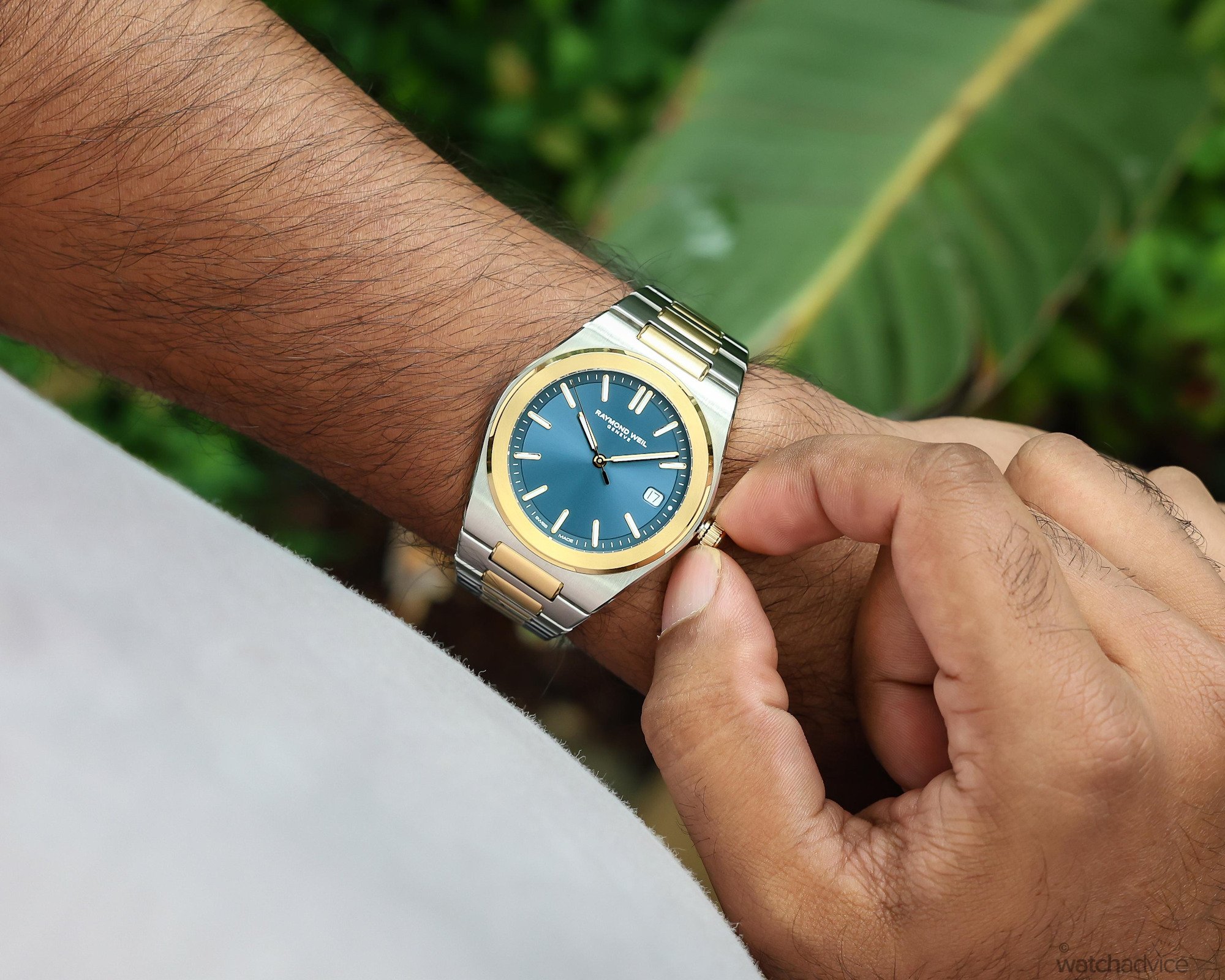
Overall, though, the two-tone edition with the metallic blue dial is the choice for me. While I don’t normally lean towards two-tone editions, I think this aesthetic works well and provides much more character than the other editions. Its yellow-gold PVD-coated bezel, crown, and central bracelet links introduce greater warmth and visual presence, while also highlighting the construction of the H-link bracelet more clearly.
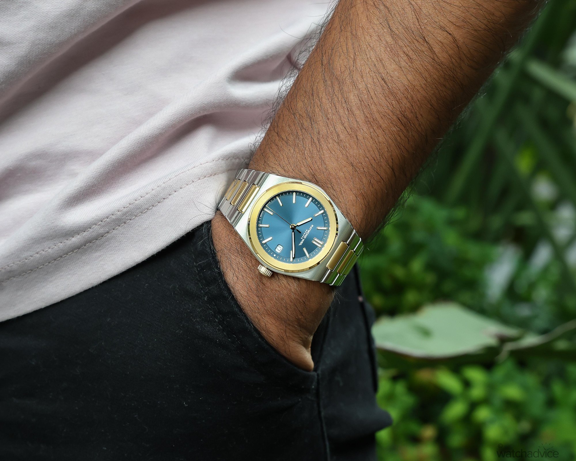
While the classic graphite black dial offers more wearability options, this two-tone edition is certainly the dressier and more attention-grabbing watch. The gold accents, however, remain controlled enough that the watch does not feel overly extravagant.
I found the H-link integrated bracelet to be comfortable once correctly sized. The butterfly clasp doesn’t offer micro-adjustment, which meant that the ideal fit depended on removing full or half-links, which can become noticeable once the wrist expands during warmer conditions.
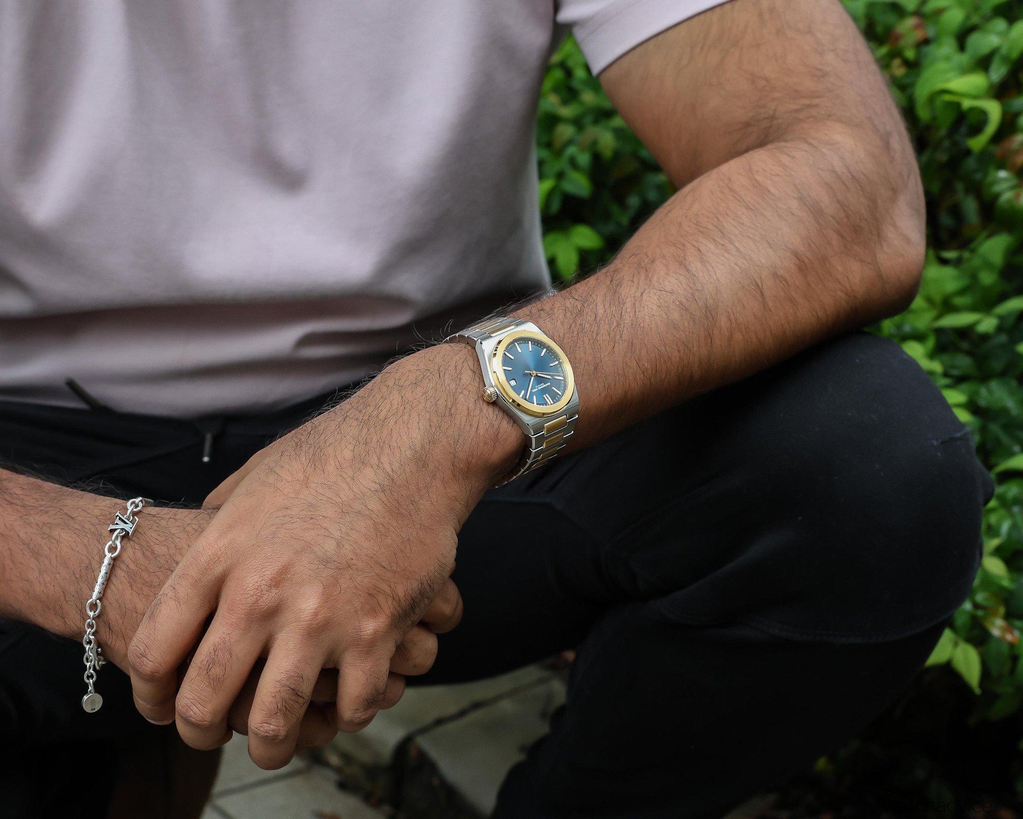
At AUD $3,300 for the steel models and $3,500 for two-tone editions, this omission is worth mentioning as some watchmakers do provide tool-free bracelet adjustment. However, keep in mind that it is still far away from being a universal feature among integrated-bracelet designs, especially those fitted with butterfly clasps.
Final Thoughts
The A.R.T Date represents the next chapter for Raymond Weil. Following the success of the Millésime, the brand needed to prove that its resurgence could extend beyond a single collection, and its first integrated-bracelet sports watch certainly represents a confident step forward. While the design of the A.R.T Date draws from the broader design language of the 70s, Raymond Weil has created an accessible version of the signature integrated bracelet design, now with more compact proportions, detailed finishing and great wearability.
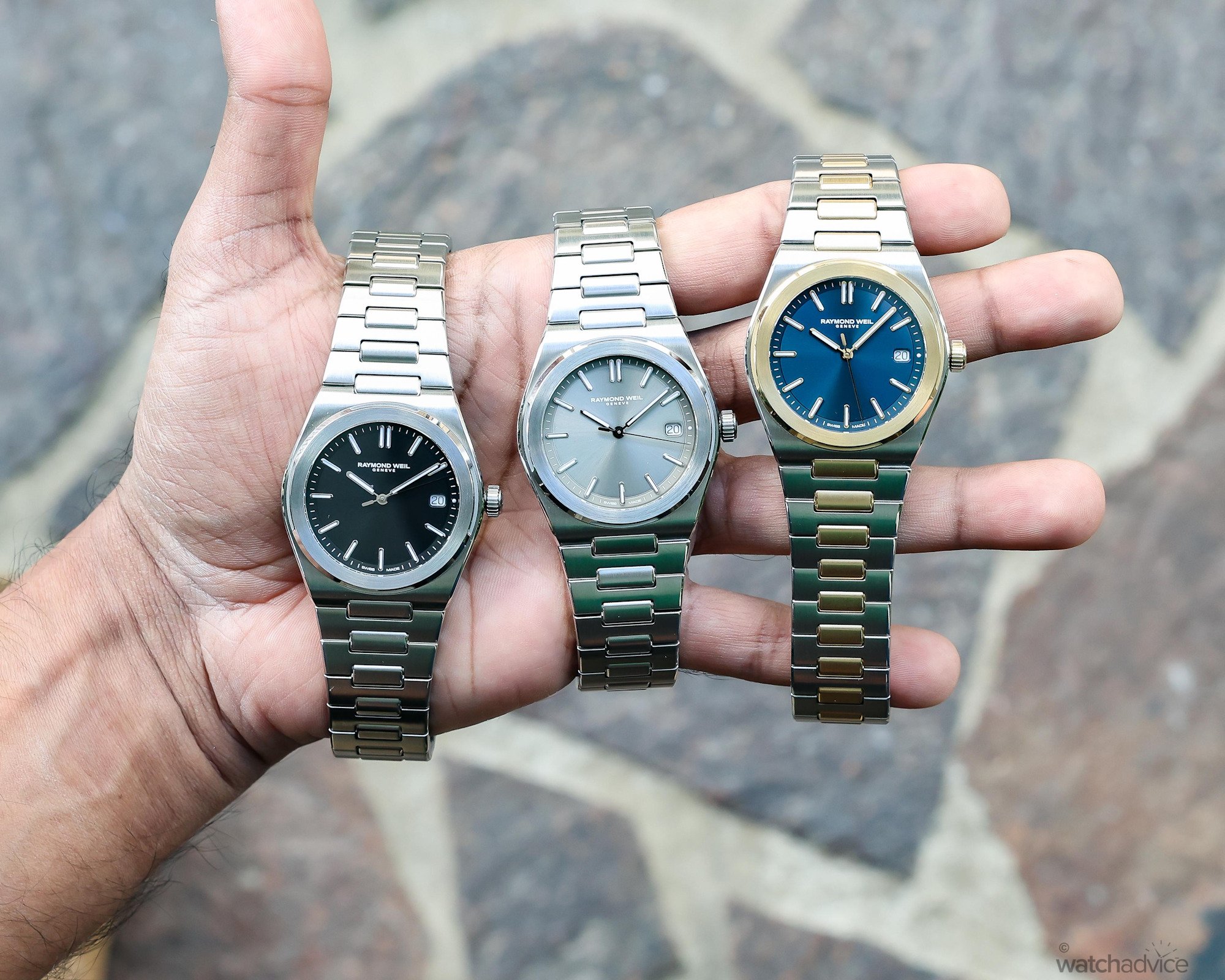
After spending time with the different variations, I found each model offered a distinct personality. The sage grey offers a monochromatic look, the black is the most restrained and versatile, while the two-tone metallic blue edition brings greater warmth and a stand-out presence on the wrist. The finishing across the sculpted case, bezel and H-link bracelet is also executed well, giving the A.R.T. Date a level of refinement and wrist presence comparable to watches positioned much higher in price.
There are, however, areas in which Raymond Weil can develop the watch as the collection evolves. A more distinctive dial texture could give the A.R.T. a stronger visual identity, while an extended power reserve and bracelet micro-adjustment would improve its everyday practicality. Nevertheless, these omissions did little to diminish my overall experience. At AUD $3,300 for the steel models and $3,500 for the two-tone editions, the A.R.T. Date delivers a comfortable, well-finished and highly wearable package, and also provides Raymond Weil with a strong foundation upon which it can build its next chapter!
Hublot Big Bang Tourbillon Automatic Yellow Neon SAXEM
Reference & Specifications
| Feature | Specification |
|---|---|
| Reference | 4291000-STP-50001 (Two-tone PVD blue), 1000-ST-20001 (Black) and 1000-ST-52001 (Grey) |
| Dimensions | 38mm case diameter x 45mm lug-to-lug (approx.) x 9.95mm thickness. |
| Case | Stainless steel / Two-tone PVD |
| Dial | Sunray-brushed black/blue / grey |
| Crystal | Sapphire with anti-reflective treatment. |
| Caseback | Closed stainless steel |
| Movement | Automatic RW4200 Calibre |
| Power Reserve | 41 |
| Beat Rate | 4Hz / 28,800VpH |
| Water Resistance | 100m / 10bar |
| Strap/Bracelet | H-link integrated bracelet design with vertical satin-brushed and polished finishing |