Breitling has updated their SuperOcean Heritage Collection, and with a range of seemingly small but big changes, we’ve taken the time-only models and put them to the test!
What We Love
- The case refinements across the range
- The small nods to the vintage 1957 model
- The new in-house B31 Calibre
What We Don’t
- The overlapping of the rubber strap under the wrist
- Fewer choices when it comes to the colour combinations in rose gold
- The domed crystal can reflect the light on the darker dials a little
Overall Rating: 8.9 / 10
- Value for Money: 8.5/10
- Wearability: 9/10
- Design: 9/10
- Build Quality: 9/10
Earlier this month, Breitling released the new look SuperOcean Heritage Collection with a suite of changes that, while looking like small incremental changes, all added up to noticeable differences across the entire range. We had a first look at these upon release, and were fortunate enough to get our hands on them for some time prior, so the whole team was able to see the changes themselves in person, and what they meant for the wearer of the new models. Sam and I flipped a coin to see who would review the time only and who would review the new chronographs. This was a coin toss with no loser, as each was a good a choice as any, and I scored the time only. So stay tuned for Sam’s review of the Chronograph in a few weeks time.
Initial Thoughts
I’ve always said, press photos and renders don’t always do the watches justice, and I feel this is true about many watches we get to see in person. It is also very true about the new SuperOcean Heritage Collection. You don’t get a sense of the refinements that Breitling has made in this collection, nor do you get a sense of the depth of the blue and green colourways that now complement the black.
The other changes Breitling has made are not so noticeable at first glance, but more so when you put them on the wrist. The contoured bracelet and straps, the more refined cases within each size range and the small aesthetic changes on the dial all make a difference when wearing them and looking at them on the wrist. But without going into detail, and back over what I’ve already covered in the release article above, let’s get into it.
The Design
The new SuperOcean Heritage has a raft of design changes that all make the pieces both easier to wear, easier to choose which one is for you, and incorporates design elements that are more in line with the original SuperOcean from 1957. Let’s start with the dial.
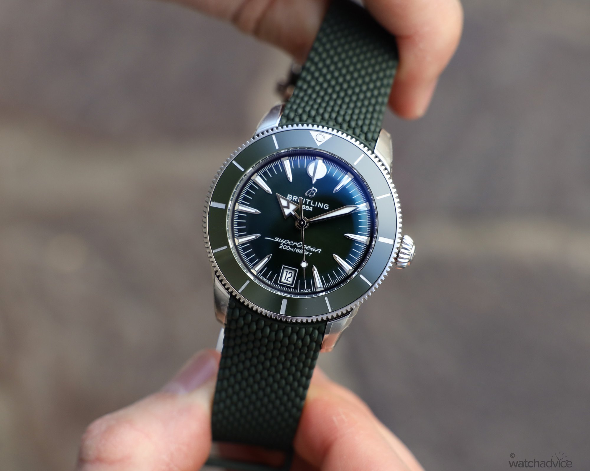
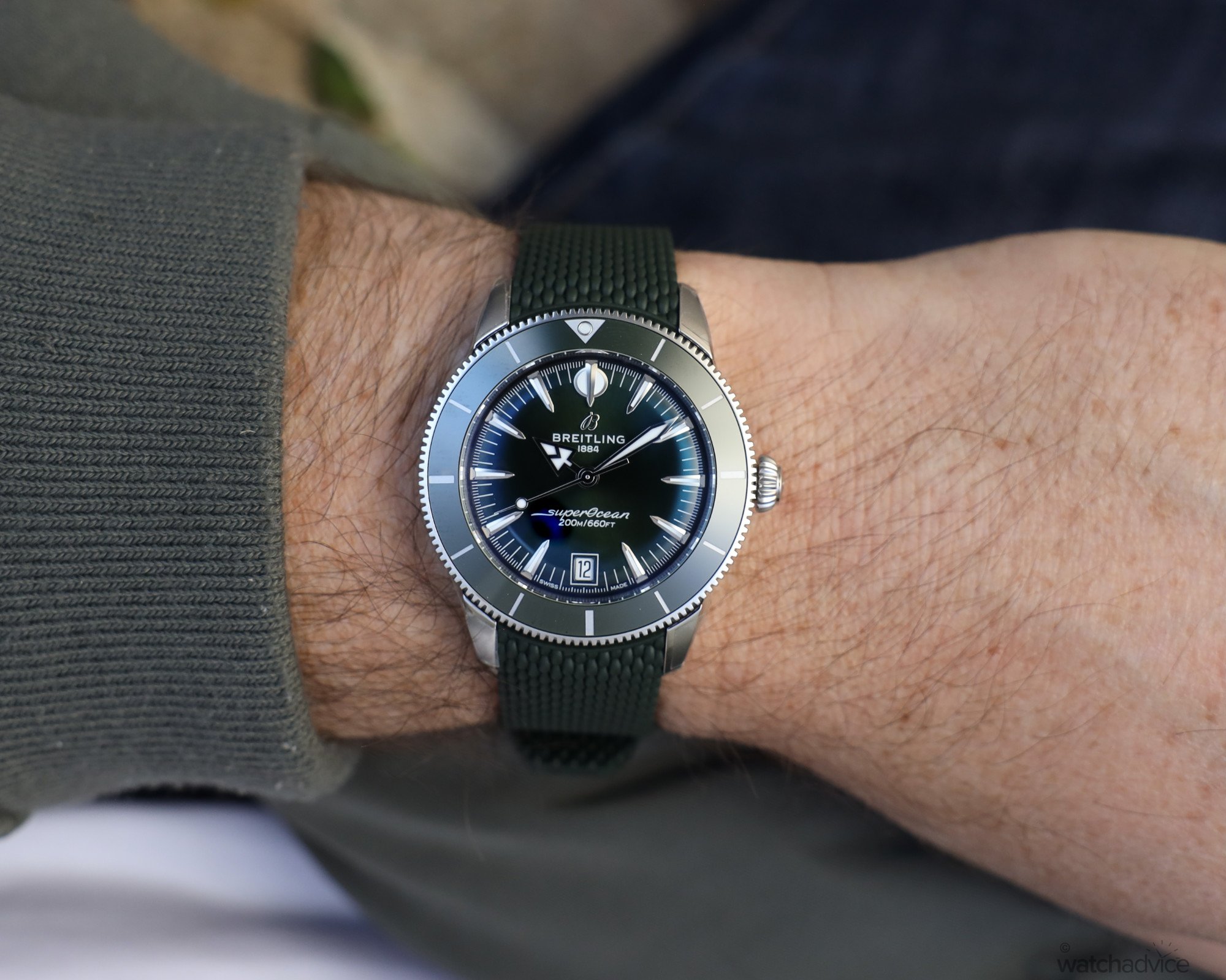
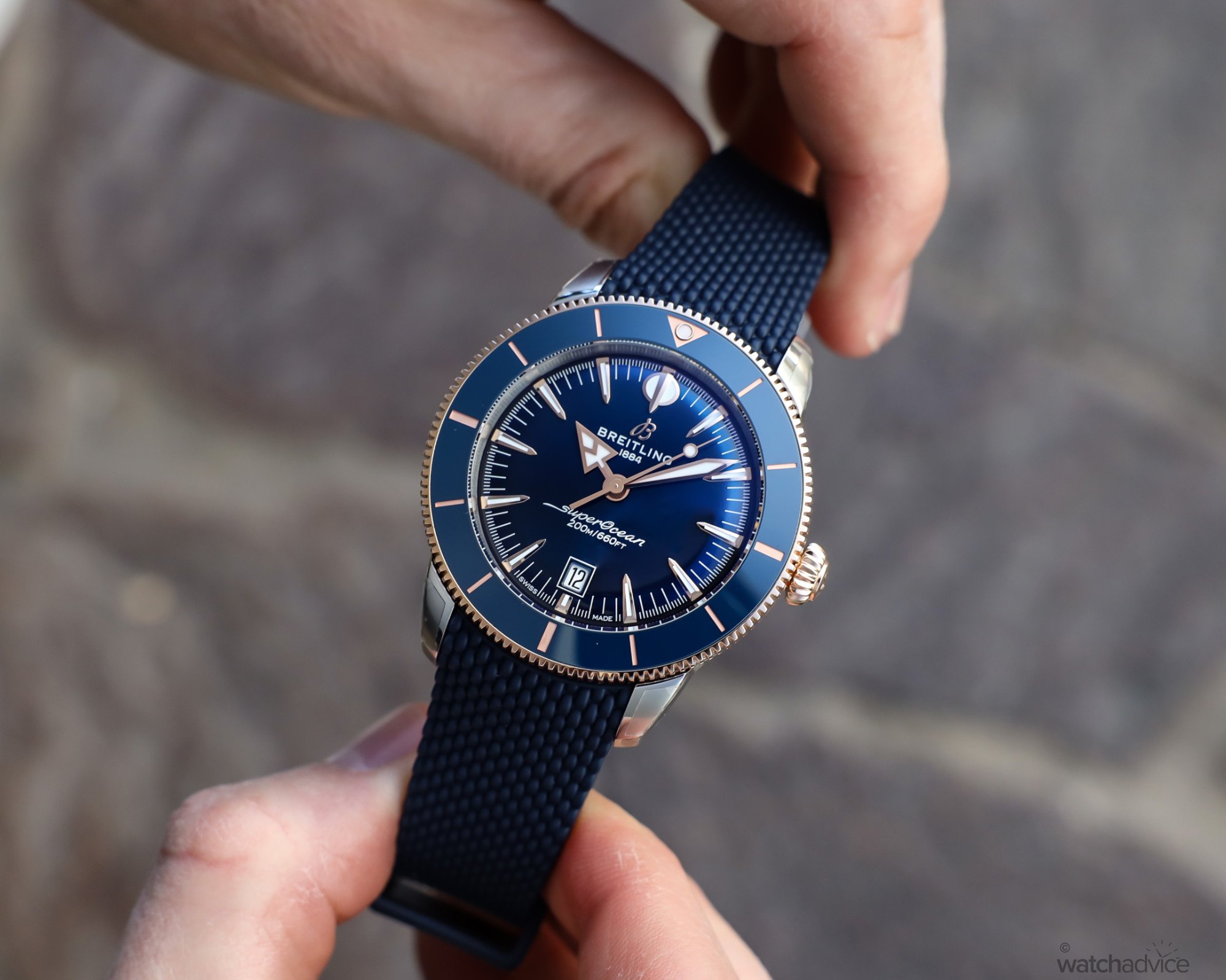
The main changes on the dial are the style of the hands and indices. These all give the new SuperOcean collection a look that resembles the 1957 model, but not exactly, so it doesn’t take away from the modern iteration of the SuperOcean ’57. The hour hand is styled like the 1957 version, the 12 o’clock hour marker is now the art-deco style and the hour markers around the dial are also now fully lumed like the original, as opposed to the lume pips next to the indices on the previous models.
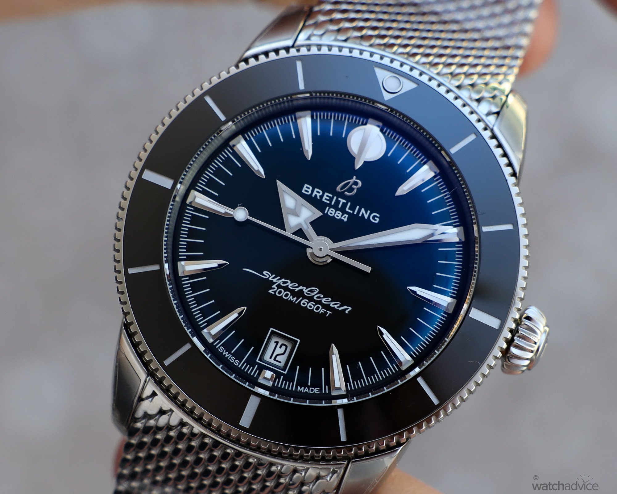
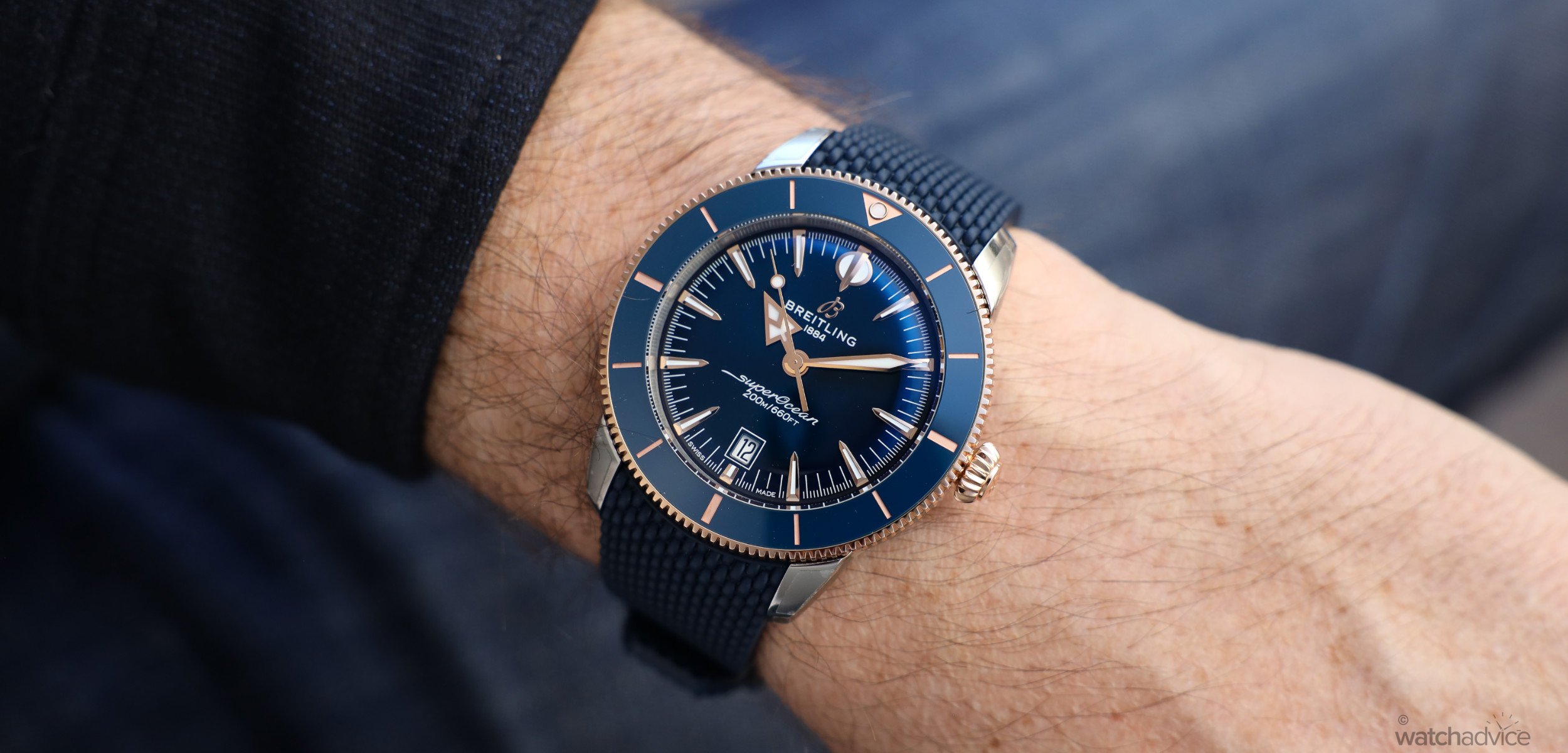
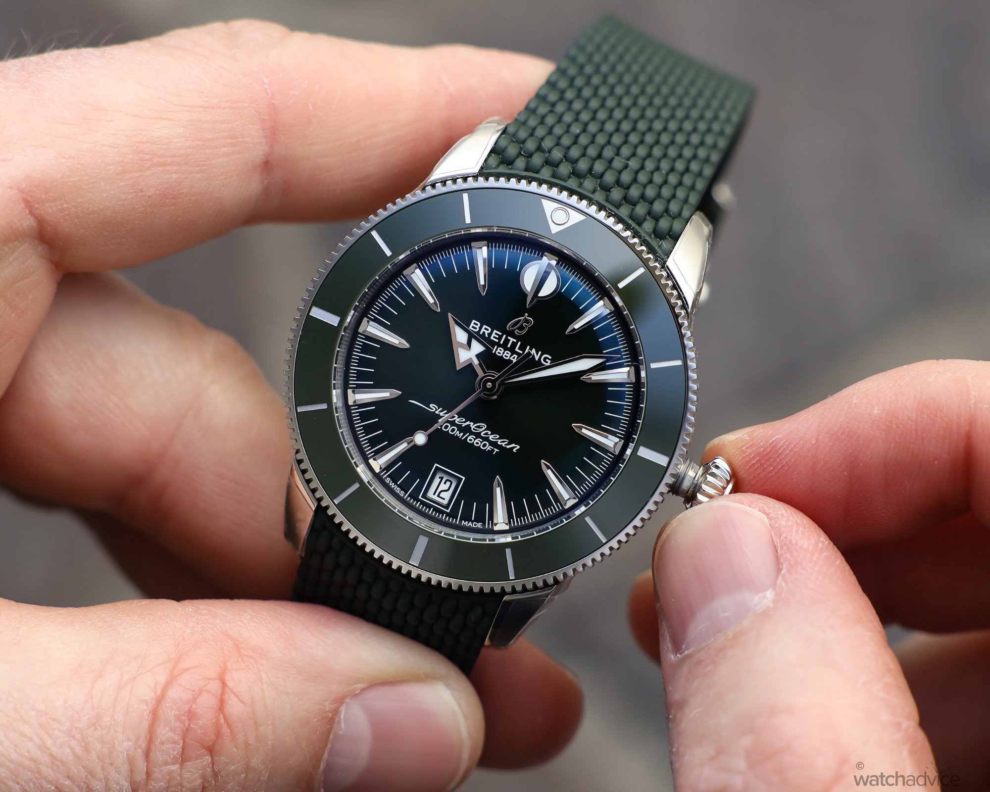
The cases across the range are now a little more refined and form-fitting. The major difference is the sizing, as you have a choice that will fit most wrists: 44mm, 42mm, 40mm and a smaller 36mm that is more aimed at females in both the size and colours. Added to this, the rubber strap as well as the steel bracelet now fit into the case with a curved end, like the 1957 model, as opposed to the previous variant with a straight end and spring bar. It is a small change, but it makes a difference from a visual perspective and as I’ll talk about later, how it feels on the wrist.
Still looking at the bracelets and straps, Breitling has made some subtle changes to the design outside of the contoured ends. The mesh is a little tighter and smoother compared to the previous Milanese bracelet, and this is then echoed in the mesh-style rubber strap, which is also on the thinner side to help with wearability. I’ve owned the previous iteration of the Milanese bracelet, and I can say that hand on heart, the new style does look better and when on the wrist, feel more comfortable as well.
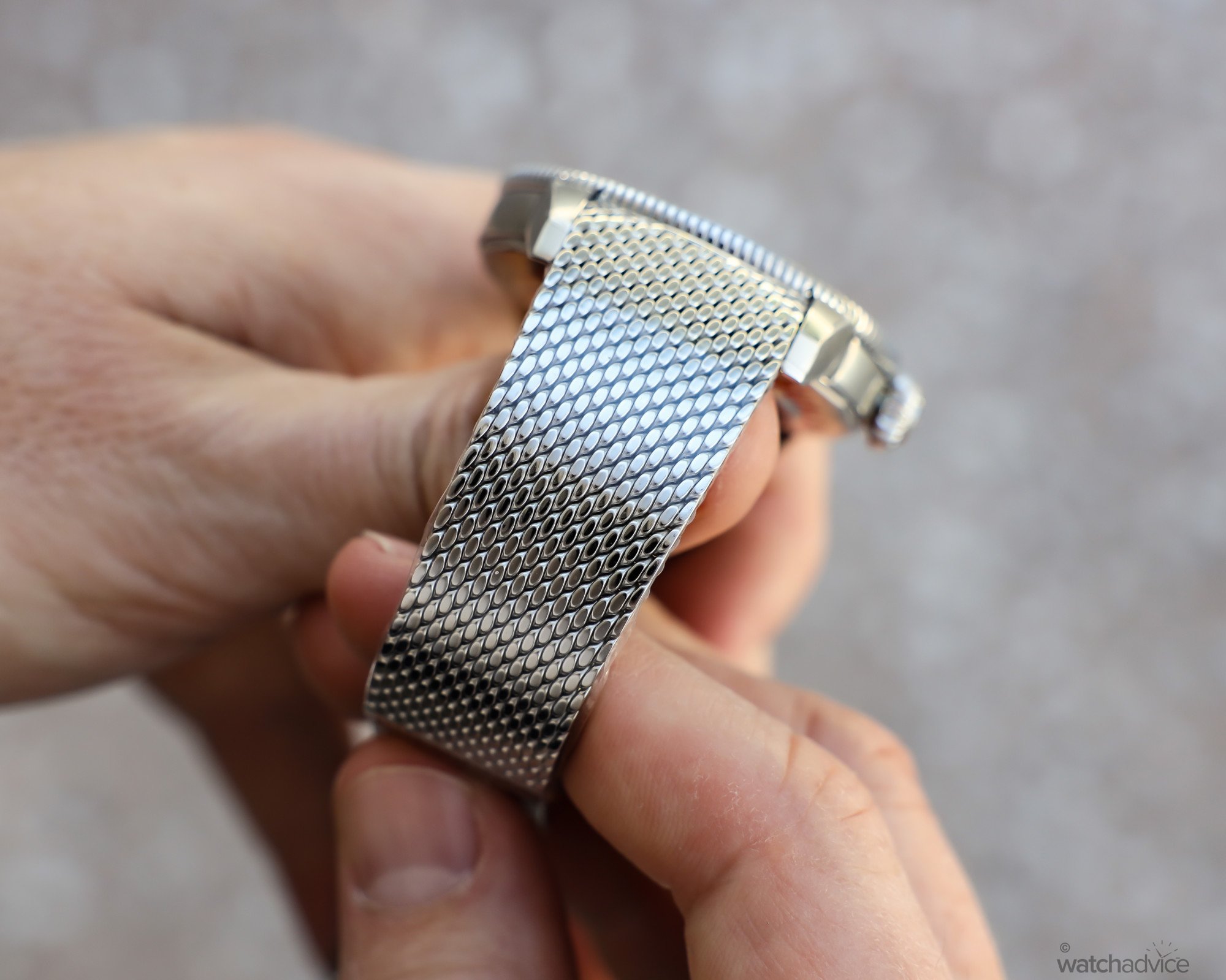
Given the vintage style nods on the new SuperOcean Heritage, the sapphire crystal is now domed like a glassbox crystal to harken back to the 1957 model. This adds to the vintage allure of the new collection, but does have a slight drawback in the fact that it reflects the light on the darker dials at certain angles. This is common on any crystal that has a decent curvature to it, especially with darker dials. My Panerai is impossible, well, nearly impossible, to photograph due to this effect. It isn’t a deal breaker at all, but something that is worth noting should this sort of thing worry you.
How it Wears
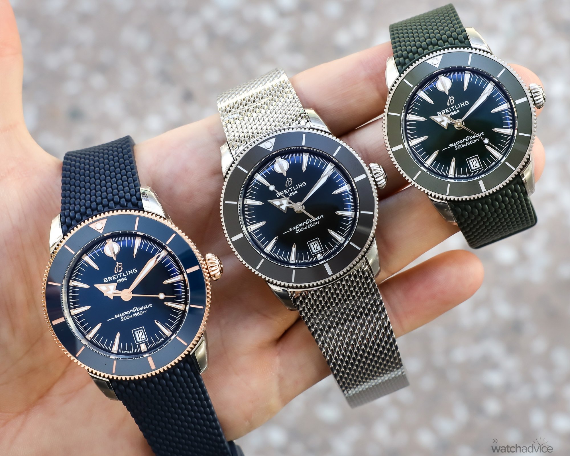
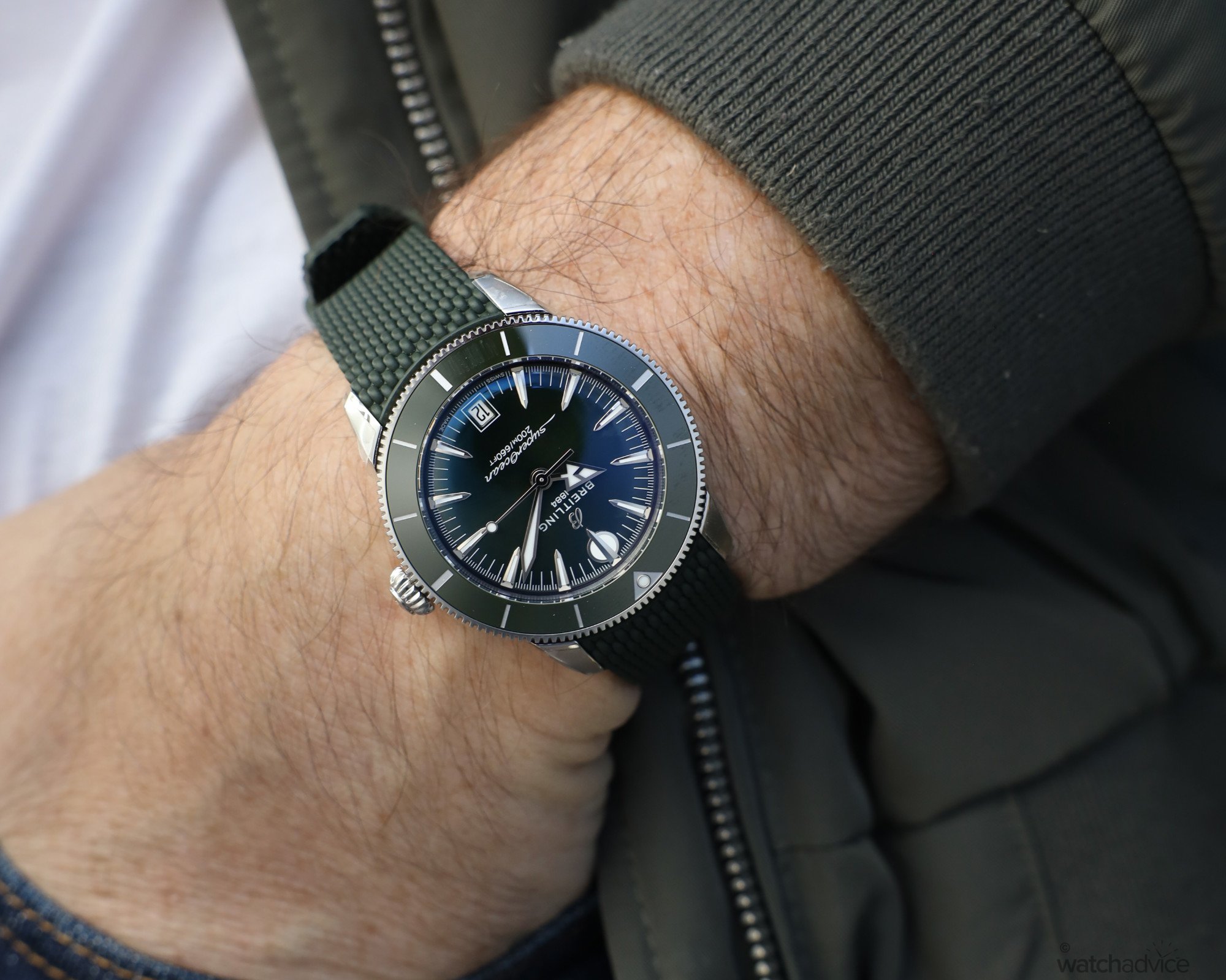
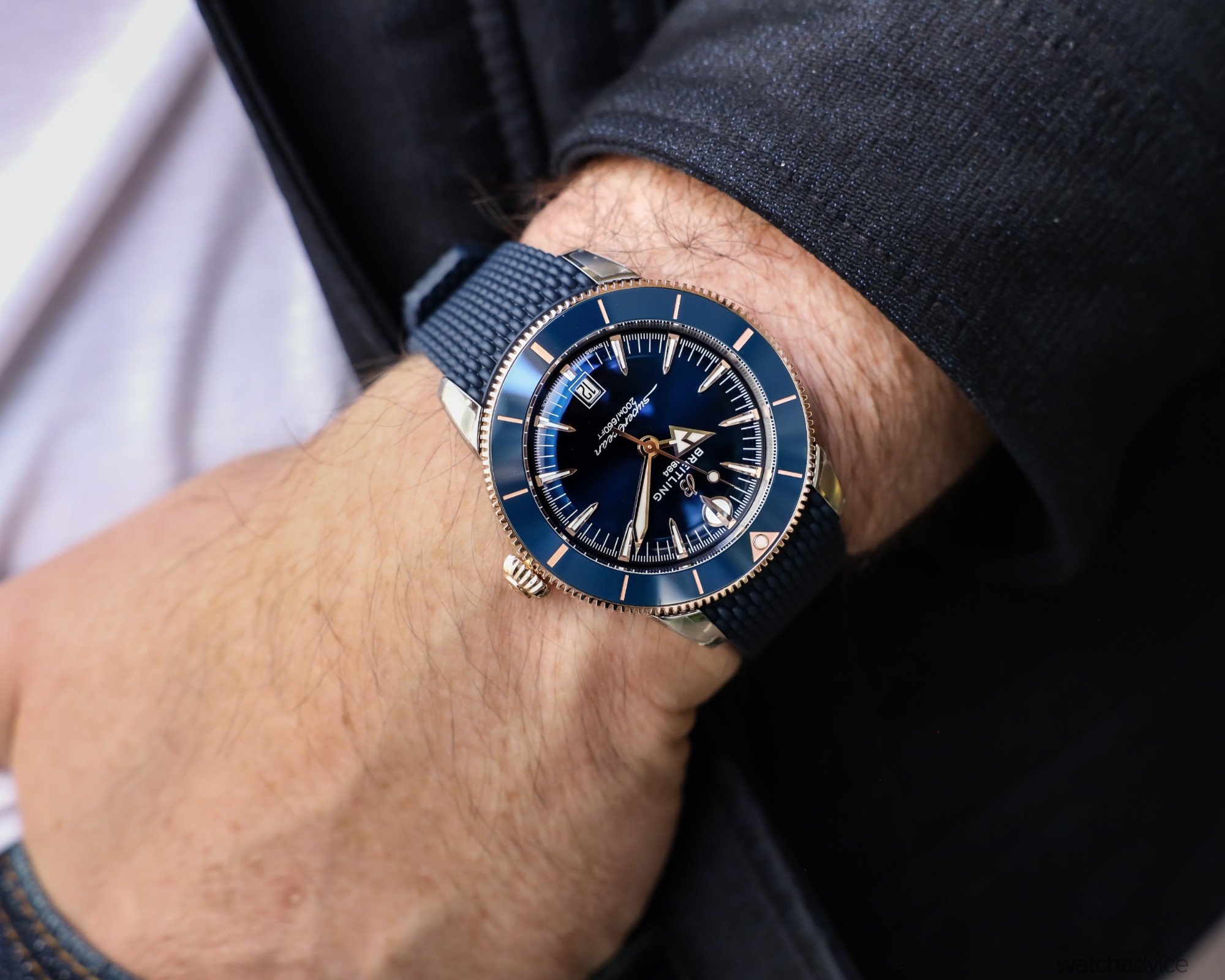
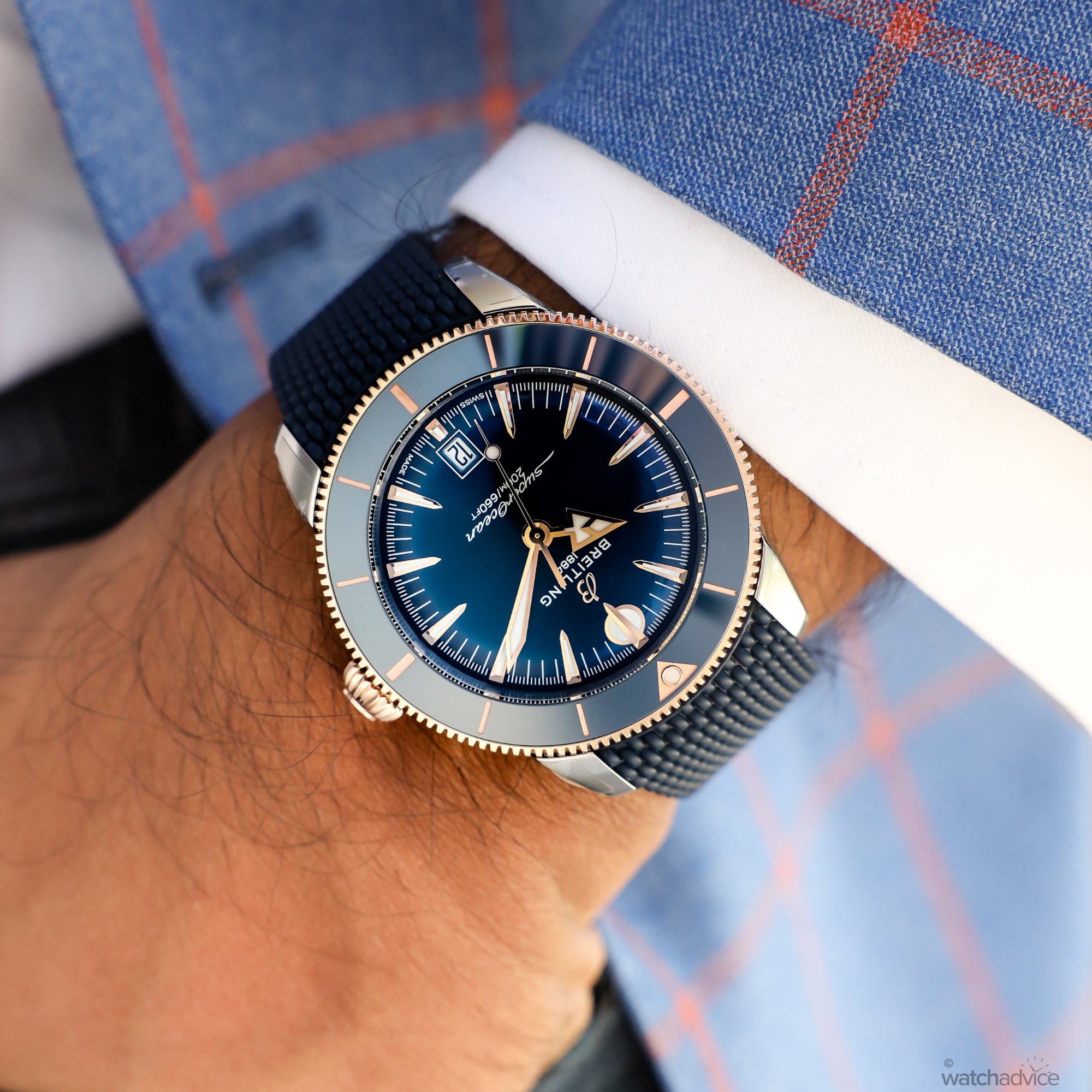
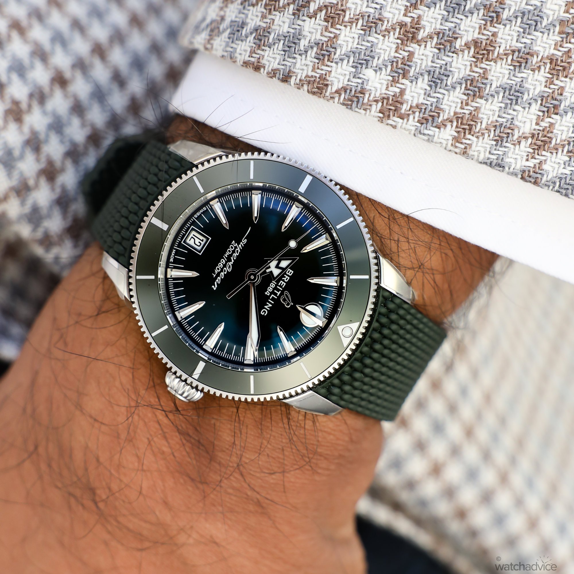
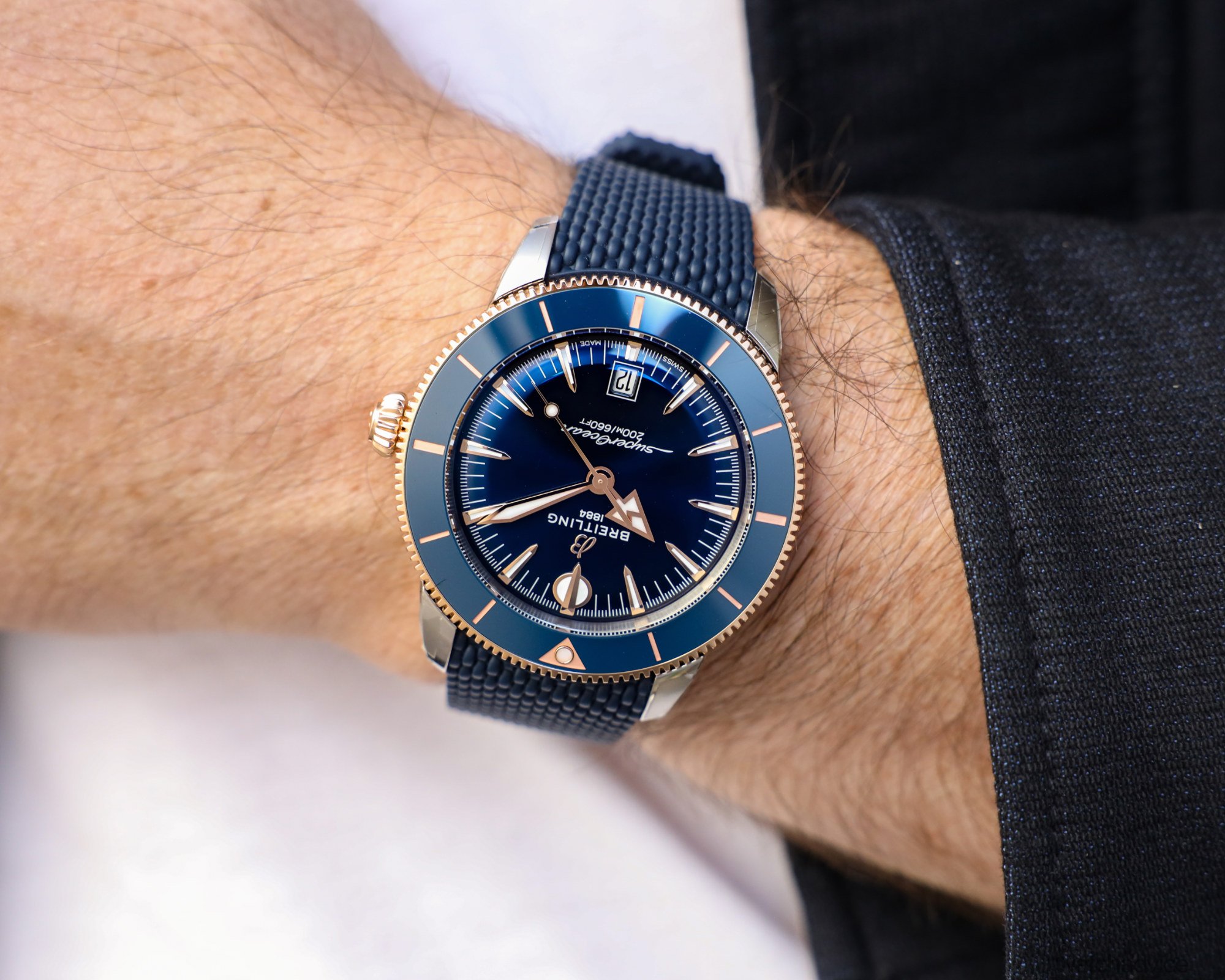
The great thing with having the entire collection on hand is that I could try all the watches out to see which is the perfect size for my wrist, and also which colour and strap or bracelet combo works. In short, all three main sizes wear fairly similarly when on my 17.5cm wrist. The rubber strap and the steel bracelet have a different feel, as you would expect, added to this, gives the watch a different look as well. Below, I’ve shot all three models on my wrist so you can see the size variations of each on my wrist from the 40mm in the green, to the 42mm in the black and the 44mm in the blue and rose gold.
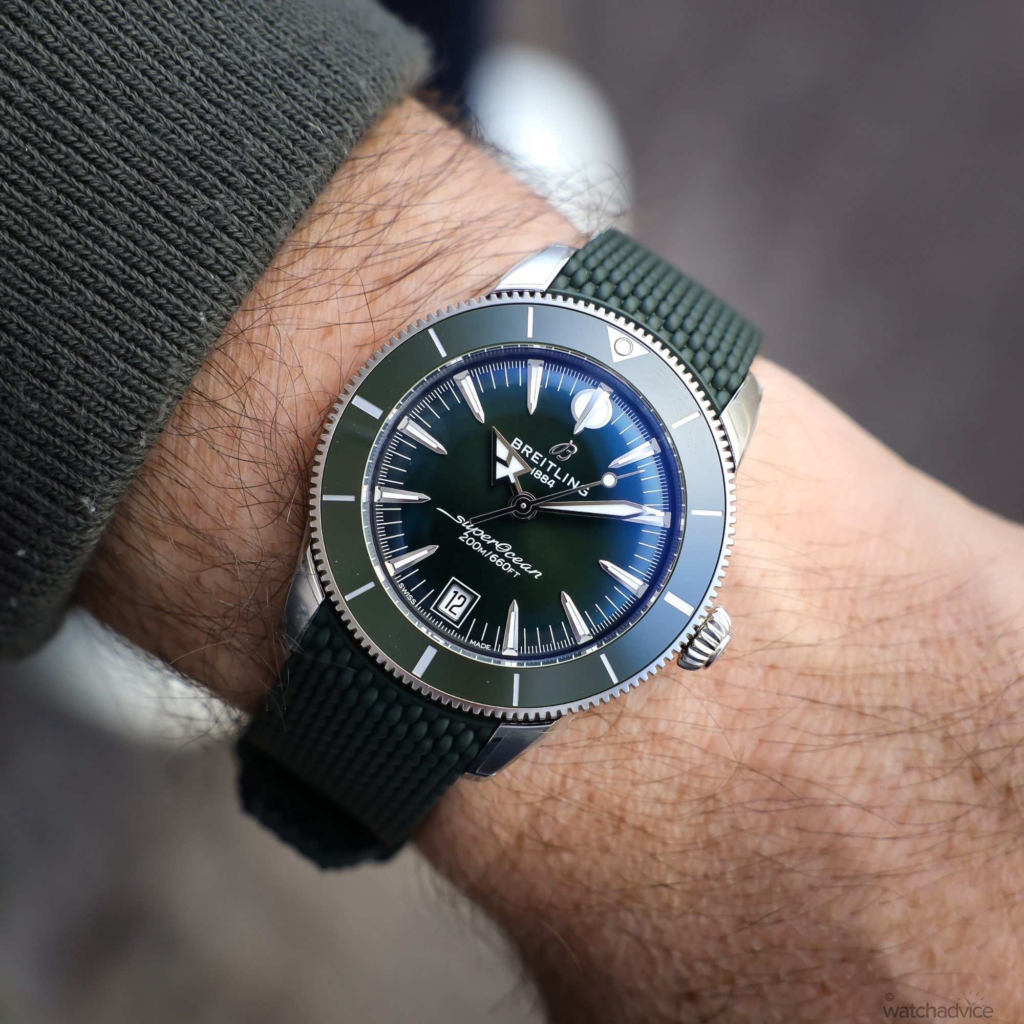
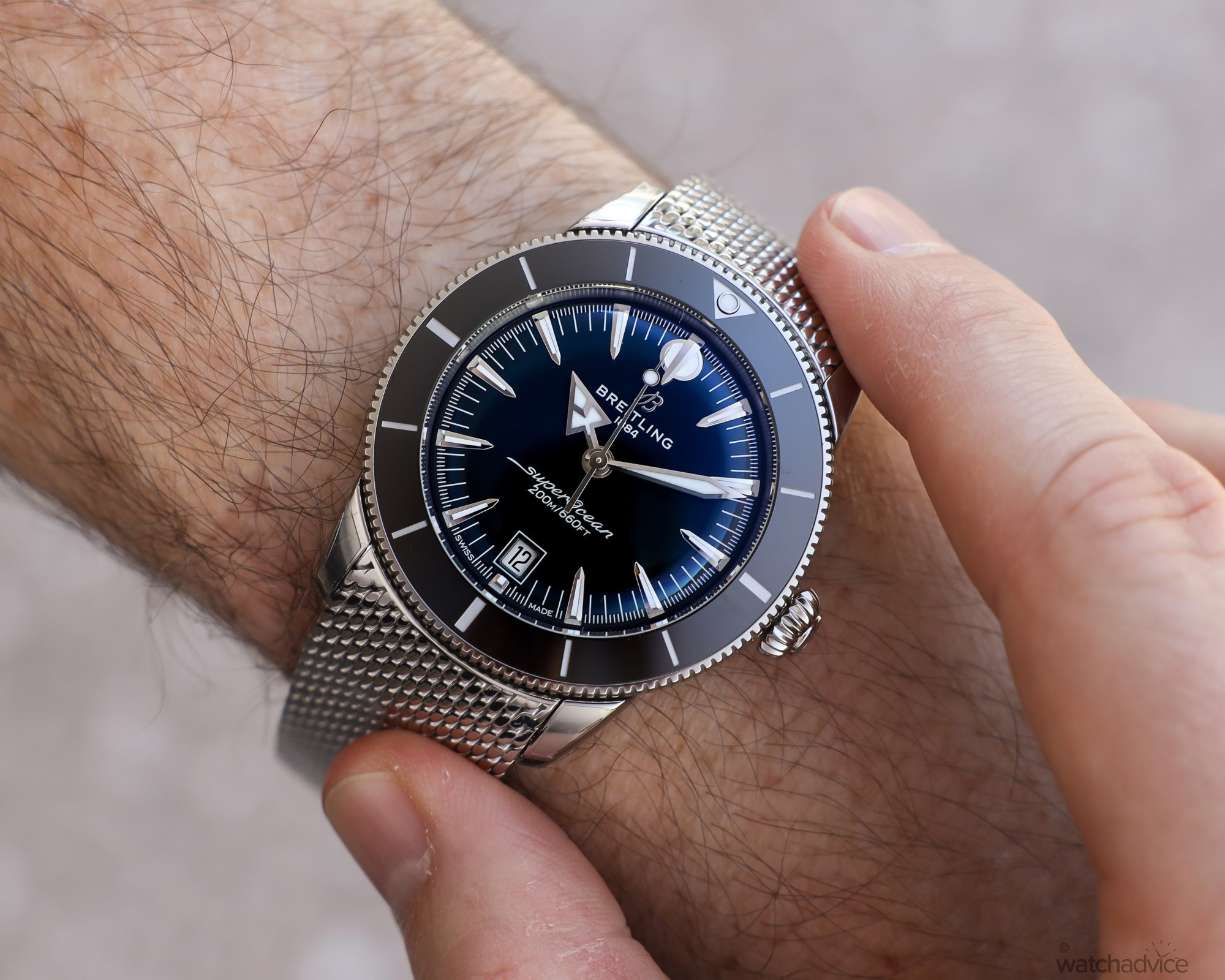
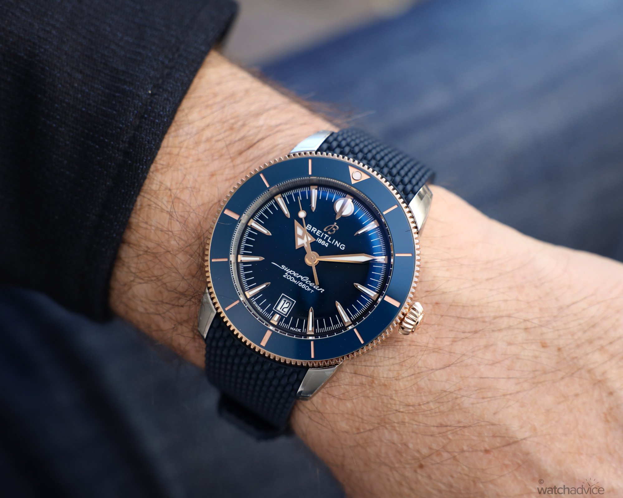
And this is where I’m a little torn between the models. The 42mm was the pick from a size perspective as I felt that it wasn’t too large or too small. The SuperOcean Heritage does wear on the smaller side, so the 40mm felt like it had less wrist presence for my liking, and the 44mm was probably edging towards being on the larger side for my current tastes, but still very wearable for me. But this is all about subjective tastes here. Personally, from a colour perspective, the blue with rose gold ticked a lot of my boxes, followed by the green.
Outside of the sizing, the refinements I’ve mentioned, such as the straps and bracelet improvements, the contouring to the case, a thinner strap and better case proportions, all add up to a better and more comfortable experience on the wrist. The lugs have the right amount of taper to help the strap or bracelet wrap around the wrist with very little flare. This will obviously depend on your wrist size and shape, and of course, the watch size too, but the reality is, unless you have a wrist smaller than about 15cm, then you should be ok. If you do, the 36mm variant will suit you. My one small quibble with the new straps is that the folding clasp design means the strap doubles up on the underside of the wrist, somewhat cancelling out the thinner design in that area. It possibly would have been better to have the deployant clasp on these, the same as on the SuperOcean straps, so you don’t have the thickness of the two straps under the wrist. But this is me nitpicking now.
The colourways on the new SuperOcean Heritage Collection are both a bit of a positive and, if I’m being picky, a slight negative. Let me explain my oxymoronic statement. With the new collection, there are only three colour variants – blue, black and green. So this makes choosing a little easier when compared to the extensive range of colours and colour combinations from the previous collection. It alleviates the paradox of choice, which afflicts all humans once you get to a certain number of choices. This is one reason good restaurants only have a limited number of items on the menu. It’s much easier for the brain to decipher and choose from 5-7 m courses than it is 15. Also, as Breitling has chosen these specific colours, they are all very versatile in design. Black is classic, as is blue these days and the green is a deep green that in some lights can almost be black or a dark grey. So each will work in many settings.
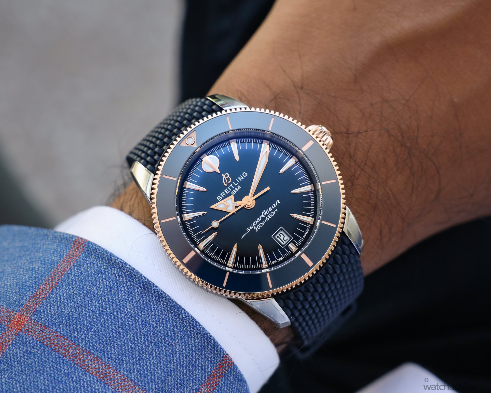
However, this is where the conflict in my mind comes in. The rose gold accents only come on certain colours within each size. So if you love the blue with rose gold, then the only choice is to have it in the 44mm currently. Want the black and rose gold? Then the 42mm is the only variant that has this. And, if you’re looking for a smaller watch, then the 40mm has only the green and blue options.
So this then begs the question, when choosing, are you choosing with your heart or your head? Get the colour that you love, but possibly not in the preferred size? Or, choose the right size and compromise on the colour? Ok, it is very much a first-world problem, but one that I should mention, given this is a review. The good news is that the green and the black colourways are found in all 44mm, 42mm and 40mm sizes.
The Movement
The B31 Calibre is one of Breitling’s talking points for 2025. It is the first time Breitling has made a time-only, or should I say three-hander, as it does have a date. This extends the in-house capabilities of Breitling and adds to the B01 Chronograph and the B19 Perpetual Calendar movements. We have covered this a bit this year with the launch of the Top Time, which was the inaugural watch with the B31 inside, then again last week with the launch of these pieces.
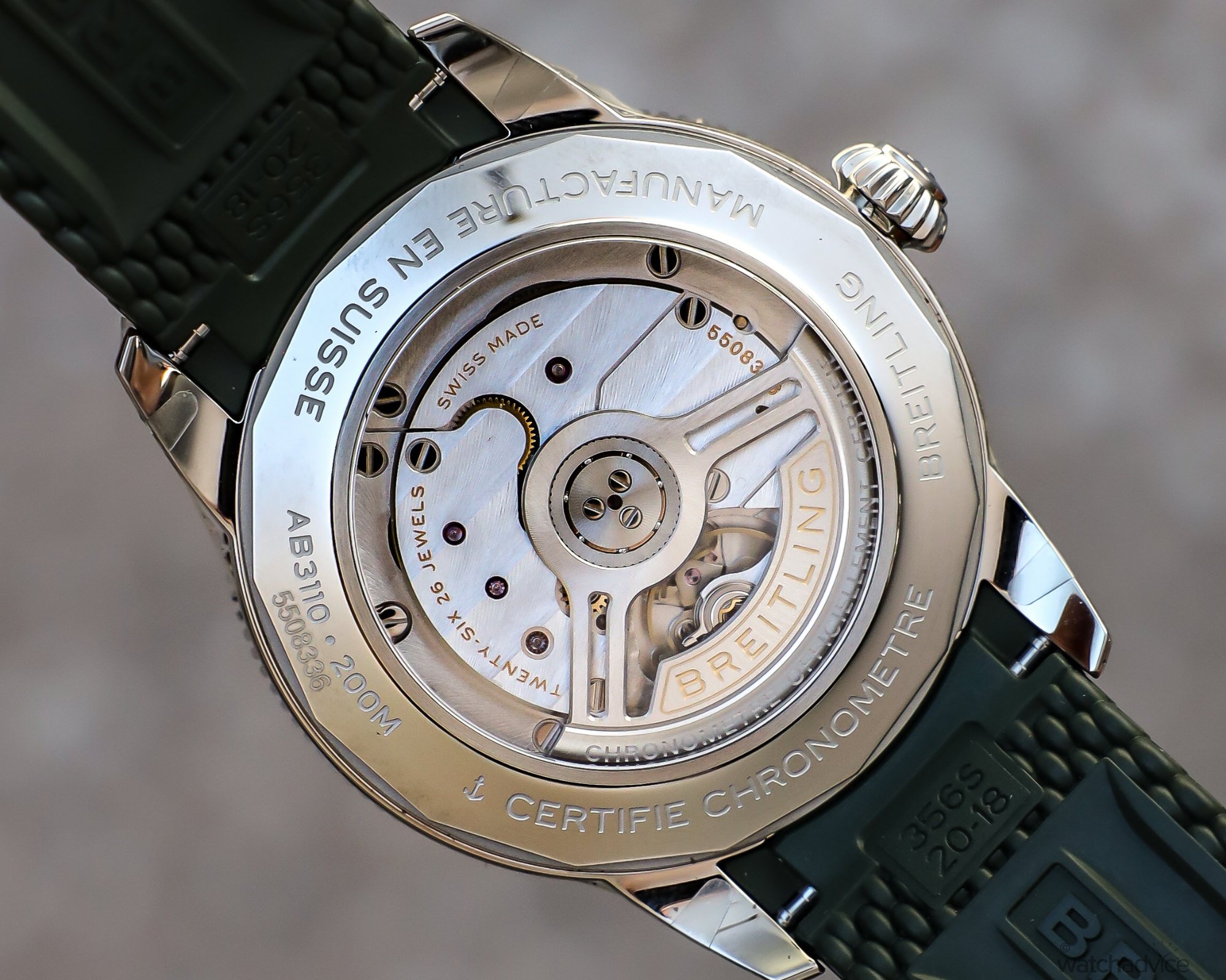
For those who haven’t read about this, let me recap: Breitling’s in-house target is to have around 85% of all production of movements in-house by 2029. Currently, with the introduction of the B31, Breitling is now producing around 65% of movements in-house. While Breitling expands its Manufacture to accommodate the new calibre, high-end movement maker, AMT, is assisting by providing a dedicated line at its facility for Breitling to make some, but not all, of the B31 movements. This means that Breitling can further break away from their supplier partner in Tudor/Kenissi, who has previously supplied the movement for the time and date models.
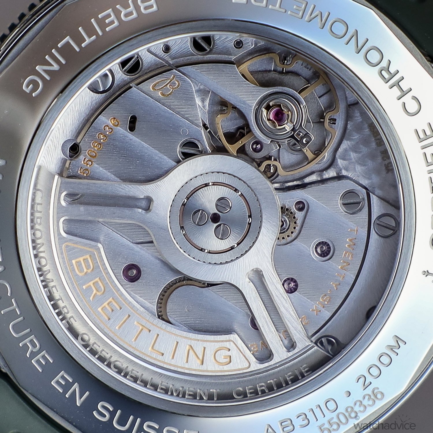
The B31 has a 78-hour power reserve and beats away at 4Hz/28,800 VpH. Inside the caseback, you’re greeted with the typical Breitling decorated bridges, plates and oscillating weight. The other fun fact about the B31 movement is, it also undergoes testing equivalent to 16 years of use: 100,000 crown winds, 3,456,000 weight turns, and 60,000 shocks at 500 G, among other extreme challenges. This is one way Breitling ensures the robustness of the movement, not to mention that it, like all Breitling movements, is COSC certified.
Final Thoughts
When it comes to the ocean, what you see on the surface vs under the waves are two different things. Just like the ocean, the new SuperOcean Heritage Collection at first glance doesn’t look like a whole lot has changed, but dive under and you see a whole lot more! Metaphors aside, great watches are not made overnight; they are made over decades. Small refinements every now and then as the years go by ensure that design progresses without being at the expense of its heritage. Many iconic watch brands have done just this, and as a result, are the names we all know and love. I feel here that the Breitling SuperOcean Heritage is one of those collections that is now having a bit of a renaissance of sorts, and the small changes are making some major improvements.
Overall, the colourways work well and are classic, so you can’t go too wrong with them. The dial changes are welcome, especially the lumed indices that give the watches more visibility at night. The nods to the 1957 model work well with the designs without crossing boundaries of the modern SuperOcean ’57 and are great, versatile sports watches that you can truly wear from the boardroom to the beach. Price-wise, I feel these are all priced fairly. We all know that luxury watches have risen over the last few years, as has everything in life post COVID, but with the new models, you’re able to get an in-house calibre with 200m water resistance and great design and good looks for around A$9,000 – a little less on rubber, a little over on steel. This puts these squarely between the Omega Seamaster and the Tudor Black Bay Heritage, which, in my mind, Breitling sits comfortably.
Stay tuned for Sam’s review on the SuperOcean Heritage Chronograph in the coming weeks!
For all sizings and specs, see our release article here.
For all availability, head to Breitling.com or head into yout local Breitling boutique or authorised retailer.
Full Image Gallery