
The 75th Anniversary Seamaster Professional Diver 300M “Summer Blue” may just be the perfect watch for Summer and we’ve taken it out to see if it really is.
What We Love
- The gradient blue dial
- Comfort factor of the rubber strap
- Wears smaller than stats suggest
What We Don’t
- Colourway could limit it’s versatility across the year
- This version on the bracelet, get the rubber!
- No display caseback on this version
Overall Rating: 9/10
- Value for money: 8.5/10
- Wearability: 9.5/10
- Design: 9/10
- Build quality: 9/10
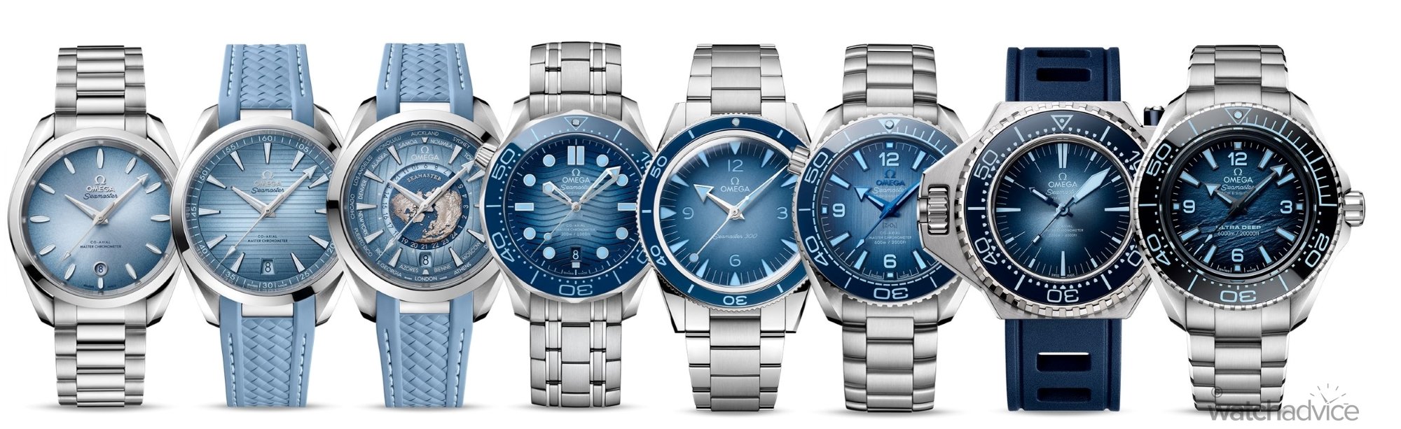
This year marks the 75th Anniversary of the Omega Seamaster, and to celebrate, the brand released the “Summer Blue” Collection in one of the most iconic locations, Mykonos Greece. In a unique move, Omega released a Summer Blue variant of each watch in the Seamaster lineup (which you can read our coverage of here) designed to mimic the Aegean Sea, and the deeper the watch’s depth rating, the darker the blue. It’s a cool concept.
Now it’s Summer here in Australia, it felt timely to take possibly the best-known, and most popular of the Seamster collection, the Diver 300M on rubber strap out and about to see if this is “THE” watch for the Summer.
Initial Thoughts
The Omega Seamaster Diver isn’t an unfamiliar watch for me. I’ve now owned two of them: an original Seamaster Diver James Bond Quartz, and then more recently, the current SMP300 with the black dial and bezel. You can read my Owners Perspective on it here. So a Hands On Review with this is more about the looks of the piece than how it wears, as technically speaking it should wear the same as my black dial version. More on this later.
Back in June, when Omega dropped its new Summer Blue collection, I was lucky enough to get hands on with most of the models in the collection the day after release and Champs and I shot a couple of the standout pieces on the wrist. See the shots below. However, that was Winter, not Summer, and for some reason, they just didn’t feel…right.
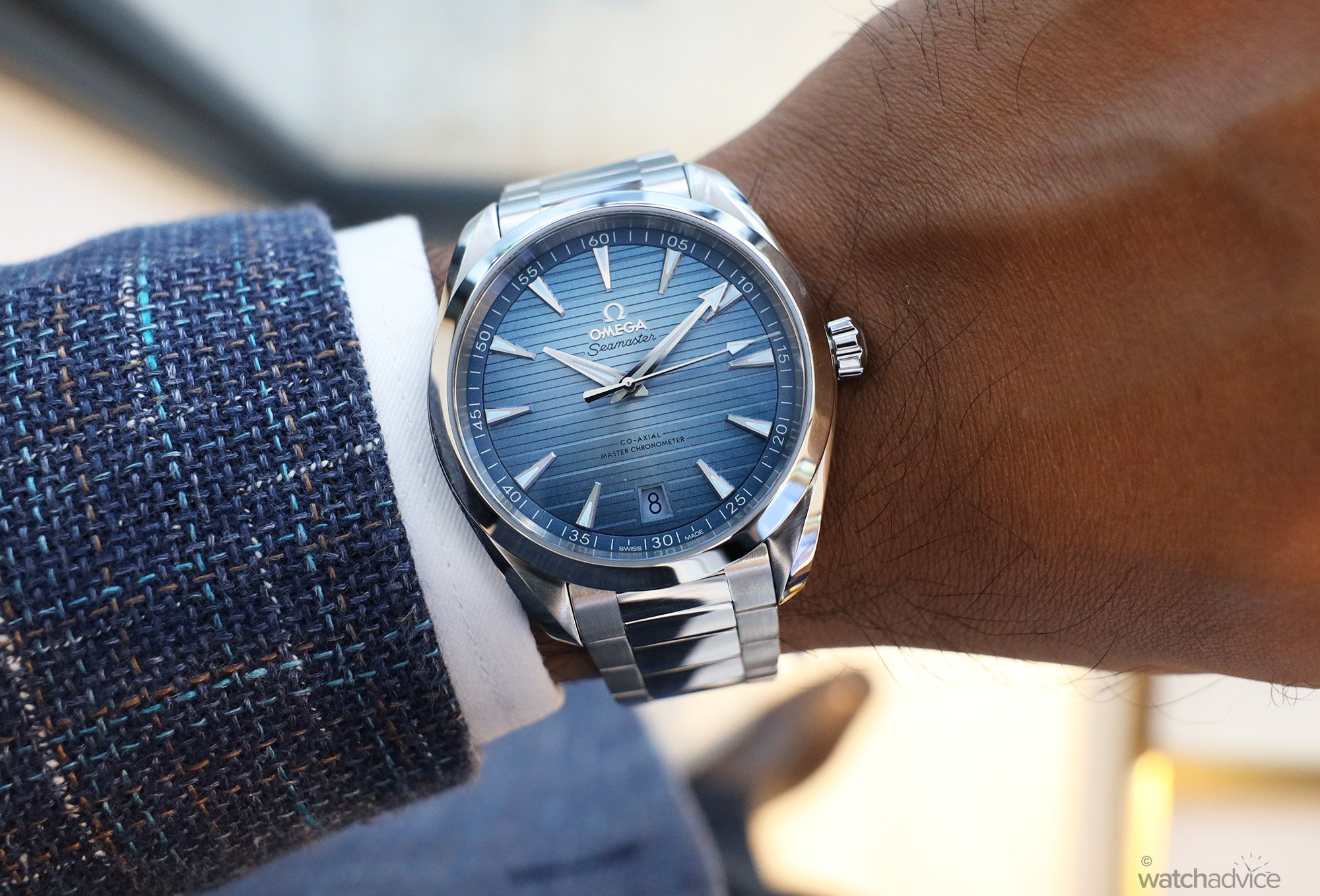
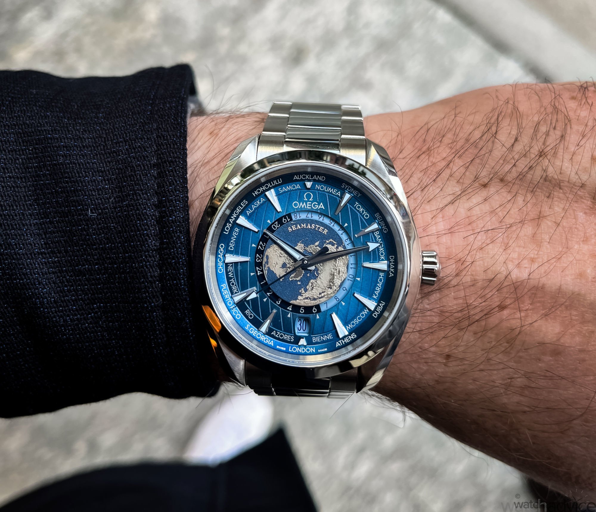
Maybe it was because the idea of a Summer watch in Winter didn’t sit right in my head, or the fact that I was wearing a watch called “Summer” Blue, and it was cold, which was a little paradoxical at the time. Either way, I wanted to come back to them as they did look great. I even toyed with the idea of buying one at the time, but again, it was Winter and I just couldn’t see myself wearing it all that often over the next few months. But in Summer, yes I could, and in Queensland, it’s Summer about 8 months of the year, so I’d have plenty of time to test one out.
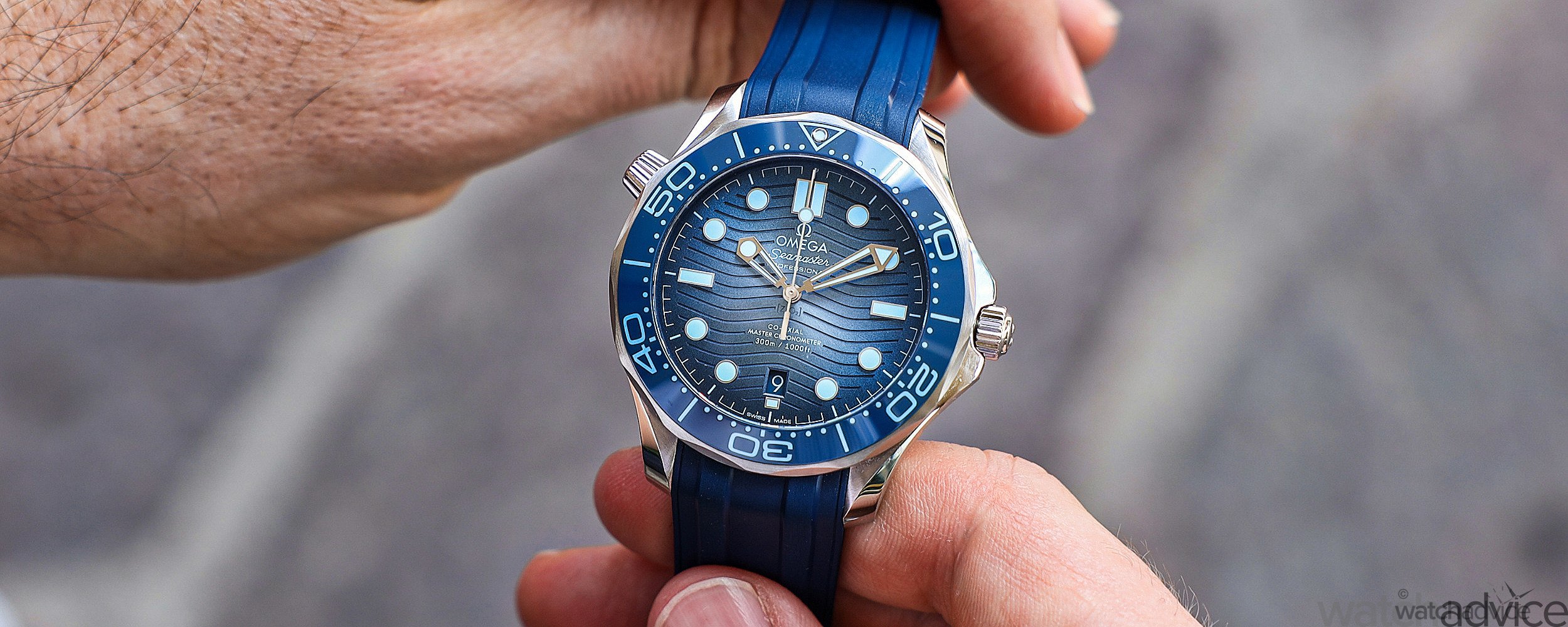
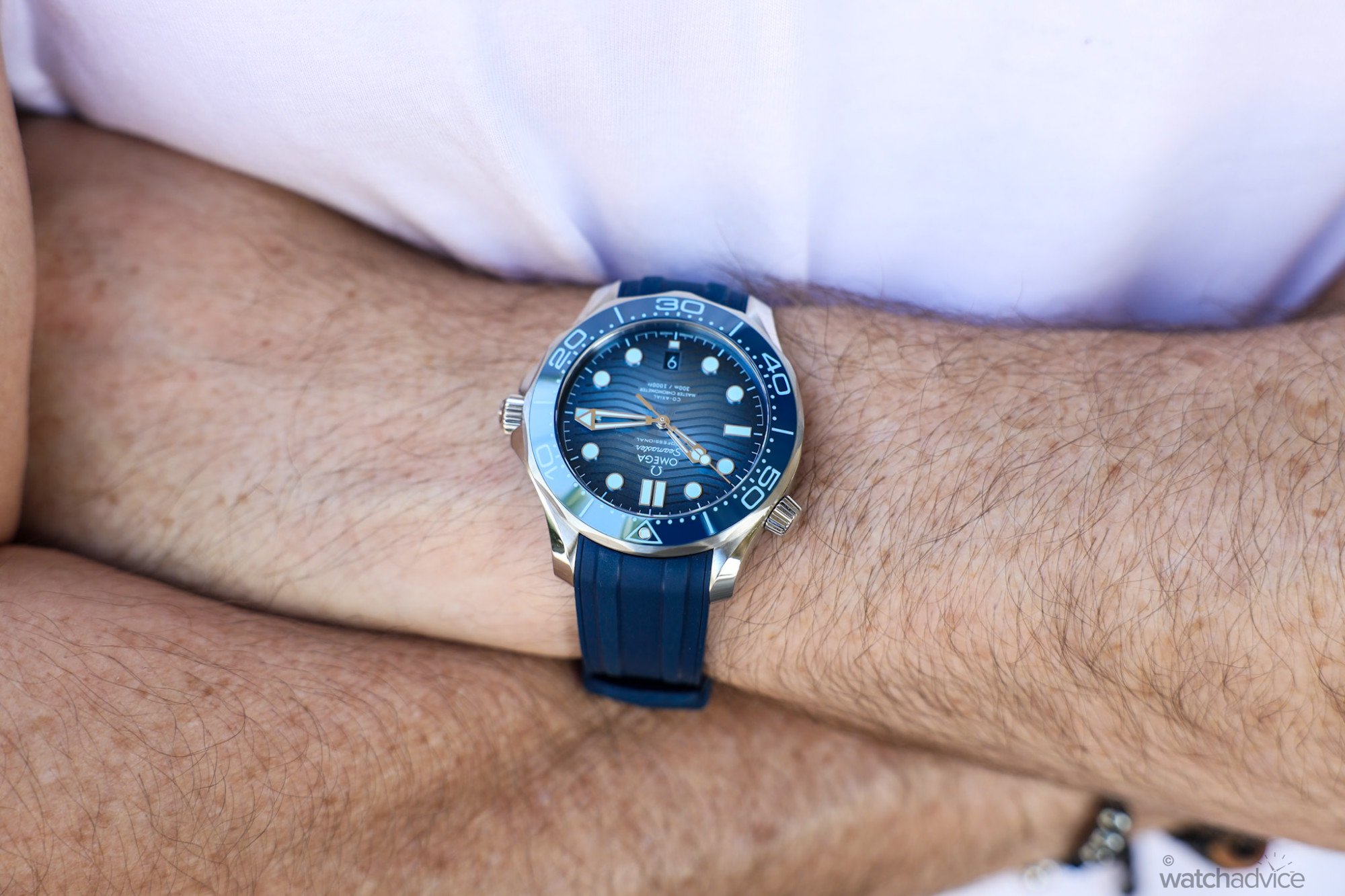
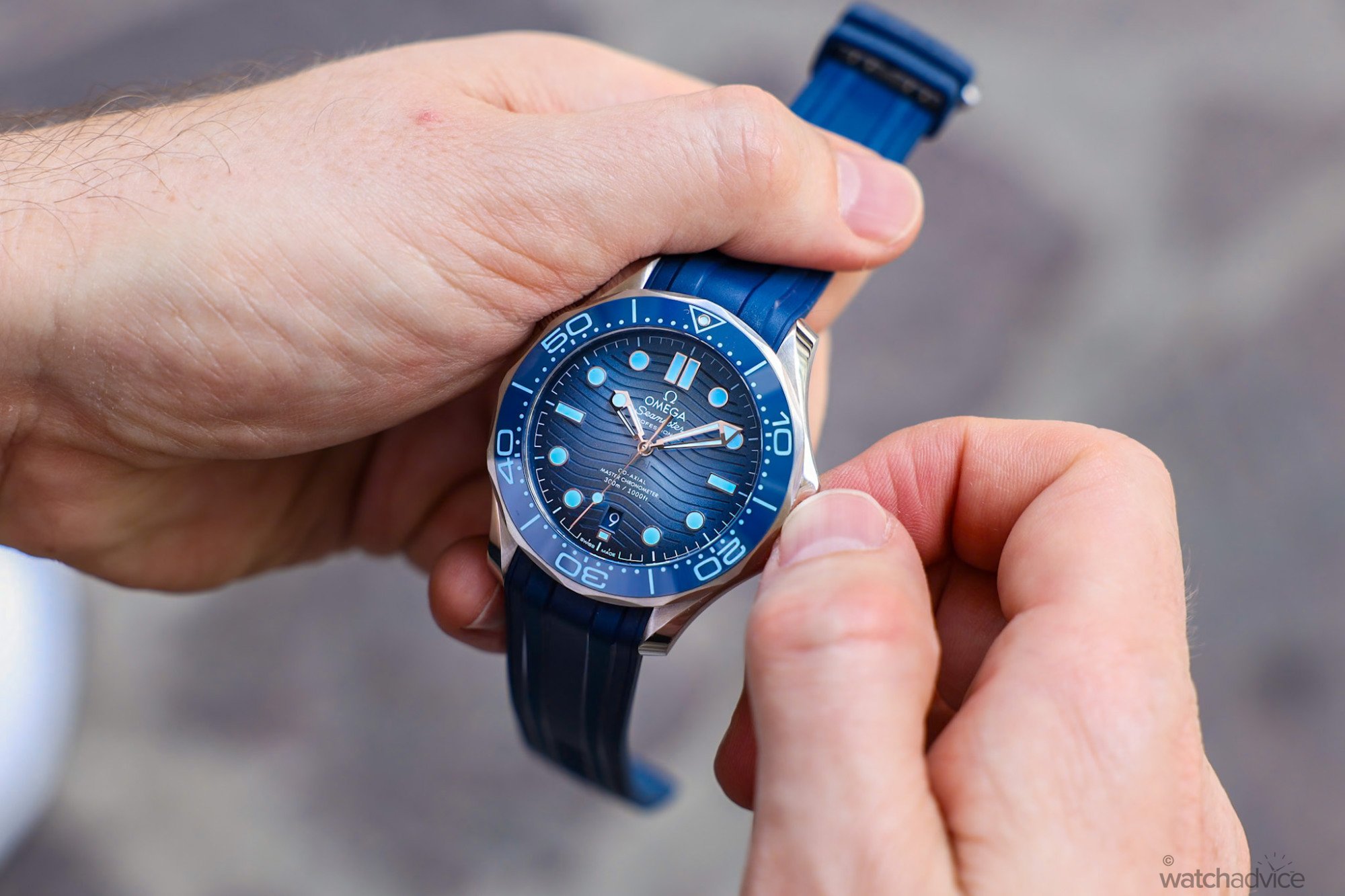
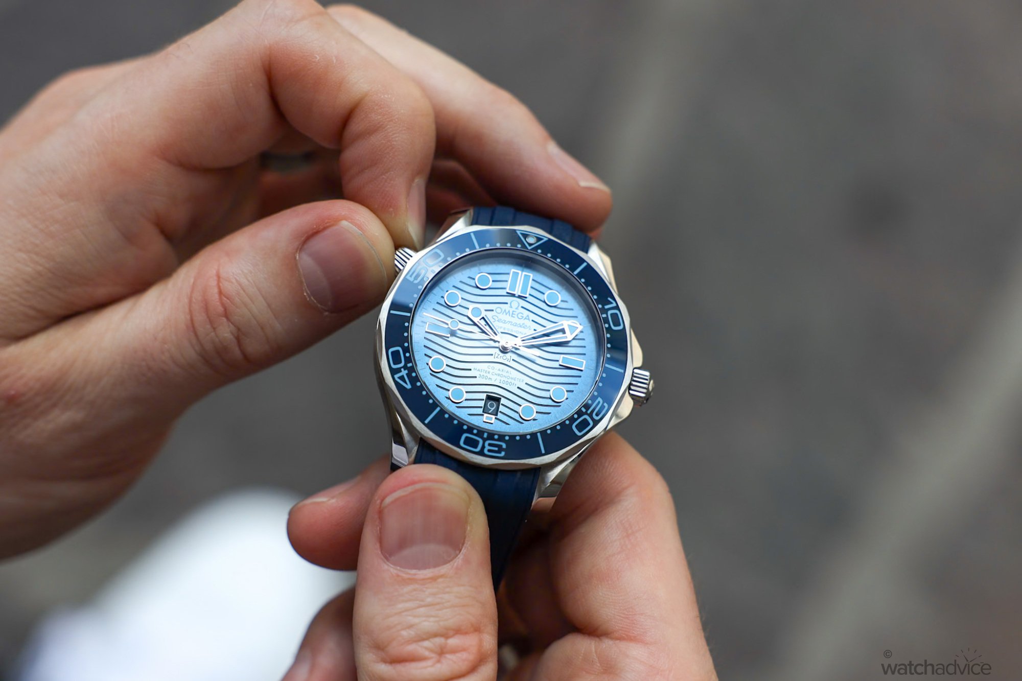
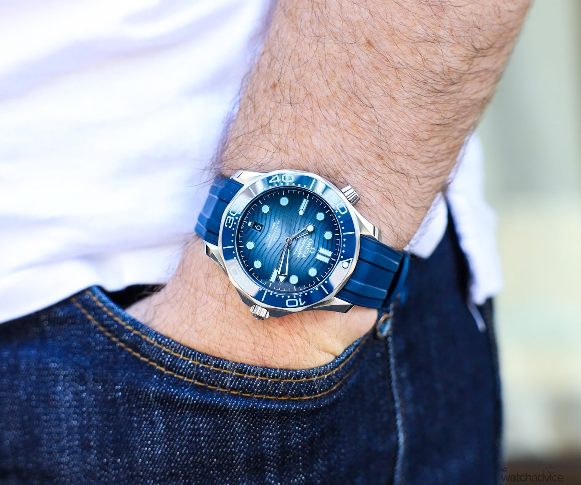
The Seamaster Professional Diver 300M was probably one of the best looking of the collection, and the grainy, gradient blue dial immediately stood out to me. This combined with the blue bezel and blue lumed markers and hands gave this piece something a little extra, and special compared to the standard blue Seamaster Diver. And being a bit of a Seamaster fan, this proved the obvious choice for a review!
The Design
As mentioned, I’ve reviewed the current incarnation of the Seamaster Professional Diver 300M, having owned it on both the rubber trap and steel bracelet, so for the purposes of this, I won’t go into too much detail on the case design etc. You can read about that here. What I wanted to focus on is the aesthetics of the piece as really, this is what Omega has changed for their 75th Anniversary edition.
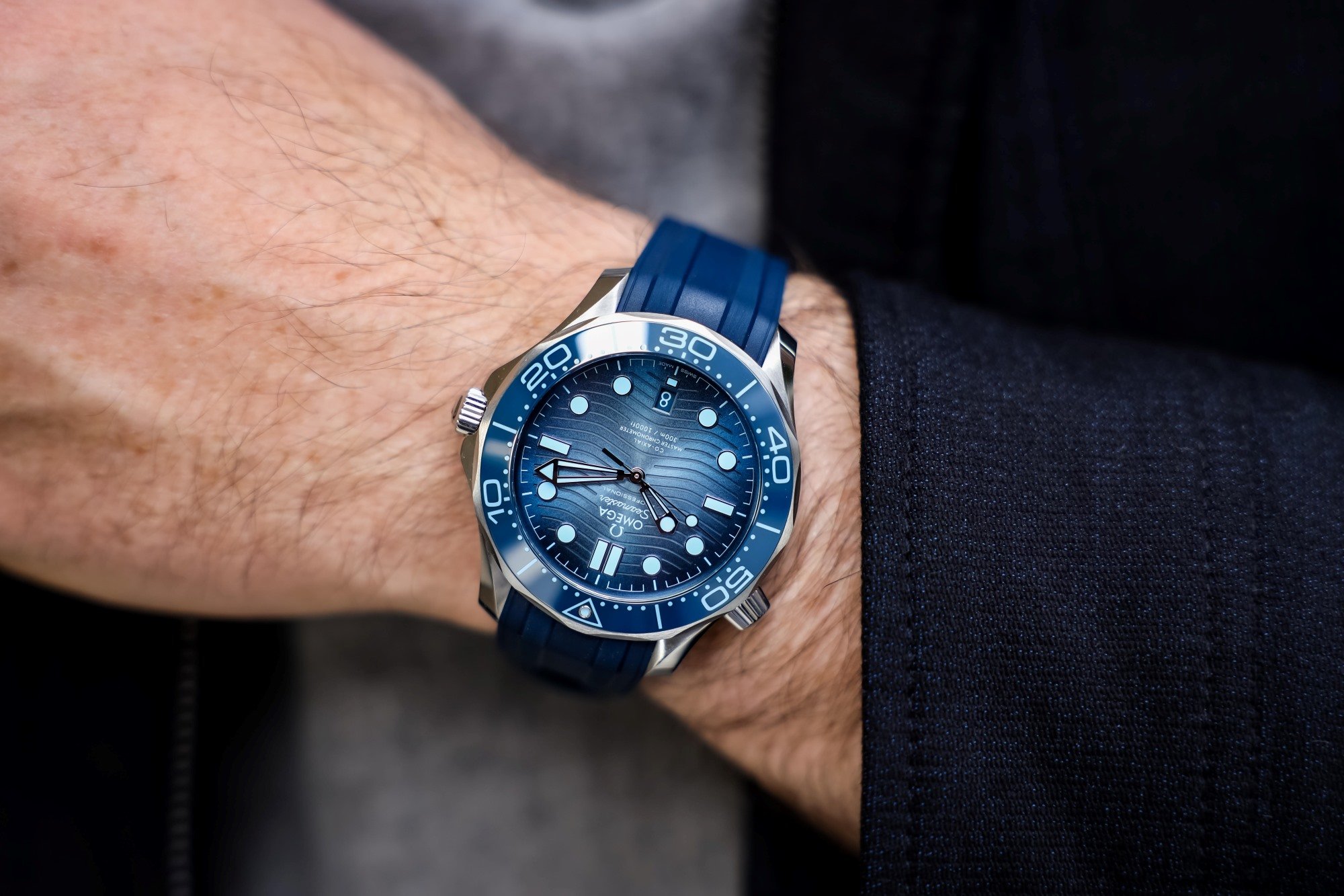
The first thing you notice is that it’s blue. Very blue. From the bezel, bezel markers and dive scale, the dial and even the lume. All are gradient variations of the Summer Blue colour. The only thing not changed is the blue rubber strap, which is the same as you find on the conventional Seamaster Diver. If you’re a blue watch fan, you’ll most probably love it. If you’re not, then you may feel a little too overwhelmed with the colour as there is a lot of blue. But I must say, in the sun, during summer in the heat, this feels right at home on my wrist.
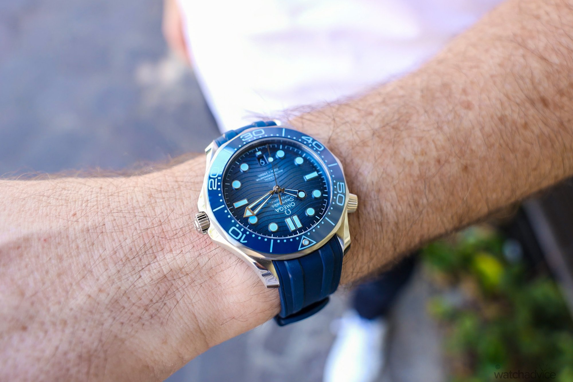
The wow factor for me is the dial. Omega has done a brilliant job with this dial. They have taken the current dial design, which is the polished ceramic with the laser etched wave pattern on the current Seamaster Diver 300M and rather than doing a full summer blue dial in one colour, they’ve given it a gradient blue dial, which starts dark around the edges near the bezel, thus taking the bezel colour and merging it onto the dial, and then slowly, graduating the colour to an almost light blue/grey in the centre.
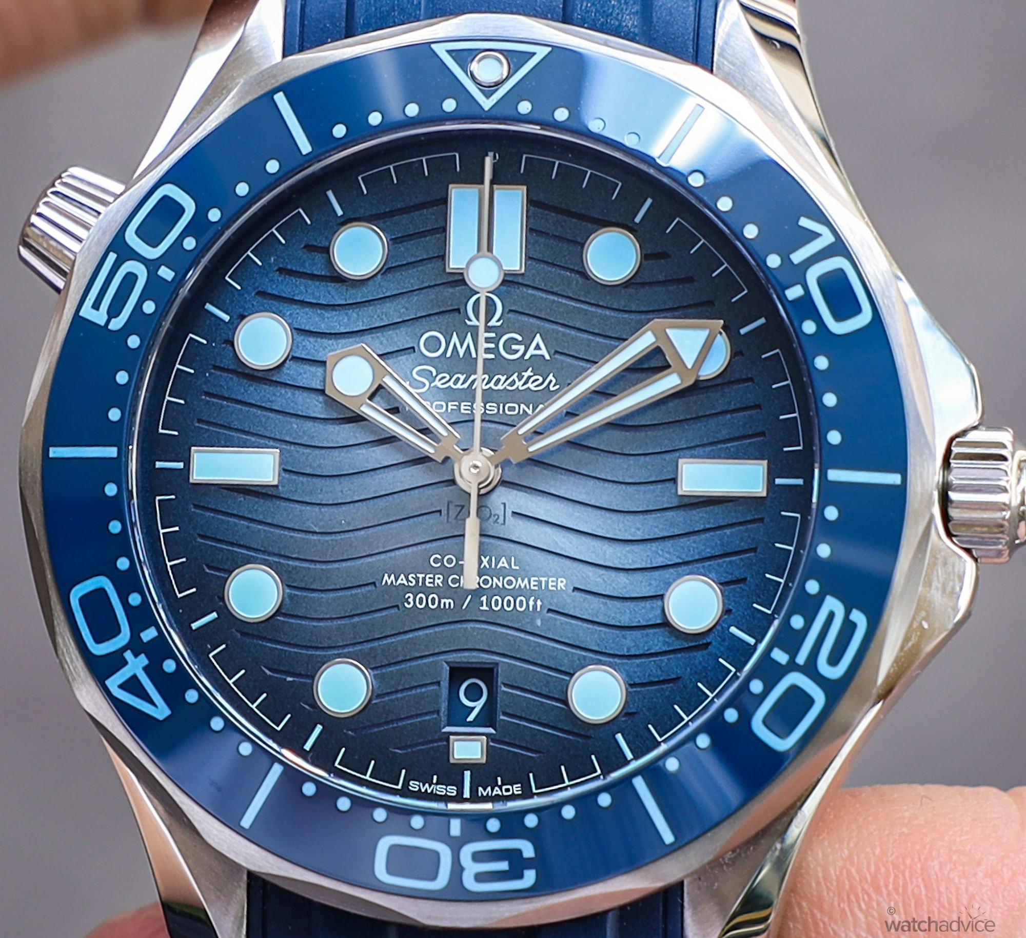
To further enhance this look, Omega has also given the new Summer Blue Seamaster Diver a metallic sheen mixed with a grainy effect dial – whilst not specifically stated by Omega, it feels like they were going for an effect reminiscent of the sandy bottom of the ocean floor. Maybe this is just me being a little poetic, but when I first saw the dial, it’s what immediately sprung to mind. Omega have even colour-matched the date window and writing, so it blends in seamlessly down the bottom of the dial at 6 o’clock.
The case shape, size, look and feel are all that you find in the standard Seamaster Diver 300M, with the mix of brushed and polished steel, chamfered lugs, crown guard and the Helium escape valve on the left side of the case at 10 o’clock. This means if you’re not a fan of the current models, you’re probably not going to love this one. If you are, great, you have a new colour to choose from!
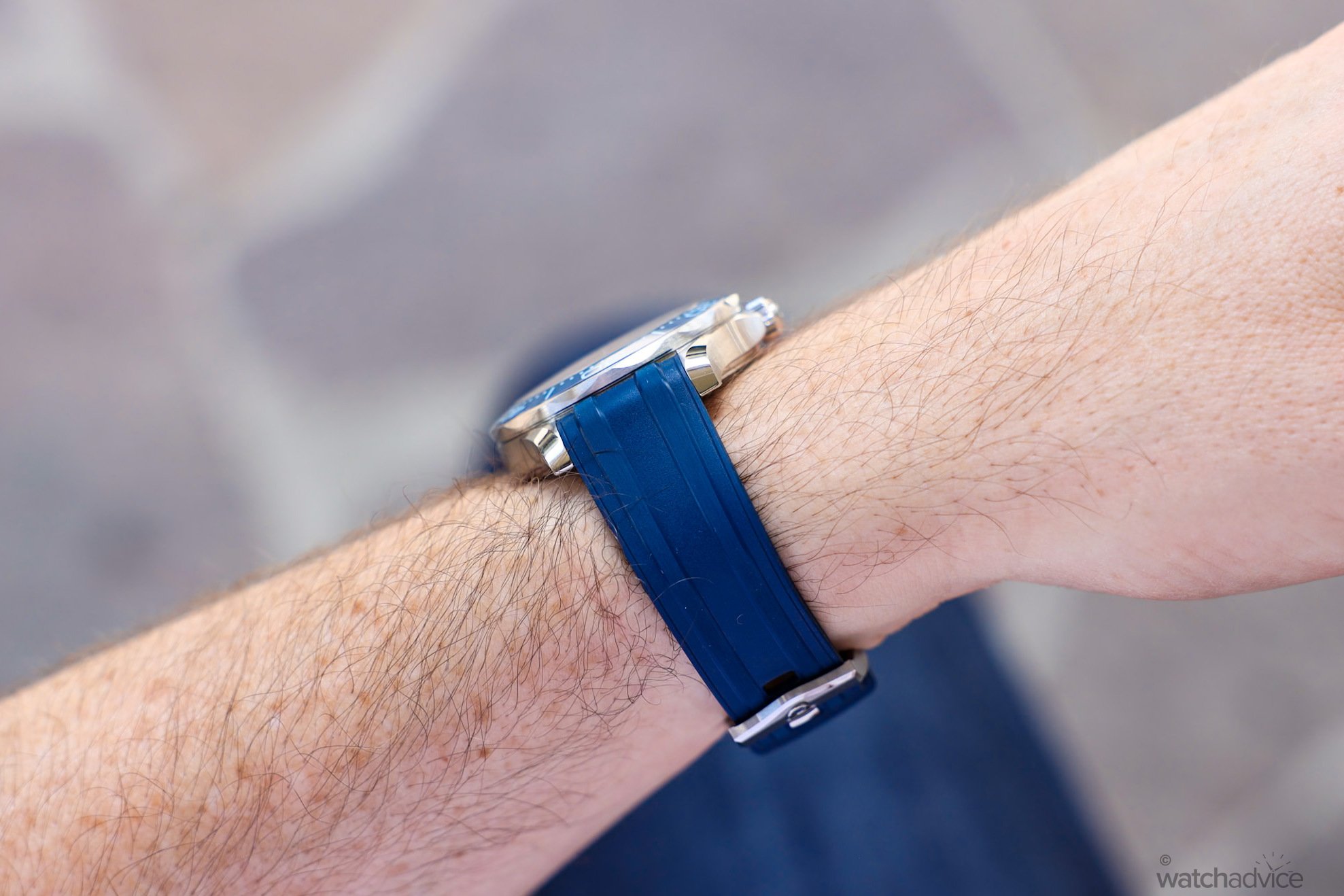
Side profile of the SMP Diver Smmer Blue 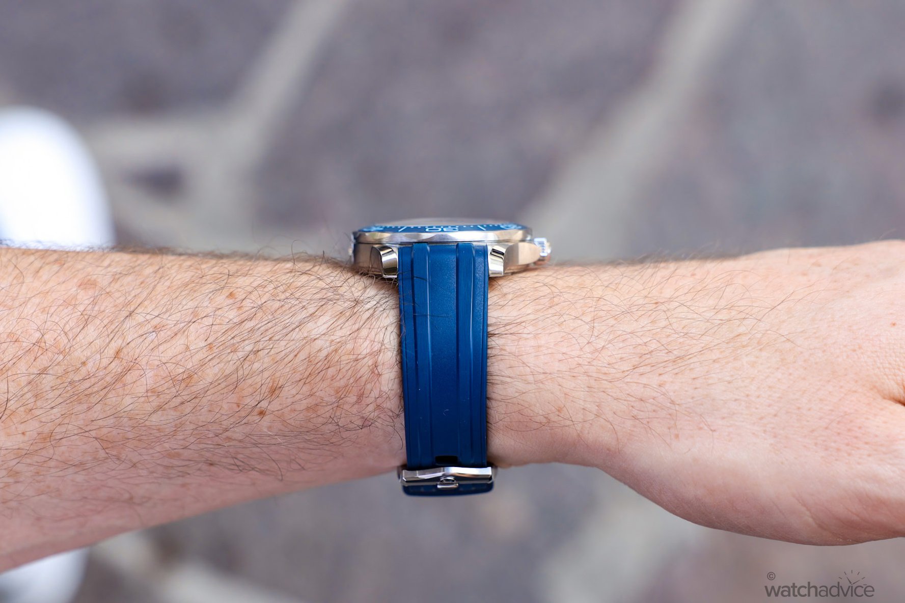
Wears fairly flat and not bulky
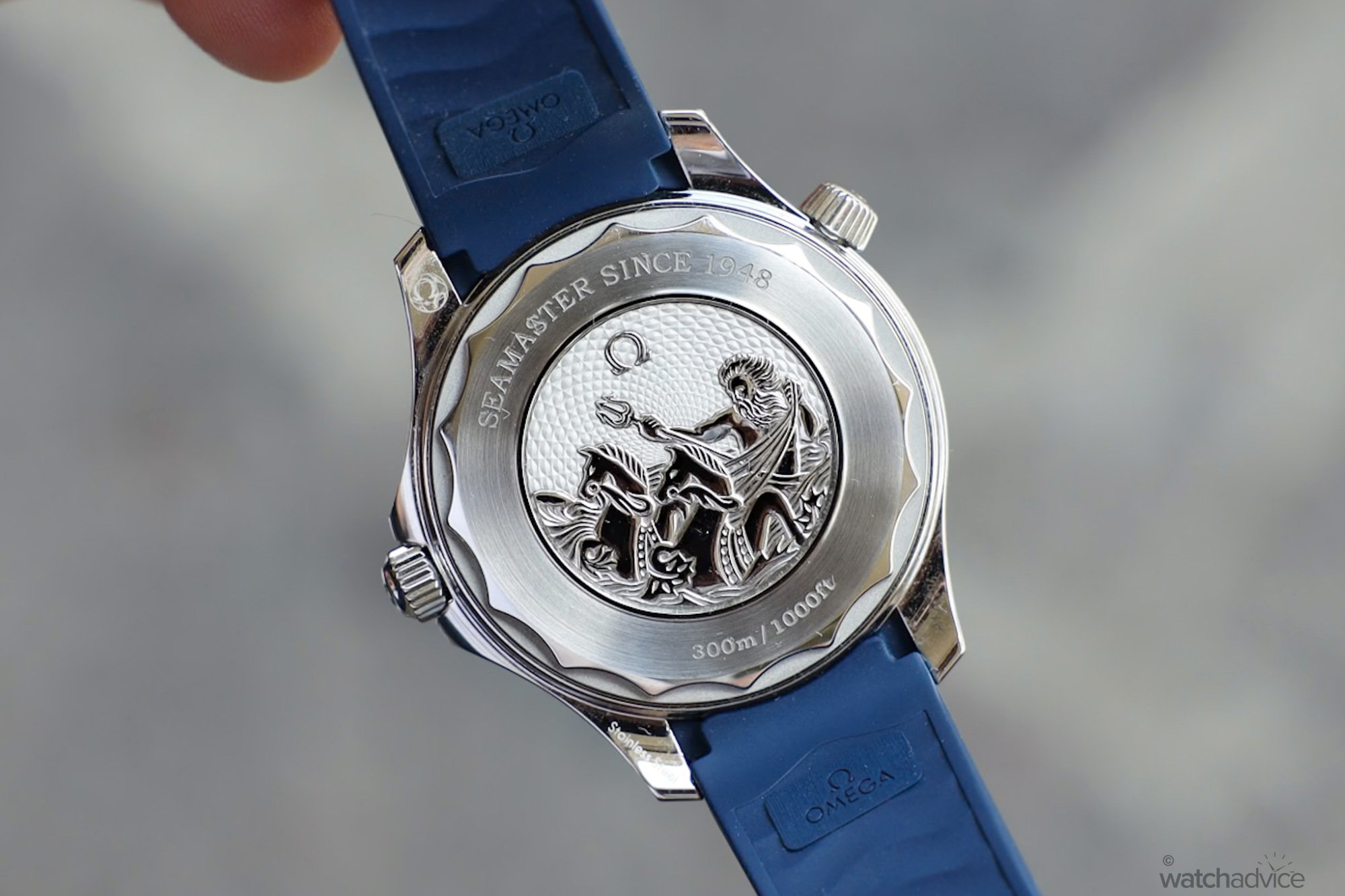
Omega has made one major change to the case, which is the case back. They’ve done away with the see-through sapphire case back and replaced it with an etched motif of Poseidon, the Greek God of the Sea riding two Hippocampus (Half fish, half horse), which is standard across all models in the 75th Summer Blue range. It’s a nice touch, and whilst I’ve heard arguments for and against the see-through case back on a dive watch, I’ll leave you to make up your mind on if this suit or not. I will say this, it does give a nod to the Seamaster’s original Poseidon motif from 1956.
How It Wears
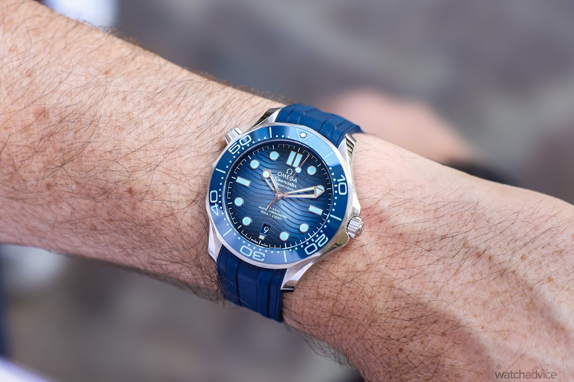
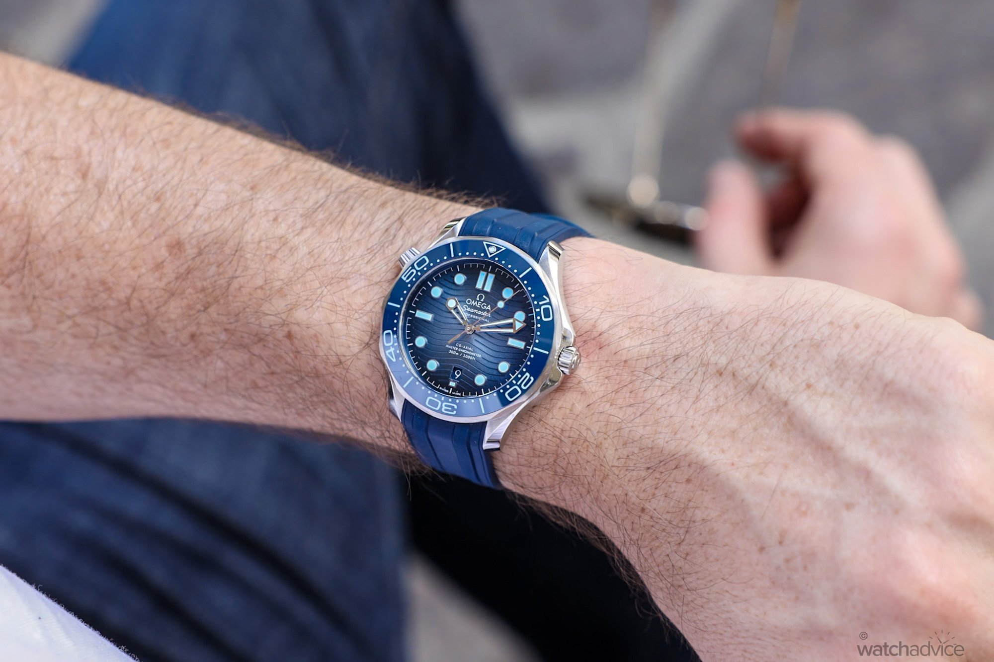
For me, the Seamaster Diver has always worn well. I find the dimensions work well on my 17.5cm wrist. Whilst some people feel that 42mm is large, I find it almost perfect for my tastes and given the design of the case, with no real slab sides, curved lugs and sloped bezel and domed crystal, it almost wears a little smaller. The gradient blue effect on the Summer Blue model helps with this aspect as well. The gradient dial helps to break up the colour and as a result, you’re not looking at one big block of colour on the wrist, but rather shades of, and this helps to draw the eye to the centre of the watch, not the edges. If this was done deliberately, it’s a great play on optics, but I feel it’s more a beneficial bi-product of the design itself.
The rubber strap on the Omega Seamaster is one of the more comfortable rubber straps around. Omega has been able to balance the robustness and quality with a softness that helps the strap conform to the wrist easily. It’s not as soft as a silicon strap, nor should it be, but enough to mould around and not be annoying or irritating. And given Omega are now charging around $540 AUD for the rubber strap and pin buckle, or $900 AUD for the rubber strap and foldover clasp, you would want it to be solid and comfortable. Plus, it’s designed for the watch, fits perfectly, is colour-matched and won’t be in any danger of coming undone with the pin buckle and multiple strap minders with their own security fasteners. The wave pattern on the back also helps it to breathe, and this is what you want in a Summer watch.
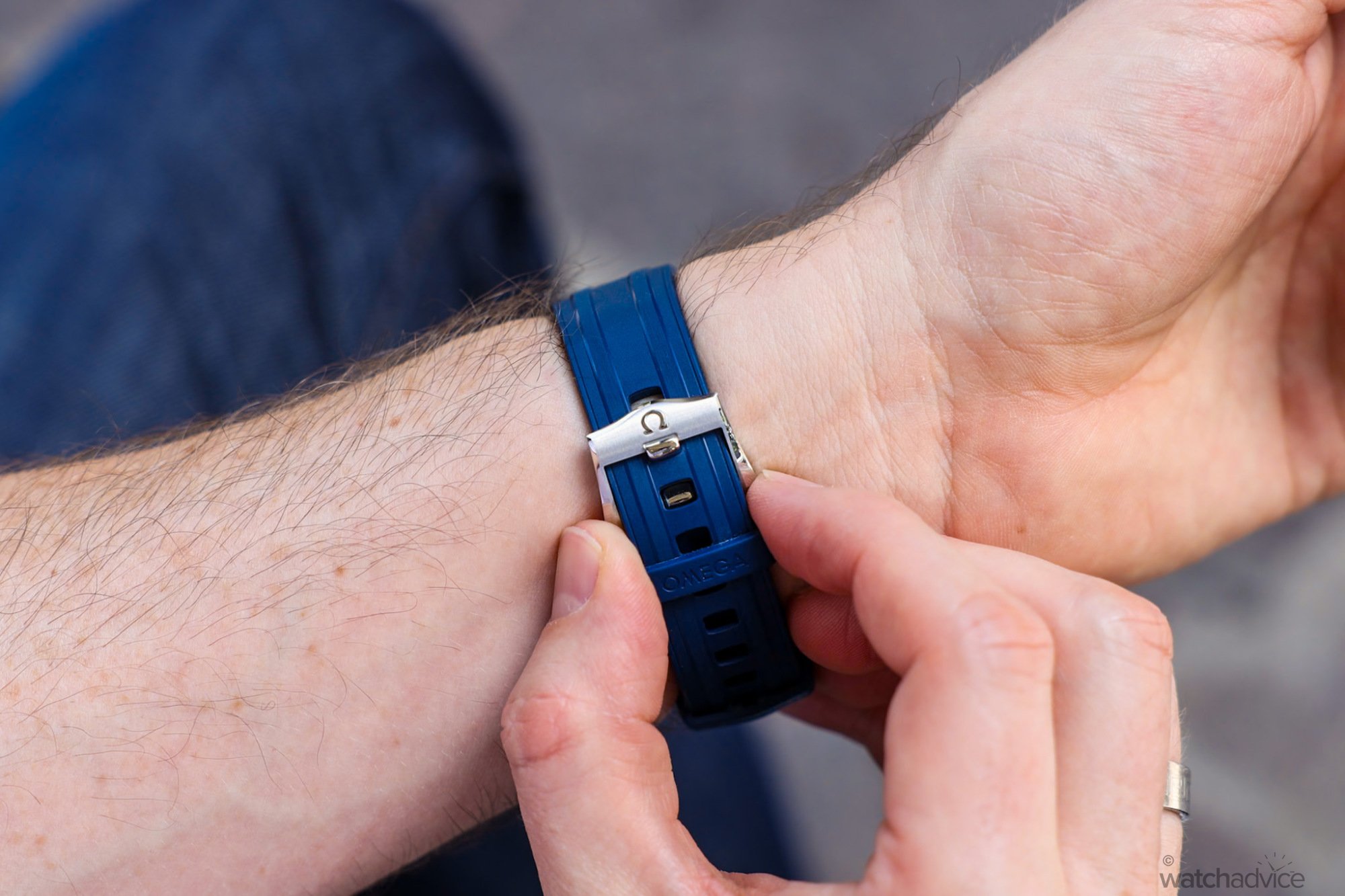
One of my gripes with the OG Bond Seamaster was the Hippocampus motif of the caseback. Whilst I loved the watch itself, what young 20 something guy who was into James Bond didn’t? The raised motif of the mythological half-horse, half-fish was enough to irritate my wrist, and there was a raised polished ring around the outside of the inner caseback so combined with the Hippocampus, wasn’t flat. I can recall taking the watch off and rubbing where the case back sat on a regular basis. Thankfully the modern variants are sapphire, so no issues there.
My worry was the 75th Summer Blue Seamaster would be the same as the Seamaster from the 90’s and early 2000’s. Thankfully it’s not. The main difference on this model is it’s not a single creature, it is an entire scene with Posiedon, his trident and the 2 sea creatures which blend into the case for the most part and leaves little room for it to rub the wrist. Plus this motif isn’t as raised as much, so it sits more flush.
The Movement
Hidden under the closed caseback is the heart of the Seamaster, the calibre 8800 movement, which is METAS certified as a Master Chronometer. Being adjusted through 8 tests over 10 days, ensuring an accuracy of -0/+6 seconds a day, it’s greater than COSC. I still maintain the Seamaster has been one of the most accurate watches I’ve owned, and the 8800 Calibre normally performs better than the +6s per day. In this case, it’s more like +1 or 2+ seconds per day.
Personally, I liked the display case back on the standard Seamaster Diver. Whilst the Calibre 8800 isn’t hand-finished, I still maintain it’s a good-looking movement. Well finished with circular Geneva Stripes on the rotor, plates and bridges, black polished screws and the visible rubies make for a nice looking movement. So I’m torn with the Summer Blue version. I miss the see-through case back but admire the 75th Anniversary motif along with the “Seamaster Since 1948” inscribed on it. It is a nice touch and differentiates it just that little bit more as a commemorative version.
Final Thoughts
The Omega Seamaster Professional Diver 300M Summer Blue is one watch that has me a little torn. On the rubber strap it’s a hard watch to fault (yes the helium escape valve is polarising, but that’s personal preference I feel). It has all the essence of the Seamaster, the look, the feel, fit and robustness, but with the Summer Blue treatment. And this is where I’m 50/50 on this piece as an all-year-round watch. As mentioned, I wore this piece in Winter, and whilst I thought the look was stunning, just didn’t feel right in June and July. However, now in Summer, I feel it’s right at home.
Paired with jeans and a tee around the city it works. Boardshorts and singlet at the beach – yes it will fit there too. Lounging about with friends sipping cocktails by the marina, even more so. It’s a fun watch designed to be worn and shown off on the wrist, all the while having the DNA of a serious diver. If you’re off to a tropical location or just taking time off with the family over the summer, it may just be the perfect watch for all occasions…at least until the weather gets cold. But maybe, it’s the cure for winter blues, having some Summer Blue on your wrist? Time will tell.
Reference: 210.32.42.20.03.002 (Steel on rubber)
Specification
- Case: 42mm, 13.6mm thick
- Case Material: Steel, with a combination of brushed and polished finishing
- Dial: PVD treated blue gradient ceramic with laser etched wave pattern
- Crystal: Domed scratch‑resistant sapphire crystal with anti‑reflective treatment on both sides
- Water resistance: 300m (30BAR)
- Movement: Calibre 8880, METAS certified and anti-magnetic up to 15,000 gauss
- Power reserve: 55 hours
- Strap: Blue rubber with brushed and polished steel pin buckle.